Every day, thousands of online businesses lose qualified leads, sales, and revenue for one simple reason: Their landing page Call to Action (CTA) fails to motivate action. You can run targeted ad campaigns, craft compelling sales copy, and design gorgeous hero sections. But if your primary button feels vague, hidden, or untrustworthy, prospective buyers will leave without taking action.
Here is the plain truth: A high-converting CTA is never just a brightly colored button that says "Submit." It is a value-driven gateway that bridges the gap between what your visitor wants and what your business offers.
Historically, testing and refining button copy meant spending hours wrestling with custom code or running complex A/B testing scripts. Modern platforms have eliminated that struggle entirely. When you launch your storefront on BoltWeb, optimizing your conversion path becomes automatic. As a future-ready business website builder, BoltWeb analyzes visitor intent, maps conversion funnels, writes high-converting sales copy, and places optimized CTAs across your storefront in under 60 seconds!
Here is your master guide on landing page CTA best practices to turn passive traffic into paying clients.
The Master CTA Conversion Matrix
| CTA Dimension | High-Converting Execution | Low-Converting Mistake |
|---|---|---|
| Button Copy | "Get My Free Marketing Audit" | "Submit" or "Click Here" |
| Value Focus | Highlights clear outcome | Asks for immediate commitment |
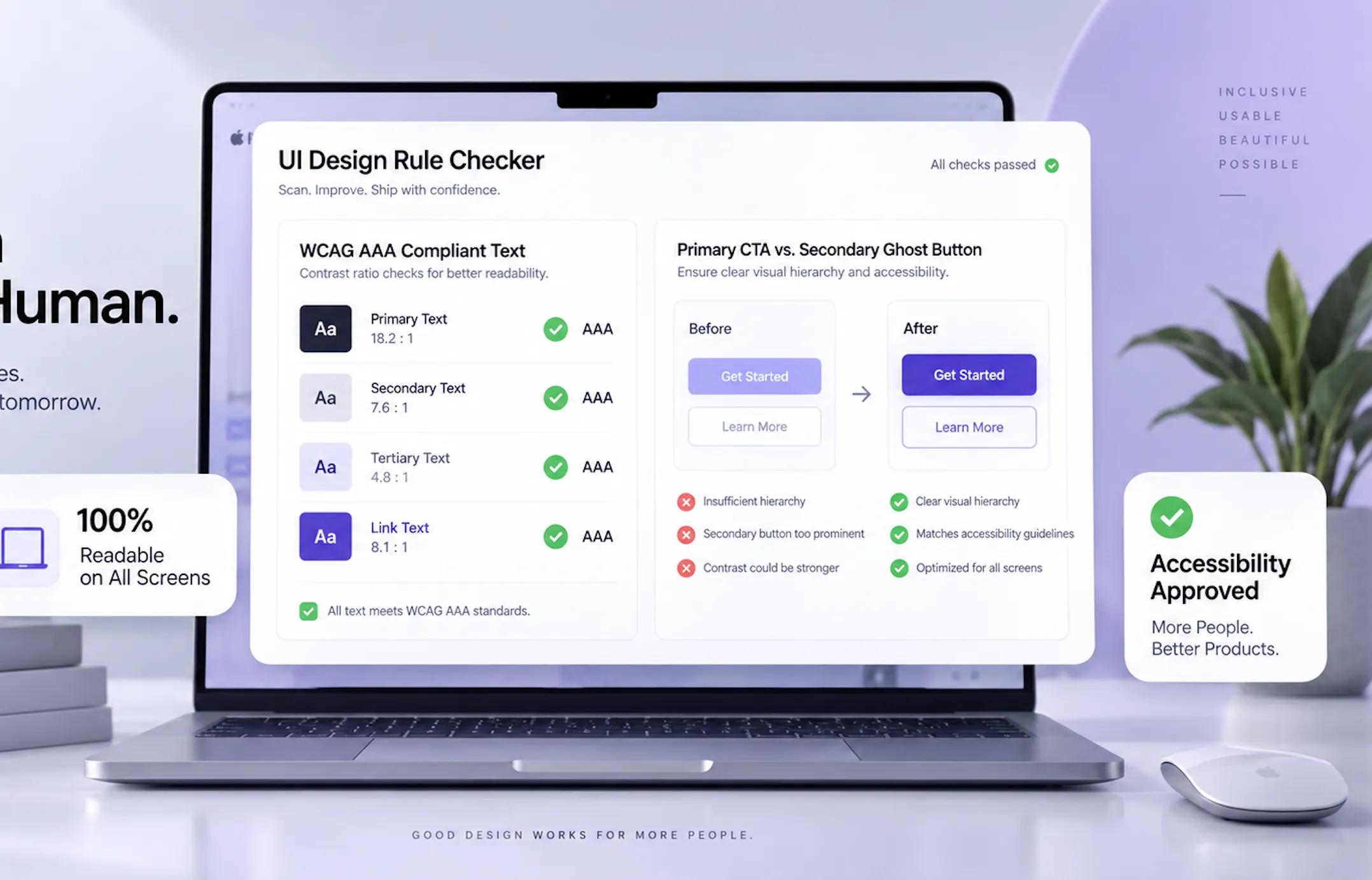
| Visual Hierarchy | High contrast, clear spacing | Blends into background colors |
| Microcopy Support | "No credit card required. Cancel anytime." | Zero trust signals or hidden terms |
1. What Are the Best Practices for Landing Page CTAs?
If your landing page gets steady traffic but zero form submissions, your call to action is likely confusing or uninspiring. A great CTA must answer one core question in the visitor's mind: "What do I get when I click this?"
Adopting proven landing page CTA best practices lays a solid foundation. Focusing on systematic landing page call to action strategy and continuous CTA optimization helps convert cold visitors into warm leads.
2. Write CTA Copy That Tells Visitors Exactly What Happens Next
Generic labels like "Submit," "Send," or "Learn More" trigger hesitation. They demand effort from the user without promising a rewarding outcome. Swap passive commands for active, benefit-driven text:
- Weak: "Submit Form" → Strong: "Claim My Instant Discount"
- Weak: "Learn More" → Strong: "See How It Works"
- Weak: "Register" → Strong: "Reserve My Seat Now"
Choosing specific CTA button text based on proven landing page CTA examples ensures your call to action examples guide users effortlessly toward conversion.
3. Lead With the Value Visitors Get From Clicking
"How do I make the button feel worth clicking?"
Your visitors don't want to fill out forms or schedule calls. They want to solve a pressing problem. Frame your button copy around the specific outcome your offer delivers:
High-Converting CTA = Action Verb + Target Value Outcome
| Generic Button Copy | Value-Driven Alternative |
|---|---|
| "Download PDF" | "Get My Free SEO Checklist" |
| "Start Trial" | "Build My Free Storefront" |
| "Contact Us" | "Talk to a Scaling Expert" |
Crafting a compelling CTA with effective call to action messaging creates persuasive CTA copy that drives clicks.
4. Match the CTA to Your Offer and Conversion Goal
Asking a first-time visitor to "Buy Now" for a $2,000 service creates immediate friction. Match your request to the buyer's stage in the sales funnel. Match your button request to user intent:
- Top of Funnel (Cold Traffic): Low-commitment requests ("Get the Guide," "Watch Demo").
- Middle of Funnel (Warm Traffic): Interactive engagement ("Start Free Trial," "Calculate Savings").
- Bottom of Funnel (Hot Traffic): Direct purchasing ("Buy Now," "Lock In My Rate").
Aligning your landing page conversion goal with a tailored CTA for lead generation or a streamlined SaaS landing page CTA maximizes campaign ROI.
5. Place Your Primary CTA Where Visitors Need It
Forcing visitors to scroll up and down looking for an action button hurts your conversion rate. Place CTAs strategically along the reading path:
- Hero Section (Above the Fold): For fast decision-makers who already know what they want.
- Mid-Page Value Blocks: Immediately following key benefit lists, testimonials, or feature breakdowns.
- Bottom Anchor Section: A final decision point for readers who reviewed your entire page.
Optimizing landing page CTA placement ensures an above the fold CTA works alongside smart CTA button placement throughout the page.
6. Make Your CTA Stand Out Without Distracting From the Page
There is no single "magic" button color. Red, green, orange, and blue can all convert exceptionally well—provided they contrast sharply with the surrounding background.
Balancing CTA button design with proper CTA button color choices applies core landing page design best practices to guide the reader's eye.
7. Reduce Friction Around the CTA
Every additional input field, unexpected requirement, or confusing step reduces your completion rate. Streamline the user journey:
- Keep Forms Short: Ask only for essential details (like name and email).
- Eliminate Hidden Steps: Tell users upfront if they will need a credit card or business address.
- Enable Single-Click Signups: Offer Google or Apple sign-ins to reduce typing friction.
Minimizing user resistance helps improve landing page conversions, drive landing page form optimization, and boost overall CTA conversion rate metrics.
8. Use Supporting Copy to Answer Last-Minute Questions
Right before a user clicks your button, anxiety peaks. They wonder: Will this cost money? Will they spam my inbox? Can I cancel later? Reassure them with concise microcopy placed directly beneath your primary button:
Adding informative CTA microcopy and CTA supporting text incorporates powerful landing page trust signals that alleviate user hesitation.
9. Use One Clear Primary CTA and Limit Competing Actions
Giving visitors too many choices often leads to no action at all. Multiple competing buttons split user attention and lower total conversions. Structure your page with a single dominant goal:
- Primary CTA: Styled with high-contrast colors for your primary conversion objective.
- Secondary Action: Use subtle text links or ghost buttons for secondary tasks (like reading documentation).
Establishing a distinct primary CTA while deemphasizing any secondary CTA streamlines your overall landing page CTA strategy.
10. Adapt CTA Copy and Placement for Mobile Visitors
Over 50% of global web traffic arrives via mobile devices. If your CTA button is too small or awkward to tap on a touchscreen, mobile conversions will plummet.
Optimizing your mobile landing page CTA and adjusting your mobile CTA button ensures your layout delivers a fully responsive landing page design.
11. Test CTA Variations Without Guessing
Never rely on guesswork when optimizing conversion rates. Run controlled experiments to test button variations. Test high-impact CTA variables:
- Button Copy: Test benefit-driven phrasing against direct action verbs.
- Supporting Microcopy: Test privacy badges against money-back guarantees.
- Button Placement: Test fixed sticky buttons against static page placements.
Running structured landing page CTA testing via controlled CTA A/B testing yields concrete data to optimize landing page CTA performance.
12. Measure CTA Success Beyond Button Clicks
A high click-through rate means little if those clicks fail to yield qualified leads or revenue. Track the complete conversion path:
True CTA ROI = (Qualified Conversions / Total Page Visitors) × 100
Evaluate metrics like CTA conversion rate, landing page conversion optimization stats, and downstream landing page performance metrics to track actual business impact.
Build High-Converting Storefronts with BoltWeb
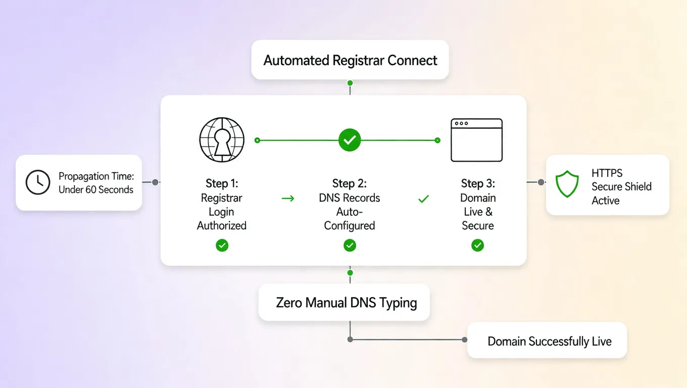
Crafting high-converting landing page CTAs, optimizing page layouts, and configuring domain routing used to take weeks of effort. With BoltWeb, that entire process is automated.
Whether you are launching a new offer or upgrading an existing site, BoltWeb acts as your intelligent website builder. It analyzes what your visitors need, writes persuasive CTA copy, eliminates manual design headaches, and builds conversion-ready pages in under 60 seconds!
Launch Your High-Converting Page Today: Skip technical hassles and manual copywriting. Build on BoltWeb, connect your custom domain, and create a business website using our advanced domain and website builder in under 60 seconds!
12 High-Converting FAQs: Landing Page CTA Best Practices
1. What are the most critical landing page CTA best practices for converting visitors into leads?
Here's the plain truth: A high-converting Call to Action (CTA) is never just a brightly colored button that says "Submit." It is a value-driven gateway that bridges the gap between what your visitor wants and what your business offers. To drive action, your primary button must communicate absolute clarity, high visual contrast, immediate relevance, low commitment friction, and an unmistakable benefit. When you build your digital storefront on BoltWeb, optimizing your conversion path becomes automatic. As an all-in-one business website builder, BoltWeb analyzes visitor intent, maps conversion funnels, writes search-optimized sales copy, and places optimized CTAs across your storefront in under 60 seconds!
2. How do I write high-converting CTA button text that replaces generic phrases like "Submit"?
Generic labels like "Submit," "Send," or "Learn More" trigger hesitation because they demand effort from the user without promising a rewarding outcome. Swap passive commands for active, benefit-driven phrasing: Weak: "Submit Form" → Strong: "Claim My Instant Discount". Weak: "Learn More" → Strong: "See How It Works". Weak: "Register" → Strong: "Reserve My Seat Now". Choosing specific CTA button text based on proven landing page CTA examples ensures your call to action examples guide users effortlessly toward conversion.
3. How do I make my button copy feel worth clicking by leading with customer value?
Your visitors don't want to fill out forms or schedule calls—they want to solve a pressing operational problem. Frame your button copy around the specific outcome your offer delivers: Generic Button: "Download PDF" → Value Alternative: "Get My Free SEO Checklist". Generic Button: "Start Trial" → Value Alternative: "Build My Free Storefront". Crafting a compelling CTA with an effective call to action strategy creates persuasive CTA copy that drives clicks.
4. How do I align my primary CTA with my specific landing page conversion goal?
Asking a first-time, cold visitor to "Buy Now" for a $2,000 service creates immediate friction. Match your request to the buyer's stage in the sales funnel. Match your button request to user intent: Top of Funnel (Cold Traffic): Low-commitment requests ("Get the Free Guide"). Middle of Funnel (Warm Traffic): Interactive engagement ("Start Free Trial"). Bottom of Funnel (Hot Traffic): Direct purchasing ("Lock In My Rate"). Aligning your landing page conversion goal with a tailored CTA for lead generation or a streamlined SaaS landing page CTA maximizes campaign ROI.
5. Where is the optimal landing page CTA placement on mobile and desktop screens?
Forcing visitors to scroll up and down looking for an action button hurts your conversion rate. Place CTAs strategically along the reader's decision path: Hero Section (Above the Fold): For fast decision-makers who already know what they want. Mid-Page Value Blocks: Immediately following key benefit lists or social proof blocks. Bottom Anchor Section: A final decision point for readers who reviewed your entire page. Optimizing landing page CTA placement ensures an above the fold CTA works alongside strategic CTA button placement throughout the page.
6. What CTA button design and CTA button color choices maximize visual contrast?
There is no single "magic" button color. Red, green, orange, and blue can all convert exceptionally well—provided they contrast sharply with the surrounding background elements. Key design rules for high-converting buttons: High Contrast: Use an accent color that stands out distinctly from your brand's background palette. Generous Padding: Leave ample white space around the button so it draws the eye immediately. Visual Focal Point: Ensure primary buttons visually overpower secondary text links. Balancing CTA button design with proper CTA button color choices applies core landing page design best practices.
7. How do I reduce form friction and improve landing page conversions?
Every additional input field, unexpected requirement, or confusing step reduces your completion rate. Streamline the user journey before and after the click: Minimize Form Fields: Ask only for essential details (such as name and email address). Eliminate Hidden Steps: Tell users upfront if credit cards or lengthy setup steps are required. Enable Single-Click Signups: Offer Google sign-in options to remove manual typing. Minimizing user resistance helps improve landing page conversions, drive landing page form optimization, and boost overall CTA conversion rate metrics.
8. What CTA microcopy and supporting text should I place near the button to build trust?
Right before a user clicks your primary button, anxiety peaks. They wonder: Will this cost money? Will they spam my inbox? Can I cancel later? Reassure them with concise microcopy placed directly beneath your primary button: "🔒 No credit card required • 14-day free trial • Cancel anytime" and "We respect your privacy. Zero spam guaranteed." Adding informative CTA microcopy and CTA supporting text incorporates powerful landing page trust signals that alleviate user hesitation on BoltWeb.
9. Should I use one primary CTA or include secondary CTAs on my landing page?
Giving visitors too many competing choices often leads to choice paralysis and no action at all. Multiple competing buttons split user attention and lower total conversions. Structure your page with a clear visual hierarchy: Primary CTA: High-contrast, bold button for your main conversion objective. Secondary CTA: Subtle ghost button or plain text link for secondary tasks (like watching a demo). Establishing a distinct primary CTA while deemphasizing any secondary CTA streamlines your overall landing page CTA strategy.
10. How do I adapt my mobile landing page CTA for smaller touchscreen devices?
Over 50% of global web traffic arrives via mobile smartphones. If your button is too small or awkward to tap on a mobile touchscreen, mobile conversions will plummet. Essential mobile button guidelines: Tap Target Size: Ensure buttons have a minimum height of 48px for effortless thumb presses. Sticky Navigation: Utilize a fixed bottom CTA bar that stays visible as users scroll down long pages. Responsive Typography: Keep button text short to prevent awkward text wrapping on mobile screens. Optimizing your mobile landing page CTA and adjusting your mobile CTA button ensures your layout delivers a fully responsive landing page design.
11. How do I run CTA A/B testing to optimize landing page CTA performance?
Never rely on gut assumptions when optimizing conversion rates. Run controlled experiments to test button variations against real user behavior. High-impact CTA variables to test: Button Phrasing: Test benefit-driven copy ("Claim My Free Audit") against direct action verbs ("Get Started"). Supporting Microcopy: Test privacy guarantees against money-back promises. Button Positioning: Test sticky mobile bars against static section placements. Running structured landing page CTA testing via controlled CTA A/B testing yields concrete data to optimize landing page CTA results.
12. How do I measure overall CTA success beyond simple button click-through rates?
A high click-through rate means little if those clicks fail to yield qualified leads, accounts, or sales revenue downstream. Evaluate your true conversion efficiency using full-funnel metrics:
True CTA ROI = (Qualified Leads / Sales / Total Page Visitors) × 100
Tracking your overall CTA conversion rate, driving landing page conversion optimization, and analyzing landing page performance metrics ensures your marketing campaigns generate maximum ROI on BoltWeb!