How to Create a Website Navigation Menu People Can Use Without Thinking
Think about the last time you walked into a giant department store without any directional signs. You probably wandered around, felt frustrated, and walked right out.
That is exactly what happens when your site lacks a clear website navigation menu.
Your navigation is the steering wheel of your entire web presence. When built correctly, it gives visitors instant confidence to explore your pages, review your offerings, and take action. When built poorly, it creates hesitation and drives potential customers straight to your competitors.
Here is the step-by-step master guide to designing, structuring, and launching a website navigation menu that converts—without overcomplicating the process.
How to Create a Website Navigation Menu People Can Use Without Thinking
Creating a usable menu starts with a mindset shift: your website menu isn't an inventory list of everything your company owns. It is a curated path designed to turn curious visitors into confident buyers.
When a prospect lands on your site, their brain immediately opens an unclosed loop: "Where do I find what I need?" If your menu fails to resolve that question in seconds, mental fatigue sets in. To create a navigation menu that feels effortless, you must organize your content around visitor intent rather than internal company department names.
Turn Your Website Pages Into a Shortlist Before You Build the Menu
Before you even touch a design tool, perform a ruthless audit of your website pages.
the time it takes to make a decision grows exponentially with the number of choices presented. Throwing 15 top-level links into your primary navigation forces decision paralysis.
- • High-value landing pages
- • Core service offerings
- • Pricing
- • Contact links
- • Privacy policies & terms
- • Affiliate disclosures
- • Press releases
- • Career pages
Trimming your list down to essential navigation links cleans up visual noise and keeps visitor attention locked on high-intent destinations.
3. Choose the Few Destinations That Deserve the Main Menu
Your main navigation should focus squarely on the top destinations your prospective customers care about most.
For most small businesses and service providers, the website menu structure should be capped at 4 to 6 primary items:
- Core Offerings: (e.g., Services, Products, or Solutions)
- Value Proof: (e.g., Case Studies, Portfolio, or Pricing)
- Company Context: (e.g., About Us or Why Choose Us)
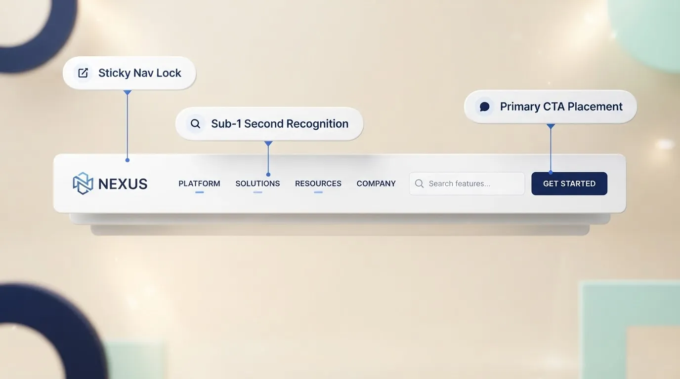
- Primary Conversion Endpoint: (e.g., Contact, Book a Demo, or Get Started)
Group Related Pages Before You Create Dropdowns
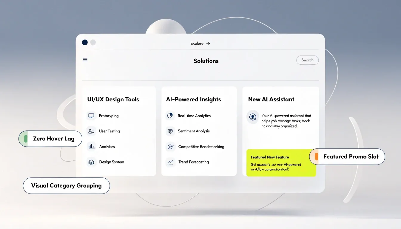
If you run a business with multiple service tiers or distinct product lines, forcing everything into a flat list breaks your layout. This is where a dropdown menu becomes valuable.
By grouping related internal pages under clear navigation categories, you establish an intuitive navigation hierarchy. Visitors scan the high-level parent item first and reveal sub-items only when relevant to their search.
Name Every Menu Item So Visitors Know Where It Leads
Here is an uncomfortable truth: clever navigation labels destroy conversion rates.
When you rename your "Services" page to "Our Craft" or your "Contact" page to "Say Hello", you force visitors to pause, decode, and hesitate. Recognition over recall means using familiar, standard industry terms that visitors instantly recognize from across the web.
| Avoid This | Use This | Why It Works |
|---|---|---|
| Investment Packages | Pricing | Matches exact user search queries. |
| Knowledge Hub | Blog | Sets accurate expectations instantly. |
| Our Journey | About Us | Direct, familiar, and actionable. |
Clear menu items eliminate guesswork, giving users the confidence to click without hesitation.
Put Your Most Important Pages Where People Will Look First
The order of your links matters just as much as their names. The Serial Position Effect demonstrates that people remember the first (Primacy) and last (Recency) items in a sequence far better than anything in the middle.
Give the Menu One Clear Action Beyond Browsing
A well-architected header does more than facilitate browsing—it creates a smooth slope that gently nudges visitors toward taking action.
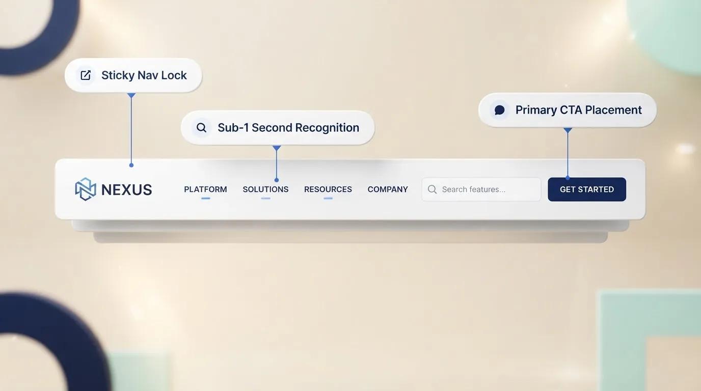
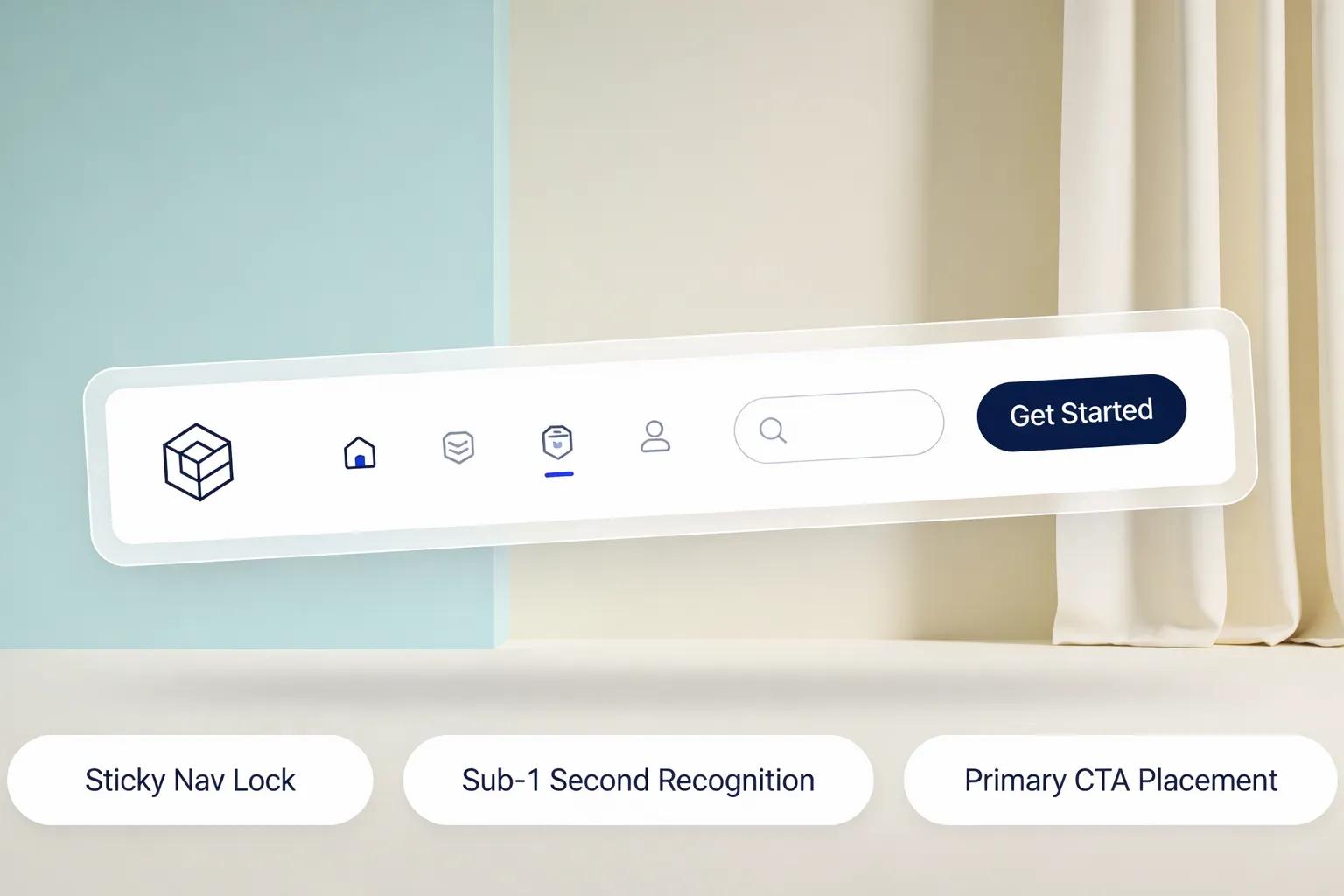
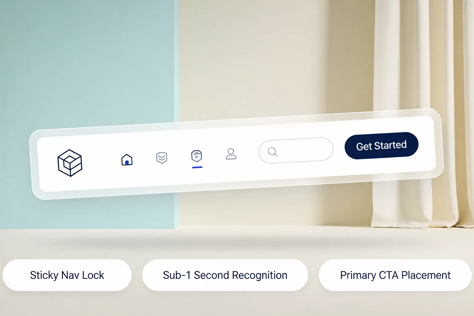
Adding a high-contrast menu button (such as "Get a Quote" or "Book Call") at the far right of your header turns your passive navigation menu design into an active lead-generation engine. Keep secondary actions (like "Log In") as plain text links nearby to ensure the primary call to action navigation stands out visually.
Use Dropdowns Only When They Make Finding Things Easier
While a navigation dropdown helps organize large websites, overuse creates "hover friction." Mega-menus that trigger unexpectedly or cover up page content disrupt the reading flow.
Apply progressive disclosure: only use a dropdown navigation structure if a parent category contains 3 or more distinct sub-pages. If a category only has one sub-page, eliminate the dropdown and link directly to that destination.
Make the Menu Work Before You Make It Look Beautiful
A beautiful menu with broken links, slow hover effects, or incorrect redirect paths hurts your brand authority.
Before publishing your website navigation, audit every single link:
- ✔ Verify that every parent item in a dropdown links to a functional landing page or opens correctly on tap.
- ✔ Ensure all navigation menu links open in the same tab to maintain browsing momentum.
- ✔ Check that active page states (e.g., highlighting the "Services" link when a user is on the Services page) work accurately.
Ensuring flawless functionality protects website usability and builds instant visitor trust.
Rebuild the Menu for the Smaller Screen, Not Just the Smaller Space
Over half of your visitors will experience your mobile website navigation on a smartphone. Shrinking a desktop header down to mobile screens results in tiny, unclickable text and overlapping links.
For mobile navigation:
- Hamburger Menu (☰): Use a clean drawer icon to collapse secondary links behind a single tap.
- Mobile Menu Spacing: Ensure every touch target is at least 44x44 pixels to prevent accidental clicks.
- Sticky Header: Keep the mobile header bar fixed at the top of the viewport so users can navigate without scrolling all the way back up.

Test the Menu With Someone Who Has Never Seen Your Website
You know your site inside and out, which makes it impossible to evaluate your own menu objectively.
Run a simple 60-second navigation UX test with a friend or client who has never seen your website:
- Ask them to find a specific service or pricing detail.
- Observe where their cursor moves first.
- Note any hesitation, misclicks, or confusion.
If they pause for more than three seconds, revise your navigation labels or reorder your menu hierarchy until the path becomes obvious. This helps uncover common website design mistakes before they impact revenue.
Create and Edit Your Website Navigation Without Rebuilding the Site
Building an intuitive website navigation menu from scratch used to mean wrestling with complex CSS code, responsive breakpoints, dynamic dropdown scripts, and manual URL mapping. If you made a mistake, your mobile layout would fall apart or broken links would kill your customer leads.
That technical friction is why so many business owners hesitate to fix their website structure.
Thankfully, modern tools have eliminated the headache entirely.
Using an advanced AI website builder like BoltWeb allows you to generate completely structured, conversion-focused website menus in minutes. As a comprehensive business website builder, BoltWeb automatically analyzes your industry, plans your page architecture, creates mobile-responsive navigation bars, and configures seamless dropdowns out of the box.
Whether you need a small business website builder or a dedicated website navigation builder, BoltWeb eliminates technical friction—giving you a polished, high-converting website menu without typing a single line of code.

Frequently Asked Questions: Creating a Website Navigation Menu
Where do I start when creating a website navigation menu from scratch?
The biggest mistake when creating a navigation menu is mapping it around your internal business operations instead of customer goals. Begin by identifying the primary "jobs" visitors hire your site to do: finding services, checking prices, verifying credibility, or contacting support. Conduct a simple card-sorting exercise to group your core pages into 4 to 6 logical parent categories that reflect how your target audience speaks and searches.
What is the ideal number of top-level links to include in a navigation menu?
To keep decision friction low, keep your primary header menu limited to 4 to 6 main destinations. Presenting visitors with 10 or more top-level links creates visual noise and causes decision paralysis. Place secondary pages into organized dropdown sub-menus to keep your primary bar clean and focused.
Should I use standard labels or creative names for my menu items?
Renaming standard menu labels like "Services" to "What We Do" or "Contact" to "Let's Talk" increases cognitive load. user hesitation increases and bounce rates rise. Plain, descriptive navigation labels eliminate confusion, keep visitors moving forward, and help search engine crawlers categorize your content.
What is the best way to handle dropdown menus without overwhelming visitors?
Multi-level, cascading "mega dropdowns" that trigger on hover often lead to frustrating misclicks—especially on mobile or laptop trackpads. Limit dropdowns to a single nested level below each main category. Group sub-links under clear, bold subheadings with sufficient spacing so users can scan and click comfortably without losing hover focus.
How do I make sure my website navigation menu works seamlessly on mobile devices?
Over 55% of web traffic comes from smartphones, meaning a desktop menu cannot simply be shrunk down. On mobile screens, collapse secondary navigation behind a recognizable hamburger icon (☰). Ensure every tap target measures at least 44x44 pixels to prevent misclicks, and implement a sticky header so mobile users can access navigation controls instantly at any point on the page.
Where should my Call to Action (CTA) button be placed in the navigation menu?
Eye-tracking studies demonstrate that users scan headers in a sweeping horizontal motion starting from the top-left logo and concluding at the far-right corner. Reserve the far-right slot of your header bar for your primary conversion button (e.g., "Get Started", "Book a Demo", or "Request a Quote"). Styling this single link as a high-contrast button gives your entire header a clear visual endpoint.
How does my navigation menu structure affect search engine optimization (SEO)?
Your primary navigation menu provides a persistent internal link structure across every page on your site. Search engine crawlers use this hierarchy to determine which pages carry the highest importance. Placing primary service pages in your main menu passes internal link equity directly to them, signaling topical authority to search algorithms and improving organic rank potential.
What is the difference between a header navigation menu and a footer menu?
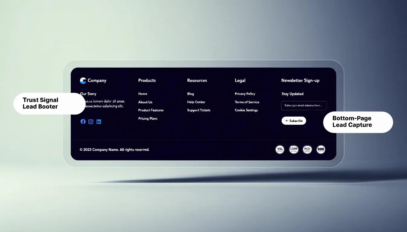
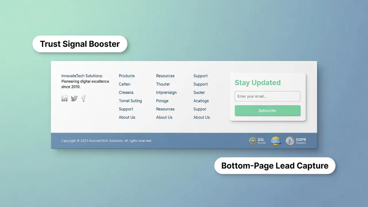
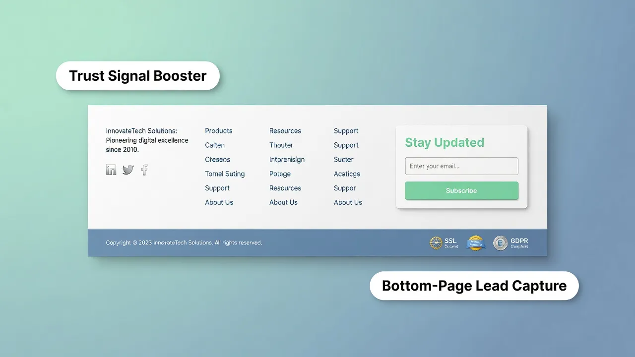
Your header menu is designed for streamlined action—guiding prospects toward high-value conversion paths with minimal distractions. Your website footer, by contrast, serves as a comprehensive safety net. It houses legal policies, support portals, physical addresses, and secondary links for analytical buyers who scroll to the bottom looking for deeper verification before taking action.
Should I use a sticky (fixed) navigation bar or a standard static header?
A sticky navigation bar stays fixed to the top of the viewport as visitors scroll down the page. This eliminates the need for users to manually scroll back to the top when they are ready to navigate elsewhere or convert. Sticky headers improve site usability and keep your main Call to Action button visible at all times, boosting overall conversion rates.
Where should utility links like 'Log In', 'Support', or phone numbers go?
Mixing administrative links with commercial offerings creates visual confusion. Place secondary utility items—such as client portal logins, support ticketing links, language selectors, or phone numbers—in a thin top utility bar positioned directly above the main header. This keeps your primary menu focused strictly on customer acquisition.