You can spend millions driving targeted traffic to your site, but if a visitor feels even a second of confusion after clicking your link, that investment vanishes into thin air.
Here is the cold, hard truth: your product or service can be revolutionary, but if your user experience is frustrating, your business reputation collapses instantly.
Visitors don't give second chances to clunky interfaces. When an experience feels confusing or difficult, people leave—and they carry a negative impression of your entire brand with them.
Creating a site that feels effortless doesn't require complex trickery. In fact, applying core website user experience best practices is all about getting out of the visitor's way so they can take action.
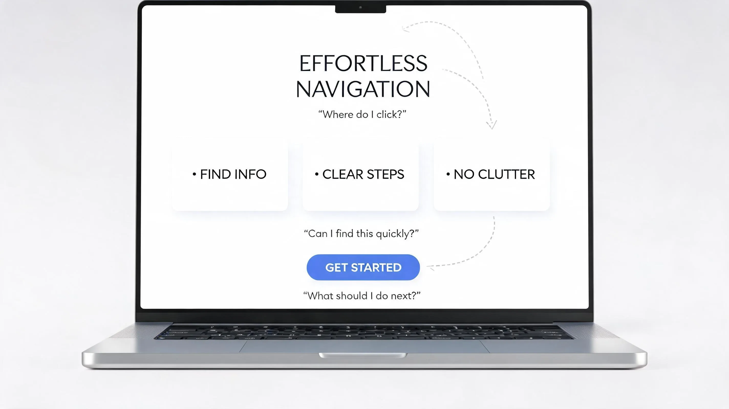
Website User Experience Best Practices: Make Every Step Feel Obvious
A common trap business owners fall into is confusing visual decoration with functional usability. A site can feature stunning high-resolution photography, slick motion graphics, and trendy typography—and still fail completely as a functional business engine.
Why? Because website usability is not about how pretty a page looks. It’s about how effortlessly a human mind can process information and take the next logical step.
When you prioritize good website UX, you remove the invisible friction that causes hesitation. You transform an administrative hurdle into a seamless, high-converting journey.
Give Visitors Their Bearings Before Asking Them to Do Anything
Ever walk into a store with no aisle markers, no signs, and no clear front counter? You immediately feel disoriented and want to turn around.
The exact same thing happens when someone lands on your site. Before you ask a visitor to click a button, sign up for a newsletter, or buy a product, you must establish instant clarity. Within the first two seconds, your website UX design must make three things crystal clear:
- Identity: Who are you?
- Value: What exact problem do you solve?
- Orientation: Where should the visitor look first?
Establishing instant context anchors the visitor's attention and builds the comfort required to explore further.

Put the Information People Need Where They Expect to Find It
Your website is not the place to reinvent how web navigation works. People spend 99% of their time on other websites. That means they bring deeply ingrained mental habits to your site. They expect the logo to be in the top-left corner and lead back home. They expect the search bar to be near the top right. They expect to see "Pricing" or "Services" directly in the primary header.
Burying essential information inside unconventional layouts ruins website navigation and increases user drop-off.
Leveraging familiar structural patterns creates an intuitive website experience that turns navigation into second nature.

Make the Important Things Visually Hard to Miss
If every text block on your page uses the same font size, weight, and color, your visitors have to read every single word just to figure out what matters. That's an asking price most users won't pay.
Establishing a dominant visual hierarchy guides the visitor's eye down the page in a deliberate sequence:
- Primary Headlines: Big, bold, high-contrast text that states the core premise.
- Supporting Subheaders: Medium-sized text that elaborates on the primary claim.
- Action Triggers: High-contrast buttons framed by generous whitespace.
Controlling visual emphasis through smart scale and contrast makes your core message unmissable.
Write for Scanning, Not for People Who Read Every Word
Here is a reality check: visitors almost never read web pages word-for-word. They scan them. Their eyes sweep across the screen in quick visual patterns searching for specific keywords, bullet points, and headers that match their intent. If they encounter a dense wall of text, their brain flags it as work and skips it entirely.
Improve website readability by structuring your content for lightning-fast scanning:
- Short Paragraphs: Cap text blocks at 2 to 3 sentences max.
- Frequent Subheadings: Use descriptive subheads that convey meaningful value even if the reader ignores the body text.
- Bullet Points: Break complex item lists out of running text so key features pop out visually.
- Bold Highlights: Strategically bold pivotal phrases to anchor the reader's eye during a quick scroll.
Structuring content for low effort respects your reader's time and delivers your core message instantly. Follow our content structuring guidelines to perfect this.

Give People Fewer Decisions When the Next Step Is Clear
The more choices you present to a user, the longer it takes them to make a decision—and the more likely they are to make no decision at all. This paralysis of choice is the primary cause of high bounce rates on sales and landing pages.
Mastering CTA design means trimming away competing alternatives at key decision points. Maintain one primary call to action per screen section. Visually subdue secondary paths (like "Learn More" or "View Docs") into low-contrast text links or outlined ghost buttons. Remove global navigation headers entirely on dedicated checkout or lead-capture pages to lock focus on completion. Implement these button design rules to eliminate hesitation.
Design Each Page Around What the Visitor Came to Do
What the reader is thinking: "Why am I seeing all this information instead of what I need?"
A major mistake in user experience website design is building pages around internal company organcharts rather than visitor goals. For example, a customer looking for pricing shouldn't be forced to read a 1,000-word history of your founding team before seeing a single dollar figure.
- Identify Intent: What exact task brought the visitor to this specific URL?
- Deliver Fast: Put the direct answer or main utility right at the top of the page.
- Progressive Disclosure: Hide granular details, edge cases, and secondary documentation lower down the page or behind collapsible accordions so you don't clutter the initial view.
Aligning content structure with true visitor intent creates a genuinely user-centered website. Learn how to organize your site structure around these goals.

Make Actions Look Like Actions
If a user has to hover over an element and wait for the cursor to change just to discover whether it's interactive, your interface has failed. Interactive elements must look interactive at a glance:
- Buttons Should Look Like Buttons: Give primary actions clear boundaries, solid fill colors, and subtle drop shadows or hover states that signal clickability.
- Links Should Look Like Links: Underline hyperlinked body text or use a distinct accent color so links stand out from surrounding copy.
- Input Fields Must Look Fillable: Give form fields clear borders and high-contrast labels so users know where to type instantly.
Clear visual affordances reduce guesswork and keep interactions fluid.
Don't Make People Start Over When Something Goes Wrong
Nothing infuriates a user faster than filling out a long form, making one tiny typo, clicking submit, and having the page reload with every single field wiped clean. Flawless form usability requires empathetic error management:
- Inline Validation: Validate inputs in real time as the user types (e.g., green checkmark for valid email format) rather than waiting for page submission.
- Preserve Data: Never wipe out user entries when a form submission fails. Keep all valid data intact in their respective fields.
- Clear Error Messaging: Highlight the exact field that needs attention in high-contrast red and explain precisely how to fix it (e.g., "Please enter a valid 5-digit postal code" instead of "Invalid input").
Guarding users against lost progress builds deep trust and protects conversion momentum. Review our guide on optimizing form layouts to prevent these drop-offs.

Make the Experience Hold Together From One Page to the Next
If your homepage uses rounded blue buttons with sleek dark cards, but your blog uses square red buttons with bright white tables, your site feels disjointed and unpredictable.
Maintaining a consistent website design builds visual trust and drastically reduces cognitive strain:
- Use a single, unified color system across every single template.
- Keep component spacing, margins, and padding rules uniform across all viewports.
- Standardize terminology across the entire site—don't call it "Shopping Cart" on one page and "Bag" on another.
Systemic consistency reassures users that they are still in the same safe, reliable environment. Ensure this consistency aligns with your overall site architecture.
Test the Website With Someone Who Doesn't Know How You Built It
You are the absolute worst person to evaluate your own site's usability. Because you built it (or know your product inside out), your brain automatically bypasses the confusing steps and confusing copy that trip up first-time visitors.
That's why website usability testing is essential:
- Observe Real Users: Sit down with someone who has never seen your site. Give them a specific task (e.g., "Find our pricing page and sign up for a trial").
- Stay Quiet: Watch where their cursor hovers, where they hesitate, and where they click the wrong element. Do not help them or explain how it's supposed to work.
- Note Friction Points: Every point of hesitation is a signal that your design or copy needs simplification.
Uncovering blind spots through real user observation reveals the hidden fixes that instantly boost performance and helps uncover common website design mistakes before they impact revenue.
Improve Your Website UX Without Rebuilding Everything
You don't need a multi-month engineering sprint or a massive custom budget to give your audience a world-class user experience. Designing a fast, intuitive, and accessible website requires deep technical optimization—from responsive layouts and instant page loads to semantic structure and clean mobile menus. For most business owners, keeping up with these technical demands while running day-to-day operations feels nearly impossible.
This is where BoltWeb transforms the equation. As a high-performance AI website builder, BoltWeb handles the heavy lifting of user experience engineering automatically. Instead of wrestling with complex code or fixing broken layouts, BoltWeb gives you a platform that is natively optimized for speed, clarity, and conversion right out of the box.
Whether you need a reliable small business website builder, a powerful business website builder, or a versatile website design builder that puts user experience first, BoltWeb empowers you to build an effortless digital experience that scales your business automatically.
Stop losing customers to confusing layouts. Upgrade to BoltWeb today and build a website where every step feels completely obvious.
Frequently Asked Questions: Website User Experience Best Practices
What is the difference between website UI and website UX?
User Interface (UI) refers to the visual presentation and surface design of a website—such as colors, typography, buttons, and layout styling. User Experience (UX) encompasses the entire interaction journey, focusing on how easily, intuitively, and efficiently a visitor can accomplish their goal. While UI determines how a website looks, UX determines how seamlessly it functions.
How quickly do visitors decide whether to stay on or leave my website?
Research shows that users form an initial impression of a website within 50 milliseconds (0.05 seconds), and typically decide whether to stay or bounce within the first 3 to 5 seconds. If your hero section fails to clearly communicate who you are, what you offer, and what action the user should take immediately, visitors will leave for a competitor. Review our guide on why visitors leave websites to fix these drop-offs.
How many menu items should I include in my primary website navigation?
Keep your top navigation bar lean by limiting primary menu items to 5 to 7 key pages. According to Miller's Law, the human short-term memory can easily process only 7 (plus or minus 2) items at a time. Overloading your main header menu creates choice paralysis, confuses visitors, and buries high-converting pages. Follow strict navigation best practices to keep menus clean.
What is visual hierarchy, and why does it matter for website usability?
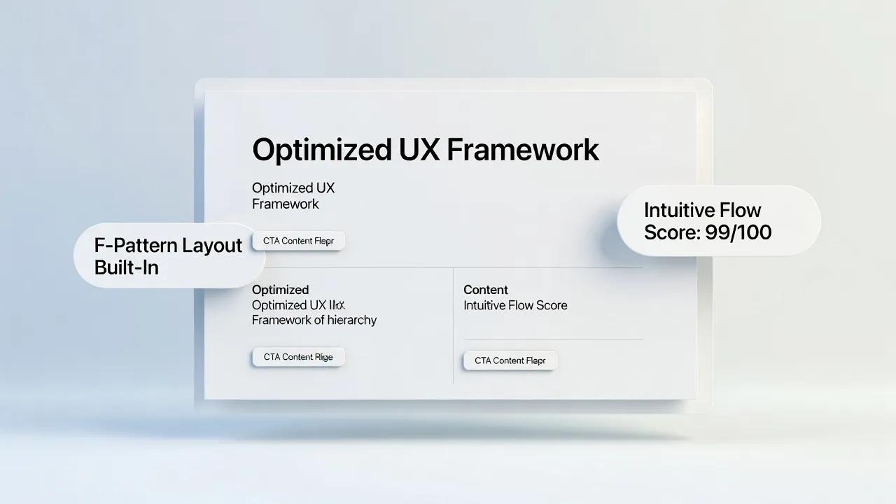
Visual hierarchy is the intentional arrangement of page elements—using scale, color contrast, font weight, spacing, and positioning—to guide the visitor's eye across the page in order of importance. A strong visual hierarchy ensures that critical information, such as headlines and call-to-action buttons, naturally catches attention before secondary supporting details.
How do I optimize my website content for people who only scan pages?
Over 80% of web visitors scan content rather than reading every word. Optimize for scannability by breaking text into short 2-to-3 sentence paragraphs, using descriptive H2 and H3 subheadings, highlighting key terms in bold, using bulleted or numbered lists for sequential steps, and leaving generous whitespace around text blocks. Read our tips on writing scannable website content to improve this.
Why should I stick to standard web conventions instead of creating a unique custom layout?
Jakob's Law states that users spend most of their time on other websites, meaning they expect your site to work like all the others they visit. Placing your logo in the top-left, putting search in the top-right, using standard button shapes, and placing contact links in the footer leverages existing mental models, allowing visitors to navigate effortlessly without a learning curve.
How can I reduce form abandonment on my checkout or lead capture pages?
Reduce form friction by asking only for essential information. Every additional input field lowers conversion rates. Use inline validation to provide real-time feedback (e.g., confirming a valid email address while typing), preserve user inputs if an error occurs so they don't have to re-type, and clearly mark optional versus required fields. Discover how to build frictionless lead forms to stop abandonment.
How does page load speed impact user experience and site conversions?
Page speed is a fundamental foundation of user experience. Pages that load within 2 seconds have an average bounce rate of 9%, while pages that take 5 seconds to load see bounce rates soar past 38%. Even a 1-second delay in page load time can reduce conversions by up to 7% and hurt your search engine rankings. Learn how to speed up your site to protect these metrics.
What is accessibility in web design, and why is it critical for good UX?
Web accessibility (WCAG compliance) ensures that people with sight, hearing, motor, or cognitive impairments can navigate and interact with your site. Essential accessibility practices include maintaining high contrast between text and background colors, providing descriptive alt text for images, ensuring keyboard navigation support, and enabling screen reader compatibility. Accessible design creates a better experience for all users.
How can I make sure my website provides a great user experience on mobile devices?
Design with a mobile-first mindset by ensuring touch targets (buttons and links) are at least 48x48 pixels and adequately spaced to prevent accidental clicks. Ensure font sizes remain readable without zooming, convert multi-column desktop layouts into single-column vertical stacks, and eliminate heavy pop-ups that block mobile viewports. Review our guide on mobile navigation ergonomics for more details.
How do I conduct a simple usability test if I don't have a big budget?
You don't need an expensive lab to run effective usability tests. Recruit 3 to 5 people who are unfamiliar with your business. Ask them to complete a specific task on your website—such as finding a specific product, requesting a quote, or booking a call—while thinking aloud. Simply observing where they hesitate, get confused, or misclick will reveal 80% of your site's core UX issues.
How can I improve my website's UX without spending months rebuilding everything from scratch
You don't need a massive engineering overhaul to deliver a modern, intuitive user experience. Utilizing high-performance visual website platforms like BoltWeb allows you to leverage pre-optimized, conversion-focused layouts out of the box. BoltWeb automatically handles responsive mobile viewports, high-speed image compression, and semantic page structure, letting you focus on publishing content that engages visitors and drives conversions effortlessly. Explore the best website builder features to upgrade your UX today.