Here is the cold, hard truth about online traffic:
Visitors do not owe you their patience. When someone clicks your link, their brain runs an immediate split-second test: Is this what I was looking for, or am I wasting my time?
If your page takes five seconds to load, flashes a giant pop-up, or hides the main topic under a wall of generic text, visitors bounce instantly. This sudden departure drives up your website bounce rate and tells search engines that your page failed to deliver.
So, how do you fix it?
Passing the initial judgment test requires instant visual clarity and zero clutter. When a visitor lands on your site, the very top section must immediately show them they are in the right place. Removing early distractions stops visitors from leaving before they even read your offer.

THE FIRST THREE SECONDS AUDIT
│
▼
[ INSTANT DISPLAY ]
Page loads under 2s
Clean mobile layout
[ CLEAR VALUE ]
Main offer visible
Instant topic match
[ ZERO OBSTACLES ]
No giant pop-up overlays
No confusing scripts
Your Website Doesn't Make Sense Fast Enough
Have you ever landed on a company page and had no idea what they were selling?
It happens constantly. Businesses often hide their core services behind abstract slogans like "Driving Synergistic Transformation for Tomorrow." But guess what? Your customers do not talk like that, and they certainly do not search for those terms.
When visitors face confusing messaging, their brains have to work double-time to process the page. That extra mental effort causes instant cognitive overload. Instead of trying to decode your puzzle, users simply close the tab.
Fixing website usability starts with ultra-clear communication:
- Name your service directly: State what you do in simple, everyday language (e.g., "Emergency Plumbing Services in Chicago" instead of "Flow Optimization Experts").
- Target your ideal client: Explicitly state who your service is for in the main headline.
- Remove vague corporate jargon: Replace clever marketing buzzwords with direct, honest descriptions.
When your message is crystal clear within two seconds, visitors relax and keep reading. To refine your site's core messaging, check out our guide on choosing your website messaging carefully.

Your Homepage Isn't Giving Visitors a Reason to Stay
Let's talk about what your visitors actually care about.
Here is a quick hint: It isn't your company history or your mission statement.
When a potential client lands on your website homepage, they care about a single outcome: Can this business solve my specific problem right now? If your page leads with a long paragraph about when your company was founded in 2008, visitors drop off because the content feels irrelevant to their immediate needs.
[ COMPANY-FOCUSED (HIGH BOUNCE) ]
"We have been a family-owned business since 2008, committed to quality excellence and values."
──► Boring, ignores visitor's problem
[ CLIENT-FOCUSED (HIGH RETENTION) ]
"Get Your Roof Repaired in 24 Hours. Fast, reliable service with a lifetime leak-free guarantee."
──► Direct benefit, solves urgent need
Hook your readers by focusing on their core goals:
- Lead with the primary benefit: Explain how their life or business gets better after using your service.
- Highlight the immediate outcome: Describe the exact result they receive (e.g., "Save 5 hours a week on accounting").
- Address their main frustration: Show them how your service eliminates their biggest daily headache.
Shifting your focus from your company history to the client's direct needs turns a quiet homepage into an engaging sales asset.

Your Website Is Too Difficult to Navigate
Picture this scenario:
A prospective buyer lands on your site, wants to check your pricing or see your work, but encounters a massive, cluttered navigation menu with fifteen drop-down subcategories. What do they do? They panic, feel overwhelmed, and exit.
When you offer too many choices at once, decision fatigue sets in fast. Giving visitors too many paths actually prevents them from taking any action at all.
Keep your website navigation simple, clean, and intuitive:
- Limit main menu items: Keep your primary header navigation to 5 or fewer core options (e.g., Services, Portfolio, About, Pricing, Contact).
- Use familiar link names: Stick to standard labels that users recognize instantly instead of creative custom terms.
- Provide clear visual paths: Guide visitors toward logical next steps using prominent buttons rather than hiding key pages inside nested menus.
When finding information is effortless, visitors stay longer and browse deeper into your site. For practical tips on structuring your layout, read our guide on making a website easy to use.

Your Website Looks Untrustworthy or Outdated
Let's face it:
Design creates immediate perception. If your website looks like it was built in 2012—with tiny text, misaligned boxes, low-resolution photos, or broken links—visitors assume your business is either inactive or unprofessional.
A poorly maintained site triggers instant safety concerns. Visitors worry about entering their credit card details or sharing their phone number on a platform that looks neglected.
INSTANT TRUST INDICATORS
- ✔ Active SSL security certificate (https in browser URL)
- ✔ Modern, responsive layout with clean white space
- ✔ Authentic, high-resolution photos of real team members
- ✔ Up-to-date copyright date and active contact details
Restore website trust and prove your business is active and reliable:
- Keep design elements consistent: Use unified fonts, aligned margins, and a single primary accent color across all pages.
- Display real business details: Feature an accessible phone number, direct email, and physical location in your site header and footer.
- Fix technical errors promptly: Repair 404 pages, missing images, and broken buttons that signal neglect.
A clean, modern look gives prospective clients the confidence to stay, explore, and reach out. Learn how to strengthen your site authority in our detailed breakdown of what makes a website trustworthy.

You're Making Visitors Work Too Hard to Find Important Information
Why do so many sites force users to hunt through five sub-pages just to find basic details?
When a customer wants to know your location, operating hours, baseline pricing, or phone number, they expect to see those details instantly. If they have to search through dense blocks of text just to find a simple answer, frustration sets in and they leave for a competitor who makes details obvious.
Solve website usability issues by placing key information right where users expect it:
- Put contact details in the header: Display a clickable phone number and email address at the top right corner of every page.
- Publish clear pricing starting points: State baseline costs or starting estimates directly on your service pages to pre-qualify leads.
- Feature prominent FAQ sections: Answer common questions right on your high-traffic pages to remove hesitation before it starts.
DECISION-SUPPORTING LAYOUT
│
▼
[ SERVICE DETAILS ]
Plain-English scope
Clear deliverables
[ CLEAR PRICING ]
Baseline cost listed
No hidden surprises
[ EASY CONTACT ]
1-click phone call
Simple intake form
Eliminating unnecessary hunting removes friction and accelerates the buyer's decision-making process.

Your Website Takes Too Long to Load
Here is a statistic that should keep every business owner up at night:
A delay of just two seconds in page load time can increase your bounce rate by over 100%.
Modern web users expect instant results. If your site takes forever to open because of uncompressed image files, bloated scripts, or cheap web hosting, visitors will hit the back button before seeing a single line of text. A slow website literally burns money.
Fix your website loading speed with these critical performance tweaks:
- Compress all image files: Convert heavy PNG and JPEG files into modern WebP formats before uploading them to your site.
- Remove unnecessary plugins: Delete unused background scripts, heavy widgets, and tracking pixels that drag down site performance.
- Use fast, modern cloud hosting: Move your site to a high-speed hosting infrastructure designed for quick content delivery.
Fast-loading pages keep visitors on your site and improve your search rankings at the same time.

Your Website Doesn't Work Well on Mobile
Over 60% of all web traffic happens on mobile devices. Yet, many business owners still design their pages on desktop monitors without checking how they look on a smartphone.
If a mobile user lands on your site and has to pinch-zoom to read text, struggles to tap tiny links, or deals with horizontal scrolling issues, they will leave immediately. A broken mobile layout communicates that your business is out of touch.
[ BROKEN MOBILE UX (HIGH BOUNCE) ]
- Pinch-to-zoom text required
- Tiny links stacked too close
- Horizontal scrolling bugs
──► Frustrating, immediate tab close
[ RESPONSIVE MOBILE UX (HIGH CONVERSION) ]
- Large, readable typography
- Wide, thumb-friendly buttons
- Single-column stacked layout
──► Smooth, comfortable browsing
Ensure your site delivers a flawless mobile-friendly website experience:
- Adopt a single-column layout: Stack your text, images, and form boxes vertically so they adjust smoothly to smaller mobile screens.
- Size buttons for thumb taps: Make buttons at least 48 pixels tall so users can tap them easily without hitting adjacent links.
- Optimize typography for readability: Use clean font sizes (at least 16px for body copy) so text is easy to read without zooming.
Delivering a seamless mobile experience keeps mobile visitors engaged and ready to connect.

You're Asking Visitors to Do Too Much Too Soon
Want to know the fastest way to scare off a interested prospect?
Show them a 12-field intake form asking for their home address, company budget, and job title on their very first visit—or hit them with a full-screen pop-up two seconds after they arrive.
Asking for too much commitment too early creates friction. When visitors feel pressured before they even understand your value, they back away to protect their privacy.
[ HIGH FRICTION FORM (POOR) ]
- First & Last Name
- Phone Number & Address
- Annual Budget & Company Size
- Detailed Project Background
──► Asks too much, high drop-off
[ STREAMLINED FORM (STRONG) ]
- Full Name
- Email Address
- How can we help?
──► Quick and easy, low drop-off
Fix your conversion flow by keeping commitment levels low:
- Shorten your lead forms: Ask for only the bare essentials—typically just a name and an email or phone number.
- Delay intrusive pop-ups: If you use pop-ups, set them to appear only when a user shows intent to leave the page or after they have read 50% of your content.
- Focus on a single call-to-action: Give each page one clear primary action instead of overwhelming users with competing choices.
Lowering early friction gives visitors the space they need to build trust and take action. See our complete guide on adding a lead form to a website for more tips.

Your Website Doesn't Give People Enough Reason to Trust You
Imagine walking into an empty restaurant with no reviews, no staff in sight, and zero customers. You would probably turn around and leave, right?
The exact same thing happens on your website when you fail to show social proof. If your page makes big claims about your service quality but offers zero reviews, client testimonials, or real project photos to back them up, visitors remain skeptical and hesitate to buy.
Strengthen your page credibility with authentic customer reviews and proof signals:
- Embed verified third-party reviews: Display live review feeds from trusted platforms like Google Business or Trustpilot.
- Showcase real project portfolios: Feature before-and-after photo galleries or documented case studies showing real client results.
- Include real human details: Pair client quotes with full names, company titles, and real headshots to prove authenticity.
Showing verified social proof removes doubt and gives prospective buyers the confidence to reach out. Learn how to integrate proof in our guide on adding testimonials to a website.

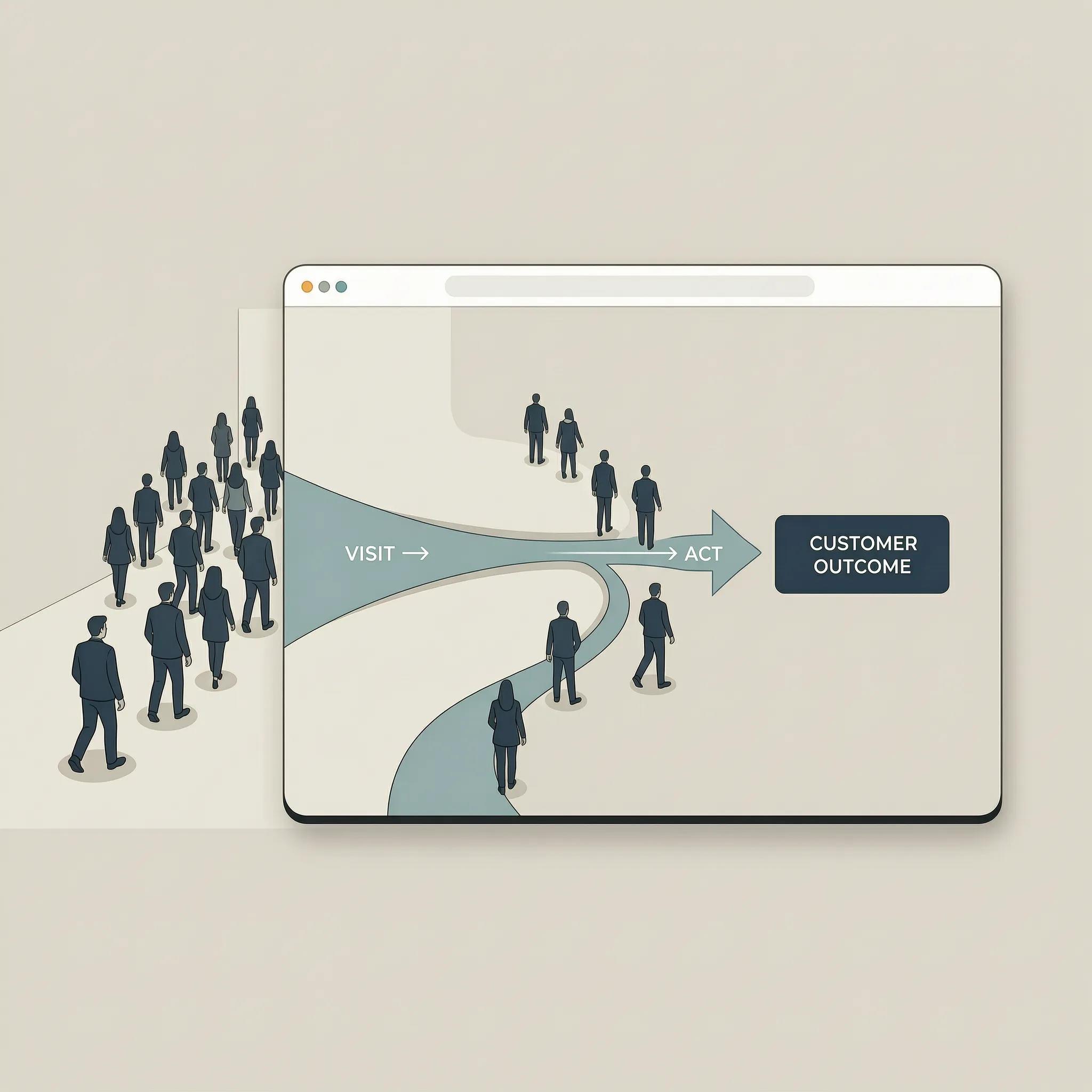
Find Out Exactly Where Visitors Are Dropping Off
Stop guessing why people are leaving your site. Look at actual user behavior data instead.
Using free website analytics tools allows you to trace the exact path visitors take across your site, pinpointing the specific pages where people drop off so you can fix the real issues.
BEHAVIOR TRACKING WORKFLOW
│
▼
[ TRACK TRAFFIC PATHS ]
See top entry pages
Review time-on-page
[ IDENTIFY HIGH BOUNCE ]
Spot pages where users leave without clicking
[ ANALYZE HEATMAPS ]
Watch mouse movement
Fix broken elements
Set up simple website visitor tracking to uncover hidden friction points:
- Monitor exit rates by page: Identify high-traffic pages with unusually high bounce rates to find broken links or weak messaging.
- Review heatmaps and session recordings: Use tools like Microsoft Clarity or Hotjar to watch real user scroll patterns and cursor movements.
- Track form abandonment: Find out which specific form fields cause users to stop typing and leave the page.
Relying on clear user data takes the guesswork out of website optimization, showing you exactly where to focus your improvements.

Fix the Reasons People Leave Without Rebuilding Everything
By now, you might be thinking:
"Fixing site speed, mobile layouts, navigation, and trust signals sounds like an overwhelming technical project."
It doesn't have to be. You do not need to spend months writing custom code or hire an expensive web agency to create a fast, high-converting digital presence.
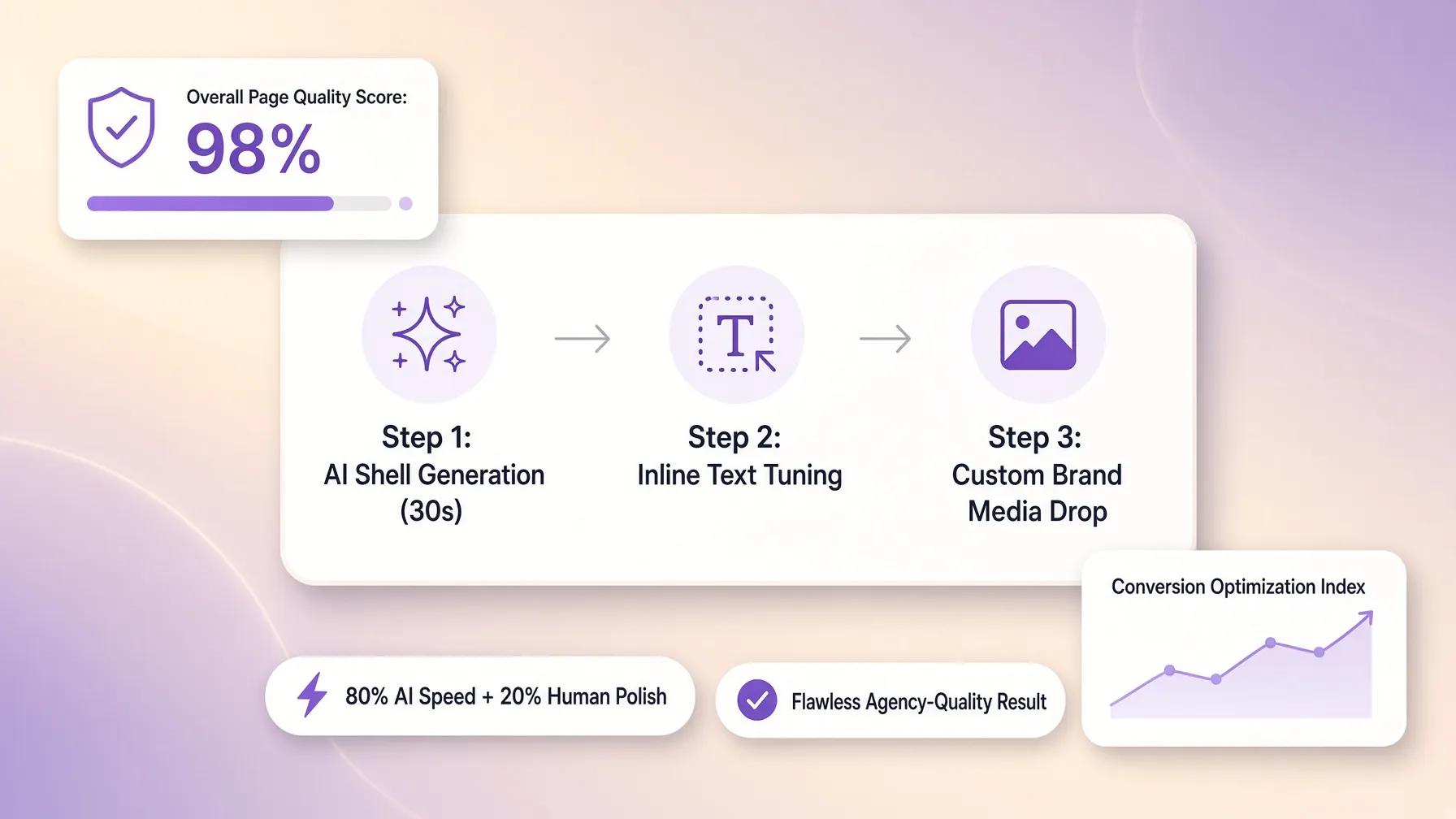
With modern tools like BoltWeb, you can launch a beautifully styled, lightning-fast professional website in minutes using an intuitive AI website builder.
BOLTWEB INTEGRATED RETENTION SYSTEM
│
▼
[ ULTRA-FAST LOADING ]
Lightning-fast delivery
Clean code structure
[ BUILT-IN TRUST BLOCKS ]
Integrated review grids
Optimized contact forms
[ FLAWLESS MOBILE UX ]
Automatic responsiveness
Thumb-friendly navigation
Why business owners rely on our small business website builder:
- Pre-designed high-converting sections: Instantly drop optimized hero banners, review grids, case study layouts, and simple contact forms into your pages using our website builder.
- Automatic speed and mobile performance: Sites created on our business website builder adjust layout sizes automatically, load quickly on cloud servers, and look great on every device.
- Zero technical headache: Update your messaging, publish project updates, and refine your offers without writing code or worrying about broken layouts.
Stop letting valuable visitors drift away to your competitors. Turn your site into a fast, high-converting lead engine with BoltWeb today. If you want to refine your conversion strategy further, read our guide on getting more calls from your website or explore building a website without a designer.
Frequently Asked Questions: Why People Leave Your Website Without Contacting You
Why are people leaving my website without contacting me?
Visitors leave your website without reaching out primarily because of confusing messaging, hidden contact options, high form friction, or a lack of trust signals. When prospective buyers arrive and cannot determine what you do within three seconds, or if finding a way to reach you feels like work, they leave for a competitor. Turning those bounces into inquiries requires a focused layout, clear calls to action, and immediate value promises on your lead generation website.
How can I turn existing website visitors into qualified leads?
To convert website visitors into leads, you must remove friction at the exact moment buying intent peaks.
- Place a simple 3-field website contact form above the fold on key pages.
- Replace generic "Submit" button labels with benefit-driven promises like "Get My Free Quote."
- Position verified client reviews and trust badges directly next to your inquiry forms.
Focusing on low-friction action steps allows you to get more website leads without spending additional budget on traffic campaigns.
Why is my website traffic high, but my website inquiries are low?
High traffic paired with low inquiries indicates an intent and messaging disconnect. You are likely attracting top-of-funnel searchers seeking free advice rather than commercial buyers, or your landing pages lack a clear next step. Aligning your content with commercial search intent, building dedicated service pages, and streamlining your website CTA placement helps increase website inquiries from the traffic you already have.
Where should I put my contact form to get more inquiries?
Place your primary lead capture form at high-intent decision points across your site:
- The Hero Banner: Position a compact intake box directly in your main header section.
- Below Case Studies: Embed a form right after showcasing successful project results.
- Beside Social Proof: Put your contact form directly adjacent to glowing client reviews.
Keeping intake forms visible where reader desire is highest increases overall website lead capture rates.
What is the best call to action to get more website calls?
The most effective call to action promises immediate clarity or zero-risk value rather than demanding user effort. Swap passive phrases like "Call Us" for action-driven triggers like "Speak With an On-Duty Specialist Right Now" or "Call for Instant Pricing & Availability." Pairing clear text with an unmistakable click to call button ensures mobile searchers can connect in a single tap on your business website.
How many fields should I include on my website lead form?
To maximize completion rates, keep required inputs to 3 or 4 fields:
- Full Name
- Business Email or Phone Number
- Primary Service Needed (using a simple dropdown selector)
Every extra field you add increases drop-off rates. Trimming unnecessary questions speeds up submissions and drives higher website conversion across desktop and mobile devices.
Why are mobile visitors leaving my website without calling or filling out a form?
Mobile visitors bounce quickly when faced with slow load times, tiny text, or hard-to-tap buttons. If smartphone users have to pinch-to-zoom or manually copy-paste phone numbers, they abandon the process. Deploying a responsive, mobile-friendly website with a persistent call button and easy tap targets makes reaching out effortless for mobile searchers.
How do trust signals help increase calls and inquiries from a website?
First-time visitors demand proof before sharing private contact details or picking up the phone. Displaying real team photos, verified Google star ratings, industry licenses, and clear privacy guarantees dismantles hesitation. Building website credibility upfront reassures prospects that reaching out is safe, making it much easier to generate more website leads.
Should I create separate service pages to generate more website inquiries?
Yes. Grouping all your offerings onto a single generic page confuses buyers and dilutes your search visibility. Creating hyper-targeted service pages tailored to specific customer needs ensures visitors land on content built specifically for their problem. Matching specific search intent directly to dedicated offers dramatically improves website conversion rate metrics.
How do I know which pages or campaigns are actually generating leads?
To identify which marketing efforts bring in real clients, implement granular conversion tracking:
- Set up event goals in website analytics for form submissions and call button taps.
- Pass hidden traffic source parameters (UTMs) directly into your CRM.
- Use dynamic call tracking numbers to tie incoming calls back to specific ad keywords.
Tracking source data reveals your highest-performing assets so you can double down on what works to increase website conversions.
How do commercial intent keywords help bring in better leads?
Targeting commercial intent keywords (e.g., "Emergency electrician near me" or "Best small business website builder") attracts searchers who are actively looking to hire or purchase today. While informational keywords bring casual readers, commercial search terms attract pre-sold buyers ready to dial your office or submit an inquiry form on your lead generation website.
How can I build a lead generation website without custom coding?
You don't need to hire an expensive agency or write complex code to build a high-converting online presence. Using a modern AI website builder allows you to launch an inquiry-focused site in minutes. An intuitive small business website builder comes pre-configured with high-converting hero sections, built-in intake forms, fast hosting, and mobile-first layouts so you can get more leads from your website from day one.