
Your website is the single most valuable digital asset your business owns. It is your 24/7 digital storefront, your primary sales pitch, and often the only tool that allows a small company to land contracts with major enterprise clients.
Yet, many business owners treat their site like an after-thought, operating under the dangerous assumption that “good enough is fine as long as the information is there.”
That prediction is dead wrong.
A single subtle usability friction, a confusing menu, or a cluttered layout can instantly destroy visitor trust, wiping out hard-earned revenue and driving high-value prospects directly into the arms of your competitors. When visitors encounter bad website design, they don't linger to figure it out—they bounce.
Avoiding these common website design mistakes isn't about chasing artistic trends; it’s about eliminating the hidden friction that quiet-kills your conversion rate. Here are the major web design mistakes every growing business must avoid, and how to fix them.
Common Website Design Mistakes That Make Good Businesses Look Worse
When a site feels "off," the issue is rarely a lack of information—it's a breakdown in visual delivery. Having all your facts present doesn't help if visitors have to fight through a chaotic structure just to find them.
The primary goal of modern web architecture is to lower cognitive effort. Identifying common web design mistakes allows you to transform an awkward, frustrating layout into a sleek visual narrative that effortlessly guides visitors from curiosity to commitment.
Making Visitors Figure Out What Your Business Does
When someone lands on your home page, you have roughly three seconds to answer three foundational questions:
- What do you actually do?
- Who is it for?
- What should I do next?
One of the most frequent homepage design mistakes is replacing clear, direct value propositions with vague corporate jargon like "We Empower Next-Generation Synergy." Visitors shouldn't have to act like detectives to figure out your business model.
Fixing website homepage mistakes starts above the fold. State your precise value proposition clearly and immediately eliminate ambiguity.

Trying to Make Everything Stand Out at Once
When every element on a page shouts for attention—bold banners, pop-ups, flashing badges, competing colors, and four different CTA buttons—nothing gets heard.
A cluttered website overwhelms the eye and triggers instant decision paralysis. Establishing a clean website visual hierarchy means intentionally deciding what the visitor should look at first, second, and third:
Dismantling a busy website design brings clarity back to your brand and ensures your core offer stands out cleanly.
Choosing Design Before Deciding What Visitors Need to Do
A common trap in website design is picking an attractive visual template before mapping out the customer journey. You end up stuffing your business goals into rigid placeholder boxes that were never built for your specific offer.
Effective website layout choices must be dictated by customer actions:
- If you sell a high-ticket B2B service, your layout must prioritize trust-building case studies and a friction-free consultation booking form.
- If you sell a straightforward SaaS tool, your layout must prioritize an interactive feature walkthrough and a free trial CTA.
When visual aesthetics take priority over functionality, you wind up with glaring website design errors that quietly sabotage conversion goals. Organizing your site structure correctly prevents this trap.
Hiding Important Information Behind Clever Design
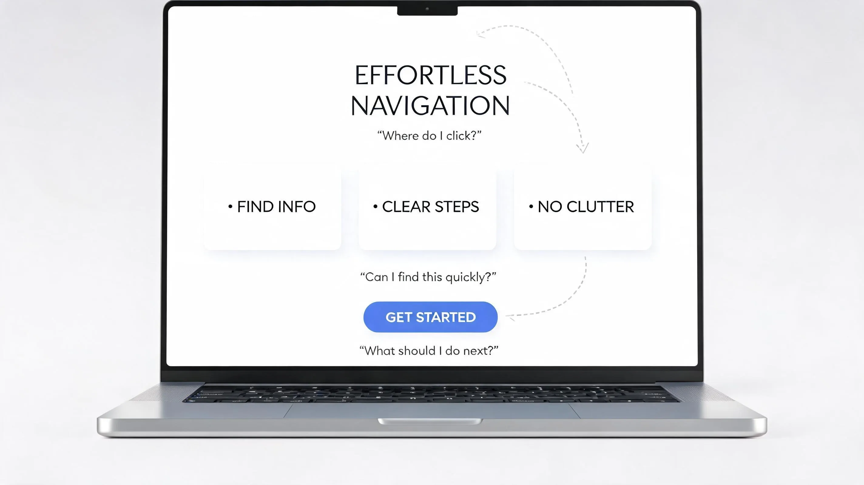
Creativity should never come at the expense of findability. Hiding key pages inside non-standard navigation menus or behind unconventional hamburger icons on desktop viewports creates immense user friction.
Avoid these critical website navigation mistakes:
- Cryptic Menu Labels: Replacing standard terms like "Services" or "Pricing" with vague creative terms like "Our World" or "Possibilities."
- Nested Menus: Burying essential contact details three levels deep inside sub-menus.
- Non-Clickable Elements: Designing items that look like interactive buttons but turn out to be static text blocks.
Stick to familiar, intuitive patterns. Proper intuitive menu design ensures visitors find critical answers within seconds.
Using Too Many Choices, Buttons, and Directions
Presenting a visitor with six competing actions on a single screen ("Book a Call," "Download Whitepaper," "Watch Video," "View Pricing," "Chat Now," "Read Blog") drastically reduces the likelihood that they will take any action at all.
This is one of the most damaging website CTA mistakes.
Every page on your site should feature one primary action. Secondary options should be visually subdued as ghost buttons or text links so they never compete with your primary goal. Implementing strict button hierarchy solves this issue instantly.

Using Generic Content Where Specific Proof Would Be Stronger
Vague promises like "We provide world-class service" or "Industry-leading quality" do nothing to build credibility. Modern web visitors filter out generic marketing fluff instantly.
Correct these website content mistakes by swapping empty claims for concrete proof points:
| Weak Corporate Claim | Strong Proof-Driven Copy |
|---|---|
| "We deliver fast results for clients." | "We reduced average onboarding time from 14 days to 48 hours for over 200 enterprises." |
| "Trusted by businesses everywhere." | "Featured in TechCrunch and trusted by 15,000+ active daily users." |
| "High-quality custom manufacturing." | "ISO 9001 certified with a 99.8% defect-free delivery record." |
Transforming copy from generic claims to verifiable facts eliminates unprofessional website red flags and establishes undeniable trust with your visitors.

Making the Website Look Polished but Feel Difficult to Use
A site can win visual design awards and still completely fail as a business asset. Unresponsive scroll effects, slow background videos, low-contrast text that is impossible to read, and floating widgets that obscure main copy are all major website usability mistakes.
Aesthetics must always serve function:
- Text Contrast: Ensure high contrast between body text and backgrounds to prevent eye strain.
- Interactive Speed: Avoid heavy animations that lag screen scrolling or freeze mobile viewports.
- Click Targets: Ensure buttons and links are large enough to be effortlessly tapped without misclicks.
Polishing your website UX mistakes creates an effortless experience that keeps visitors engaged. Follow core usability principles to perfect this balance.
Treating Mobile as a Smaller Version of Desktop
Over 60% of web traffic originates on mobile devices. Simply taking a wide desktop layout and shrinking it down to fit a mobile screen is a recipe for disaster.
Top Responsive Web Design Mistakes to Avoid:
- Tiny Touch Targets: Buttons placed too close together, making accurate tapping impossible.
- Uncropped Images: Wide landscape banners that turn into tiny, unreadable horizontal strips on portrait displays.
- Interstitials & Pop-ups: Modals that block the entire mobile screen with hard-to-find close icons.
Fixing these mobile menu interactions guarantees a frictionless experience across every device.

Forgetting the Small Details That Make a Website Feel Unfinished
Micro-details carry massive weight. Broken links, misaligned text blocks, missing meta descriptions, low-resolution blurred imagery, and outdated copyright footers subtly signal neglect.
Run through a strict website design checklist before launching:
- Check every external link and contact form button for functionality.
- Audit visual alignment across multiple browser windows (Chrome, Safari, Firefox, Edge).
- Verify that all image assets render sharp on retina displays.
- Ensure customized 404 error pages redirect users back to high-value pages.
Eliminating subtle website errors converts an amateur site into a polished, high-performing corporate asset. Run through a comprehensive pre-launch technical audit to catch these details.
Launching Without Watching What Real Visitors Do
Designing a site based entirely on internal assumptions is a costly mistake. You are not your user, and what feels obvious to your internal team might be deeply confusing to a first-time prospect.
Iterate using real behavior metrics:
- Session Recordings: Watch anonymous screen recordings to locate exact drop-off points and menu confusion.
- Click Heatmaps: Identify which layout elements draw interest and which sections are ignored completely.
- A/B Testing: Benchmark headline variations and CTA placements to systematically improve conversions over time.
Continuous feedback eliminates subjective guesswork from your ongoing strategic site redesign process.

Fix the Website Problems That Matter Most—Without Rebuilding Everything
You don't need to burn your digital presence to the ground or spend tens of thousands of dollars on agency fees to fix critical design flaws.
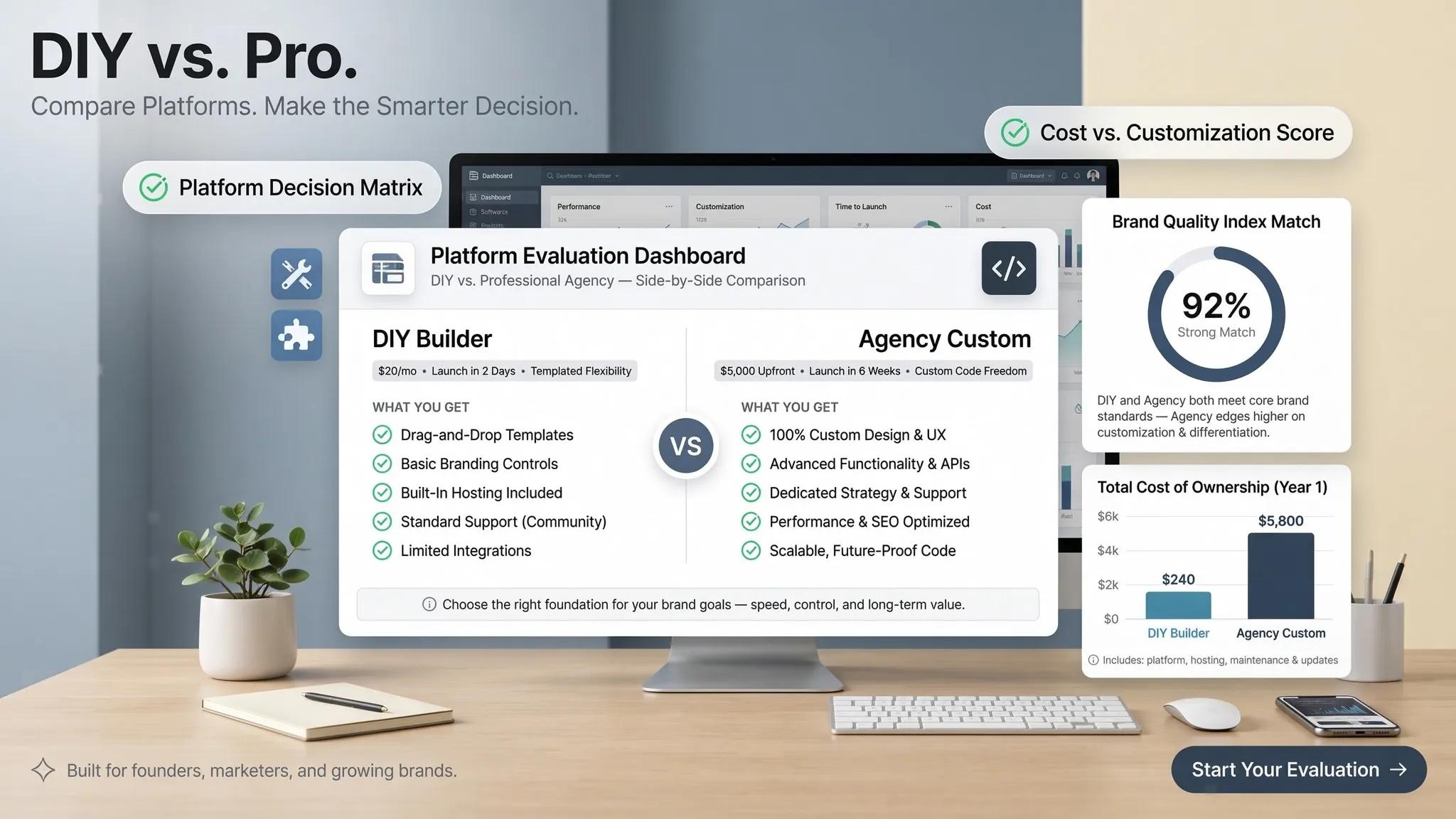
If your current site suffers from slow load times, broken mobile viewports, unoptimized SEO metadata, or awkward layouts, migrating to a modern, unified platform like BoltWeb offers a seamless solution.
As an all-in-one AI website builder, BoltWeb eliminates technical debt while putting 20+ specialized AI tools directly at your fingertips.
Whether you need an intuitive small business website builder, a robust corporate digital presence, or a versatile website builder that simplifies design iterations, BoltWeb gives you all the tools needed to eliminate costly web design mistakes and scale your business effortlessly.
Stop letting bad design sabotage your growth. Switch to BoltWeb today and turn your site into your most reliable customer acquisition engine.

Frequently Asked Questions: Common Website Design Mistakes
What is the single biggest mistake small businesses make on their homepage?
The most critical mistake is failing to state clearly what the business does within the first three seconds of a visit. Many homepages feature vague, corporate headlines like "Empowering Next-Generation Synergy" instead of direct, value-driven statements. If a first-time visitor cannot immediately identify your service, your target audience, and the next step to take above the fold, they will leave. Understanding visitor drop-offs helps correct this.
Why does my website look cluttered even though I included all necessary information?
A cluttered feel happens when everything on the page competes for equal visual attention. When headlines, banners, pop-ups, multiple CTA buttons, and dense paragraphs share the same scale and contrast, the brain experiences cognitive overload. Establishing a clear visual hierarchy—using varying font sizes, high-contrast primary buttons, and generous whitespace—organizes the page so the eye naturally knows where to look first.
How many call-to-action (CTA) buttons should I put on a single page?
Every page should focus on one primary call to action (e.g., "Book a Free Consultation" or "Start Free Trial"). Offering five or six competing actions ("Call Us," "Download PDF," "Subscribe," "View Gallery," "Chat Now") triggers choice paralysis, making visitors hesitate and exit without taking any action. Secondary options should be visually subdued as text links or outlined ghost buttons.
Is it really that bad to use generic stock photos on my website?
Yes. Modern web visitors filter out staged stock photos—such as models shaking hands in pristine conference rooms or generic laptops next to coffee cups—almost instantly. Overly polished or unnatural visuals trigger skepticism because they feel artificial. Authentic, real photos of your team, physical location, completed work, or actual product interface build far more trust and credibility than generic stock assets.
Why shouldn't I use creative or custom labels for my website menu?
Clever navigation labels (like calling your Pricing page "Possibilities" or your About page "Our Journey") confuse visitors who are looking for quick answers. According to Jakob's Law, people expect websites to operate like all the other sites they use daily. Stick to familiar, predictable labels like Services, Pricing, About, and Contact so users don't have to guess where information is buried. Choosing clear messaging applies directly to your navigation structure.
How does a slow-loading website harm my business beyond losing visitors?
Slow page speeds directly destroy search engine rankings and paid advertising ROI. Google uses page load speed and Core Web Vitals as key ranking signals; slow sites are penalized in search results. Furthermore, if you run paid ad campaigns, high load times cause users to bounce before the tracking tag even fires, wasting your ad budget on clicks that never see your landing page. Analyzing page performance is crucial to stop this leak.
What are the most common mobile web design mistakes to watch out for?
The biggest mobile mistake is treating a mobile display as just a shrunk-down desktop screen. Common issues include: Tiny touch targets (buttons and links placed too close together to tap accurately). Wide landscape banners that turn into tiny, unreadable strips on portrait screens. Full-screen pop-ups or chat widgets that block the mobile screen with hard-to-find close icons.
Why are dark mode designs or low-contrast text blocks considered design errors?
When text contrast is too low (such as light gray text on a white background or dark blue text on black), reading requires physical eye strain. When content is difficult to scan, visitors stop reading. Adhering to WCAG contrast ratios (at least 4.5:1 for body text) ensures your content remains readable across different lighting conditions, screens, and vision abilities.
What are micro-details, and why do they make a website look amateur?
Micro-details are subtle technical and visual touchpoints that reflect the site's overall polish. Common micro-mistakes include broken links, misaligned text margins, low-resolution blurred imagery, missing meta descriptions, and outdated copyright years in the footer. While individual micro-errors seem minor, together they signal neglect, making an established business look unprofessional. Avoiding amateur design flaws requires attention to these tiny details.
How can generic marketing copy hurt my website's conversion rate?
Vague, empty claims like "We deliver world-class quality" or "Industry-leading solutions" do nothing to build trust because any business can say them. High-converting websites replace generic promises with concrete proof: specific metrics, verified client reviews, ISO certifications, case studies, and clear before-and-after transformations that demonstrate actual performance.
How do I know if my website's user experience is working without guessing?
Eliminate guesswork by using behavioral analytics and usability testing tools: Session Recordings: Watch anonymous recordings of real users navigating your pages to locate friction points. Heatmaps: See visually where visitors click, hover, and stop scrolling. Usability Tests: Ask 3 to 5 people unfamiliar with your site to complete a specific task (e.g., "Find our pricing and book a call") while observing where they hesitate.
Do I need to spend thousands of dollars on a custom agency redesign to fix these mistakes?
No. You don't need a multi-month engineering project or expensive custom coding to eliminate common design errors. Using modern platforms like BoltWeb, you can build or migrate to a fully optimized, high-speed website effortlessly. As an all-in-one AI website builder, BoltWeb automatically handles mobile scaling, visual hierarchy, image optimization, and technical SEO structure out of the box so your business looks professional and converts traffic smoothly. It's the ideal platform engineered for growth.