When a visitor scrolls all the way to the bottom of your website, they haven't given up. They are looking for answers.
Yet, most business owners treat their footer as an afterthought—a digital graveyard for copyright notices and random links. That's a massive missed opportunity.
Your footer is your website's safety net and final conversion checkpoint. When someone reaches the bottom of your page, they've consumed your content and are making a decision: Should I take action, dig deeper, or leave?
If your footer provides a dead end or a wall of chaotic links, visitors bounce. But if you design a well-structured, high-converting footer, you capture high-intent leads who are ready to engage.
Here is your master guide to designing a website footer that keeps visitors moving forward instead of clicking away.
Treat the Bottom of Your Website Like a Final Checkpoint
The bottom of your page isn't just where your content stops. It's an active decision point.
When users scroll through your site, they build up questions that your main content might not have explicitly answered: Where are they located? How do I get support? Are they legitimate?
Effective website footer design isolates this area as a dedicated orientation hub. It gives users immediate access to crucial structural links, helping them navigate without forcing them to scroll back up to the top.
Bottom Line: If your header is the map that starts the journey, your footer is the safety net that catches anyone who reaches the end without converting.
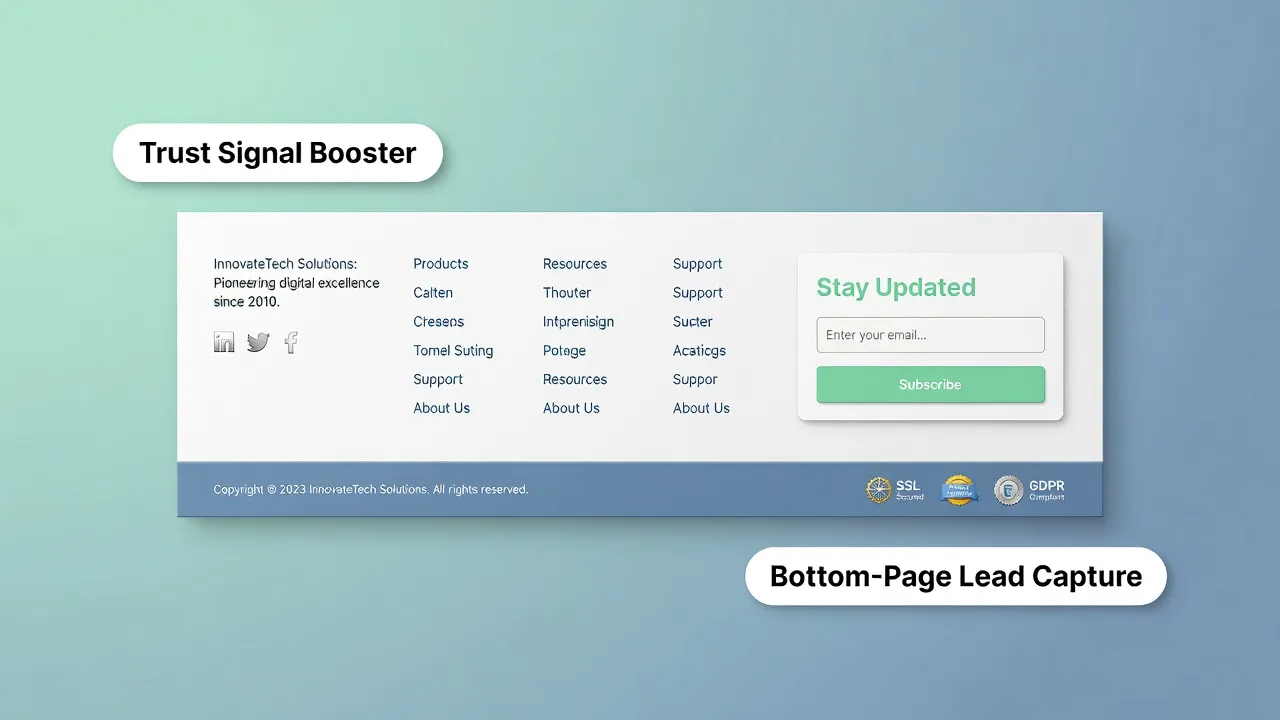
Turn the Footer Into Your Website's Safety Net
Your website footer layout must provide clear resolution paths depending on what they need next:
- For Buyers: A primary footer CTA (e.g., "Book a Free Demo" or "Start Trial").
- For Researchers: A organized list of footer navigation links to dive into case studies or product specs.
- For Skeptics: Trust signals like address details, certification badges, and legal policies.
By providing clear paths at the bottom, you improve website user experience and capture visitors who would otherwise exit.
Decide What Deserves a Place Before Adding Links
Cramming 60 random links into your footer doesn't make your site helpful—it makes it unreadable.
An overcrowded list of website footer links creates visual noise, making it harder for visitors to find what they actually want.
| Link Type | Include in Footer? | Reason |
|---|---|---|
| Privacy Policy & Terms | Yes | Required for compliance and legal trust. |
| Core Product Categories | Yes | Helps visitors jump directly to high-intent pages. |
| Contact Info & Location | Yes | Establishes local business legitimacy. |
| Every Single Blog Post | No | Creates severe visual clutter; link to a main Blog page instead. |
| Internal Admin Links | No | Hurting visual hierarchy; keep off public pages. |
Curating your footer links keeps your site clean, scannable, and efficient.
Build a Small Map of the Website, Not a Wall of Links
If you have a larger website, group your links into distinct visual columns rather than listing them randomly.
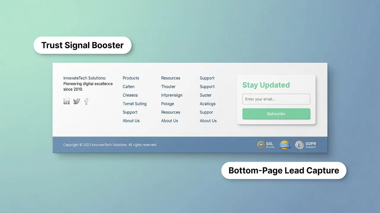
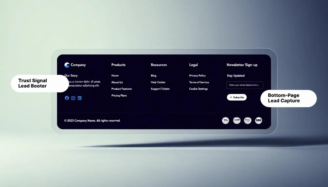
Organizing your footer navigation into clear, labeled categories . Visitors scan column headers (Products, Resources, Company) to locate relevant destinations in milliseconds.
Give Visitors a Reason to Keep Going
Reaching the bottom of a page shouldn't mean reaching a dead end. Your footer should act as an accelerator for your main business goals.
Include a focused conversion element inside your footer design:
- Newsletter Signup: Offer a high-value lead magnet in exchange for an email address.
- Direct Contact CTA: Add a primary button for booking a call or requesting a quote.
- Secondary Navigation: Direct users toward popular or featured articles to keep them browsing.
Integrating a clear call to action into your website footer best practices creates a continuous journey that keeps engagement high.

Answer the Questions Your Main Menu Can't
Your header navigation needs to stay lean and focused on primary revenue drivers. Your footer, however, is the ideal home for secondary operational details.
Use your footer menu to surface:
- Help & Support: FAQ links, knowledge base, system status updates, and ticketing portals.
- Compliance Details: Privacy Policy, Terms and Conditions, Cookie Settings, and Accessibility Statements.
- Company Background: Investor relations, media press kits, and active career openings.
This strategy keeps your main menu clean while giving analytical visitors access to detailed footer content.
Make Your Business Feel Real at the Very Bottom
An anonymous website raises red flags. Including verified business identity details in your business website footer builds immediate credibility.
Essential trust elements to include:
- Physical Address: Shows your business is real and established.
- Direct Contact Info: Phone numbers and support email addresses.
- Trust Badges: SSL security seals, industry accreditation badges, or awards.
- Social Media Links: Active social profiles demonstrate that your company is active and responsive.
Providing transparent footer contact information reassures hesitant visitors and increases site conversions.
Let the Footer Carry the Details Without Stealing the Page
A great footer carries significant utility without distracting from the main page body. Achieving this balance comes down to thoughtful visual design.
- Background Contrast: Use a slightly darker or distinct background color to separate the footer from the main content area.
- Font Sizing: Keep footer link typography smaller (13px–15px) than main body text to establish clear hierarchy.
- Subtle Colors: Use neutral tones for links and reserved accent colors strictly for key CTAs and primary headings.
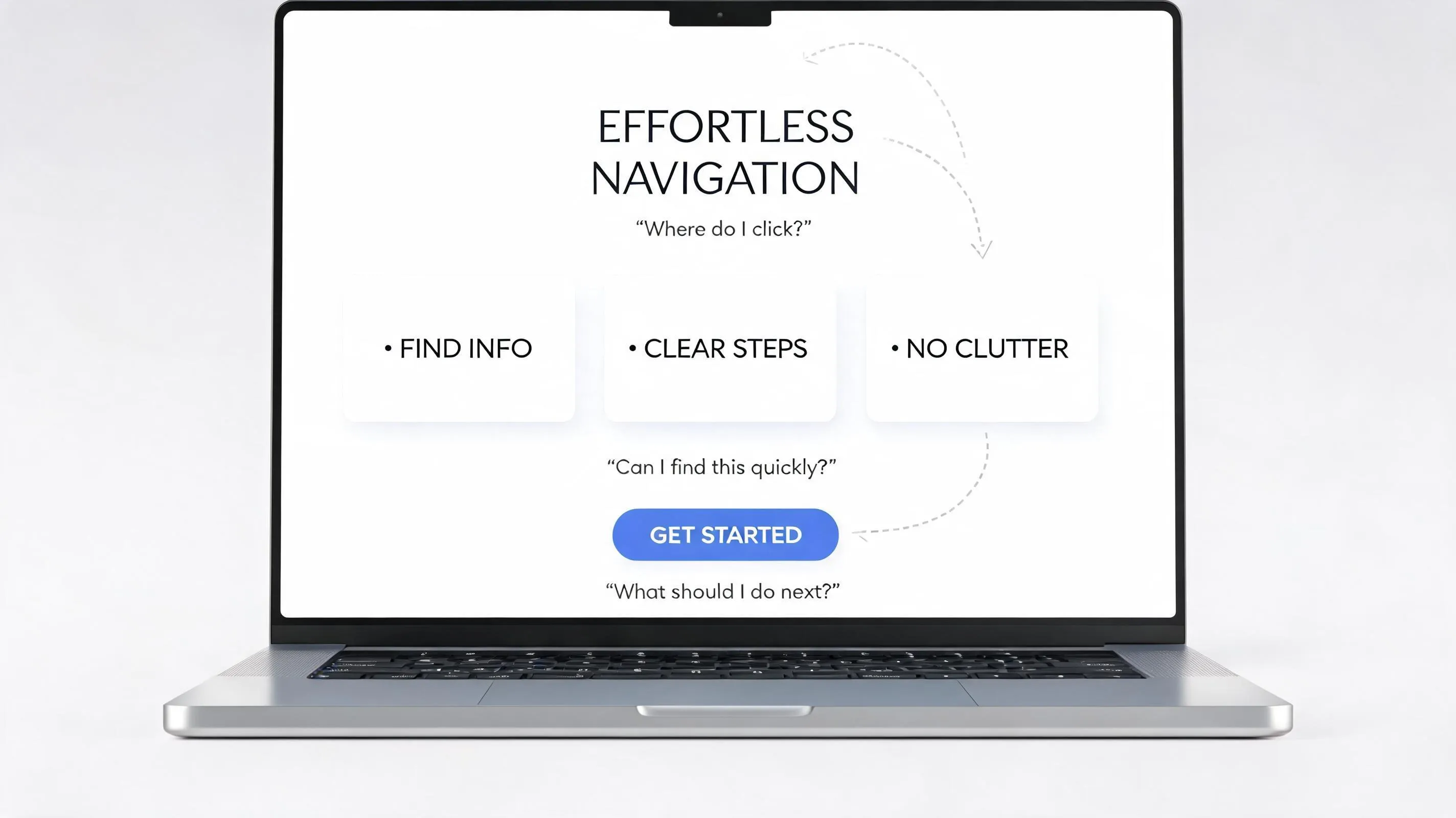
Design the Footer Around the Way People Actually Scan
Eye-tracking studies reveal that users scan digital pages in horizontal movements starting from the top-left—the classic F-pattern.
When building your footer UX:
- Place your logo and brief company mission statement in the top-left column.
- Arrange navigation categories across middle columns with bold headers.
- Position newsletter forms or primary action buttons on the far right or top of the footer block.
Aligning your footer layout with natural eye movements makes scanning effortless. This is a core component of making a website easy to use.
Don't Let Mobile Turn Your Footer Into a Scroll Marathon
On desktop, a 4-column footer looks organized. On mobile screens, those same 4 columns stack vertically into an endless wall of text that takes seconds of scrolling to pass.
Optimizing your mobile footer:
- Accordion Menus: Collapse link categories into expandable accordion tabs on small screens so users can tap to view sub-links.
- Adequate Touch Padding: Ensure links have enough vertical spacing (minimum 44px tap area) to prevent misclicks.
- Simplified Footer Content: Hide non-essential links on mobile views to keep the experience fast and responsive.
Applying these responsive web design techniques ensures your footer works smoothly across all device sizes.
Catch the Details That Break Trust Before Publishing
Small administrative oversights in your footer can quietly ruin user trust and hurt search rankings. Run through this quick audit before launching your site:
- Copyright Year: Ensure your copyright date updates dynamically or reflects the current year. Outdated dates signal an abandoned website.
- Broken Links: Test every link to confirm it routes to the correct live page.
- Legal Compliance: Verify that your Privacy Policy and Cookie Consent links are active to meet GDPR/CCPA requirements.
- Social Links: Confirm that social media icons open your official profiles in a new tab.
Fixing these small errors protects your brand reputation and supports long-term SEO health. Run through a full website launch checklist to catch everything.

Create an Impactful Footer in Minutes—Without Coding
Here’s the reality: designing a custom, high-converting footer from scratch is tough. If you don't know the exact structure, column spacing, and responsive breakpoints for your specific industry, you end up with a basic, boring footer that fails to convert visitors. That's why so many websites lose potential customers right at the bottom of the page.
Every successful brand puts as much care into their footer as they do into their hero section. They know an impactful footer drives deeper engagement, showcases key pages, and builds instant credibility.
That’s where BoltWeb changes the game. With BoltWeb, you don't have to guess what layout works best. Utilizing its groundbreaking Foundry AI engine, BoltWeb lets you generate custom, conversion-optimized footers with a single click.
- Open the BoltWeb Website Builder
- Select the Footer Section
- Open Foundry AI and enter your idea
- Generate 3 unique, high-converting footer styles instantly
Whether you are looking for a feature-rich business website builder or a flexible small business website builder, BoltWeb gives you access to an intelligent AI website builder that builds tailored header, body, and footer layouts for your exact niche.
Stop letting visitors bounce at the bottom of your pages. Switch to BoltWeb and launch an impactful, responsive website today.

Frequently Asked Questions: Website Footer Design Best Practices
How many links should I actually include in my website footer?"
While your footer can hold more links than your main menu, cramming 50+ random links creates choice ,Audit your footer links rigorously: keep core product categories, support options, legal links, and company background, but cut deep individual blog posts or internal admin links. Aim for 15 to 25 total curated links grouped logically into distinct vertical columns so users can scan options instantly.
What are the essential legal and compliance links required in a website footer?
To comply with global data regulations (GDPR, CCPA) and maintain search engine trust, every modern business website footer must contain: Privacy Policy (detailing data collection and usage), Terms of Service / Terms & Conditions, Cookie Preferences / Do Not Sell My Info link, and an Accessibility Statement. Omitting these basic compliance links signals an untrustworthy or abandoned website to both human visitors and search engine crawlers.
Should I include a call to action (CTA) or email signup form in the footer?
Yes. Reaching the bottom of a page is a prime decision point. If a visitor hasn't converted via your main body content, a secondary footer CTA or newsletter opt-in acts as a net to capture lingering interest. Offer a clear value proposition—such as a lead magnet, discount code, or direct consultation button—rather than a generic "Subscribe to our newsletter" box. This helps maximize website conversions.
How should I structure footer navigation for large websites with dozens of pages?
For complex or content-heavy websites, organize footer links using a multi-column visual matrix. Group related links under bold, descriptive column headers (e.g., Products, Solutions, Company, Resources). This visual arrangement relies on the Boltweb Principle of proximity, letting users scan category headers in milliseconds instead of wading through an unstructured wall of text.
How do I optimize my website footer for mobile screens without creating an endless scroll?
A 4-column footer layout that looks clean on a desktop monitor will stack into a massive, tedious list on a mobile screen. To fix this, convert multi-column footer link groups into expandable accordion menus on mobile viewports. This keeps the mobile layout compact, reduces vertical scrolling friction, and ensures all links feature a minimum touch target of 44x44 pixels for easy tapping.
Should social media icons go in the website header or the footer?
Placing prominent social media icons in your website header invites visitors to leave your site before they ever read your value proposition. Position your social media links near the bottom of your footer instead. This rewards interested researchers with your social profiles after they have consumed your primary content, opening social links in a new tab so your site stays active in their browser.
How does my website footer impact search engine optimization (SEO)?
Your footer provides a persistent internal linking structure across every page on your domain. Including core service, category, and regional landing pages in your footer helps search engines crawl deep site architecture and understand topical relationships. However, avoid "keyword stuffing" or dumping hundreds of exact-match location links into the footer, as search engines filter out unnatural, sitewide link spam.
What visual design guidelines keep a footer readable and separate from main content?
To prevent your footer from blending confusingly into page copy, use a contrasting background color—typically a neutral dark or distinct muted tone—to signal the end of the main content area. Keep footer text slightly smaller (13px–15px) than body text, maintain high contrast ratios for readability, and use subtle accent colors strictly for primary headings and button actions.
Why is an outdated copyright year in the footer harmful to my business?
An outdated copyright year (e.g., displaying a past year) gives visitors the immediate impression that your business is inactive, unmonitored, or out of business. It damages instant credibility and increases bounce rates among cautious buyers. Implement dynamic code script in your header/footer template to update the copyright year automatically every January 1st.
What local business details should be placed in a footer for local SEO and trust?
To maximize local search visibility and build consumer confidence, include your full NAP data (Name, Physical Address, and Phone Number) in the footer. Matching this information exactly with your Google Business Profile signals legitimacy to search algorithms and gives local shoppers immediate contact access regardless of which page they land on. Avoid common website design mistakes by ensuring this data is legible and consistent.