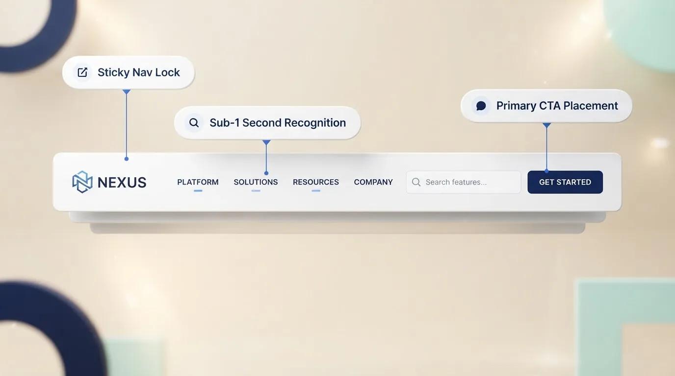
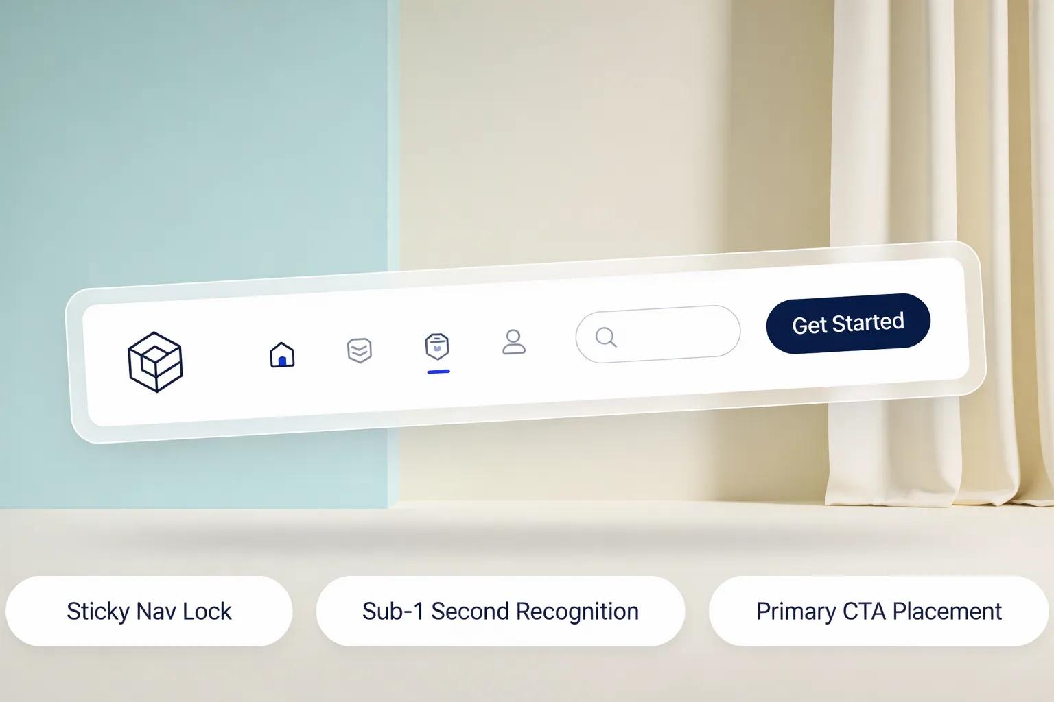
Your header isn't a decorative banner. It’s the traffic controller of your entire website.
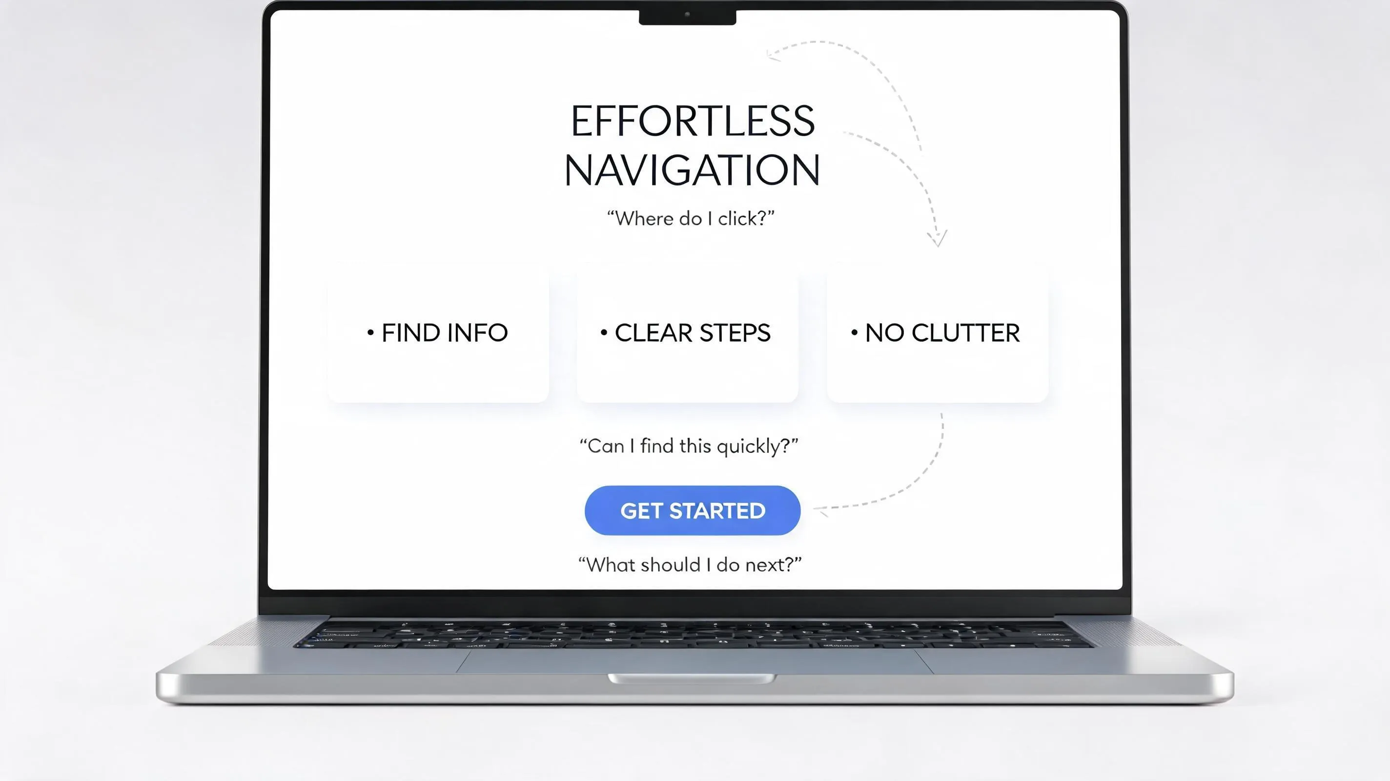
Within three seconds of landing on your page, visitors look to the top of the screen to answer three subconscious questions: Where am I? What can I do here? Where should I go next?
If your header fails to answer those questions immediately, users don't browse deeper—they bounce. Creating a high-converting header used to require hours of UX research, competitor analysis, and manual coding. Today, understanding the underlying psychology of user intent allows you to craft navigation that feels effortless.
Here is the definitive guide to designing a website header that guides visitors exactly where they need to go.

Establish Immediate Orientation Before Anything Else
When a new user lands on your site, their eyes naturally scan the top area first. This initial scan needs to establish your business identity and primary value proposition instantly.
If your header is cluttered with dozens of links, obscure icons, or vague slogans, the visual noise overwhelms the visitor. Effective website header design relies on clear figure-ground segregation: separating your identity and core navigation from the background so the user's brain processes the orientation points without mental fatigue.
Key Takeaway: Treat your header as a compass, not a billboard. Keep the background clean and contrast high so identity and action stand out instantly.
Answer What Visitors Need to Know Before They Click
When visitors land on your page, they immediately start looking for an answer: “Is this company right for me?” If the page creates a clear question but delays the answer, curiosity gives them a reason to keep reading. Each section should resolve one question while naturally leading to the next.
Your header must partially close this loop right away by establishing:
- Who you are (Brand Logo)
- What core offerings exist (Primary website navigation)
- How to take the next step (Primary header CTA)
When these three elements are present, the user feels anchored and confident enough to explore the rest of your site.
Give Your Brand a Clear Place to Be Seen
A common mistake in website branding is making the logo enormous under the belief that bigger equals better. In reality, an oversized logo eats up valuable vertical screen real estate above the fold and pushes key content out of view.
- Position: Place your website logo in the top-left corner (for left-to-right languages) or dead center.
- Proportion: Your logo should be clearly legible but proportional—typically 35px to 50px in height for desktop headers.
- Functionality: Always link your header logo back to your homepage. Users expect this universal pattern
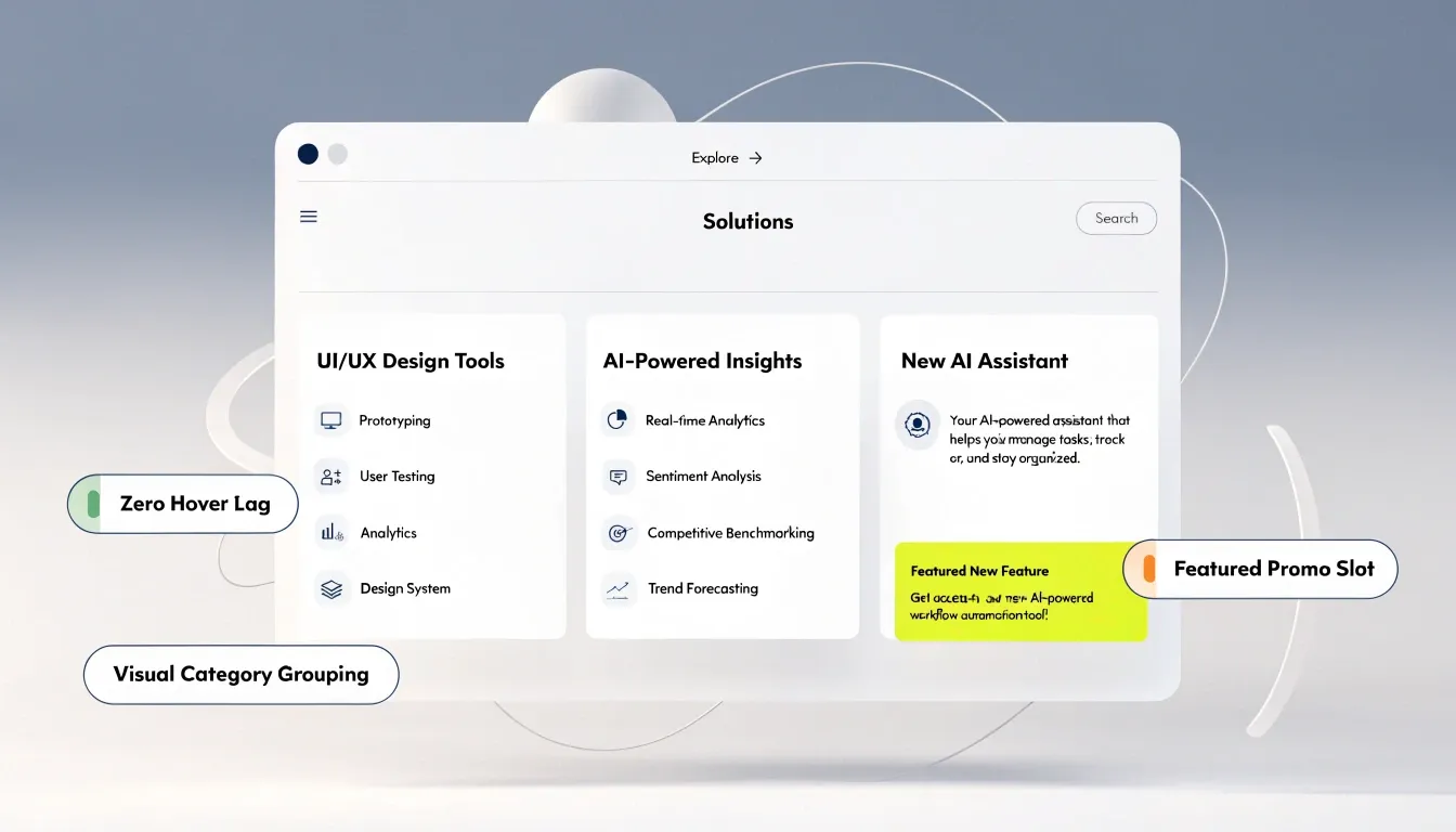
Choose the Few Destinations That Matter Most
When visitors land on your page, they immediately want to know: “Is this company right for me?” Create a clear question, then give them a reason to keep reading before revealing the answer. Each section should satisfy one question while naturally opening the next, creating a smooth path that keeps visitors engaged.
| Page Type | Belong in Header? | Alternative Location |
|---|---|---|
| Core Offerings / Services | Yes (Top Priority) | Main Navigation |
| Pricing | Yes (High Buying Intent) | Main Navigation |
| Primary Resource / Portfolio | Yes | Main Navigation |
| Terms, Privacy, Legal | No | Footer Menu Only |
| Social Media Icons | No | Footer Menu Only |
| Careers / Press | No | About Dropdown or Footer |
Keep your primary header navigation limited to 4 to 6 essential links.
Arrange Your Navigation So the Important Things Get Seen First
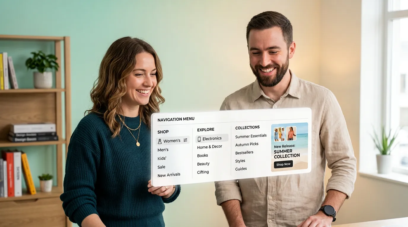
Human memory naturally retains the first and last items in a list better than those in the middle. When structuring your navigation menu design:
A well-structured website header naturally directs attention toward the elements that matter most. Place your most important navigation options where visitors are most likely to notice and remember them, making key actions easier to find without overwhelming the layout.
Make Every Menu Label Instantly Understandable
Cleverness can get in the way of conversions. Calling your services page “Our Craft” or your blog “Musings” makes visitors stop and figure out what you mean. Use familiar labels such as “Services” and “Blog” so people can understand your navigation instantly and move through your website without unnecessary friction.
| Vague / Clever Label | Clear / Functional Label | Why It Works |
|---|---|---|
| Our Craft | Services | Eliminates ambiguity instantly. |
| Investment | Pricing | Matches exact user search queries. |
| Knowledge Hub | Blog / Resources | Sets accurate expectations. |
| Reach Out | Contact Us | Direct, actionable, and familiar. |
Using clear navigation labels reduces cognitive load, allowing visitors to predict exactly where each click will take them.
Give the Header One Job It Should Do Better Than Anything Else
A header CTA should stand out as the single most important action on the page. Including competing buttons (e.g., "Sign Up", "Log In", "Call Now", "Book Demo") dilutes focus and creates visual clutter.
- Primary Action: Style your main goal (e.g., "Get Started" or "Book a Call") as a high-contrast, filled header button.
- Secondary Action: Style secondary goals (e.g., "Log In") as plain text links or subtle outline buttons.
Use Space to Make the Header Feel Easier Than It Really Is
Visual clutter is rarely caused by having too much text—it is caused by inadequate whitespace and poor alignment.
- Vertical Padding: Ensure equal breathing room above and below your logo and menu items.
- Horizontal Spacing: Maintain consistent gaps between navigation items so they read as distinct choices rather than a run-on sentence.
- Grouping: Place your brand logo on the left, primary navigation links in the center (or left-aligned adjacent to the logo), and action buttons strictly on the right.
Let the Header Support the Page Instead of Covering It Up
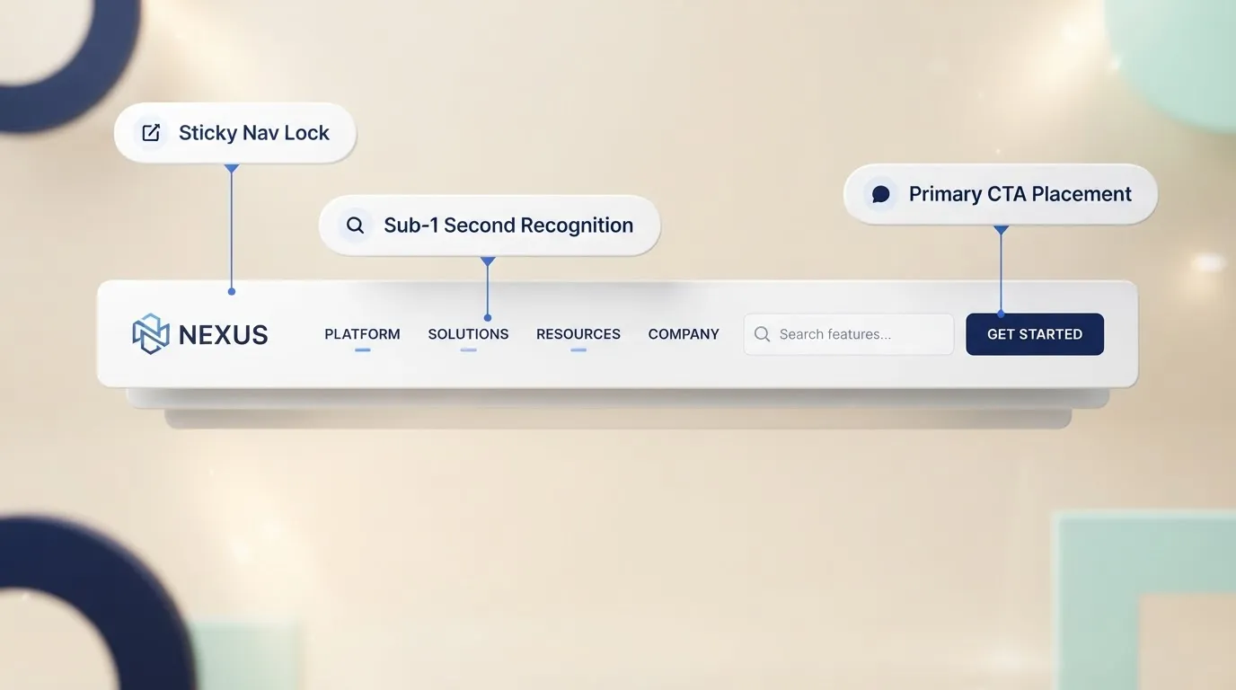
On desktop screens, a header should rarely exceed 70px to 90px in height. If your header consumes 200px of vertical space, it steals attention from your main hero section and forces key value propositions below the fold. If you choose to use a sticky header (a header that remains fixed at the top of the viewport as the user scrolls), consider using a shrink-on-scroll effect:
- Initial State: 80px height with full padding.
- Scrolled State: Condenses to 50px–60px with a subtle background shadow to separate it from page content.

Rebuild the Header for the Smallest Screen First
Over 55% of global web traffic originates from mobile devices. Attempting to squeeze 6 navigation items and a CTA across a 375px smartphone screen leads to broken layouts and unclickable buttons.
For mobile navigation:
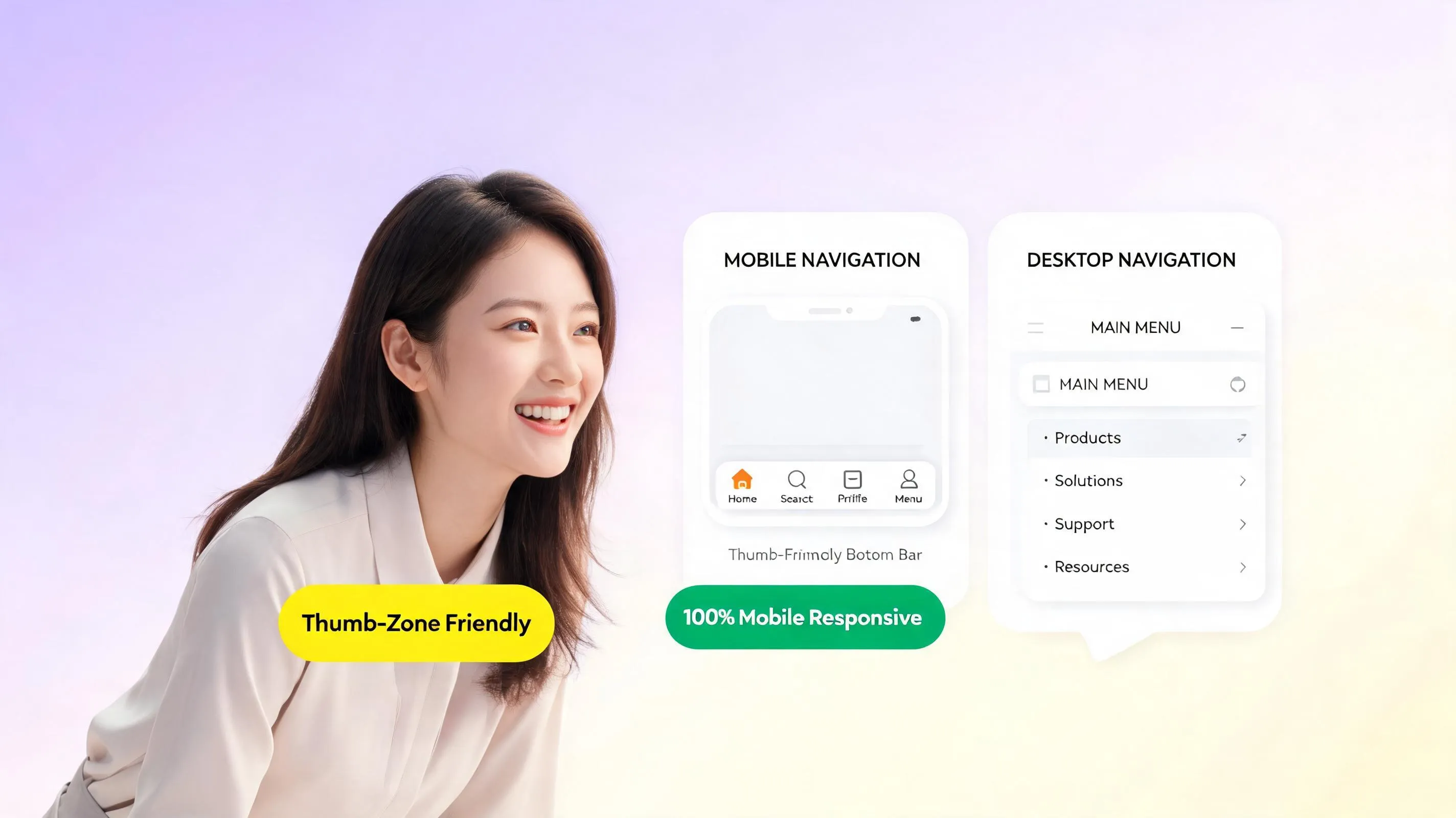
- Mobile Header Bar: Keep it compact (50px to 60px height) featuring only your logo, a prominent primary CTA button, and a hamburger menu icon (☰).
- Progressive Disclosure: Hide secondary navigation links inside the drawer menu. Only reveal deeper pages when the user explicitly taps the menu icon.
- Touch Targets: Ensure all mobile menu links and buttons have a minimum tap target of 44x44 pixels to prevent accidental clicks.
Make the Header Feel Familiar on Every Page
Inconsistent navigation breaks user trust. If your header changes colors, jumps positions, or alters its link structure as visitors navigate between pages, it creates disorientation. Maintain absolute website header consistency:
- Keep logo placement, menu order, and CTA styling identical across all subpages.
- Use breadcrumb navigation on deep subpages or blog posts to help users track their location within your site hierarchy.
Test Your Header With Someone Who Has Never Seen Your Website
You cannot evaluate your own header objectively because you already know where every link leads. To discover where real users get confused, run a simple 5-Second Test:
- Show your header design to someone unfamiliar with your business for exactly 5 seconds.
- Hide the image and ask them:
- What does this business do?
- What action were you expected to take next?
- Where would you click to find pricing?
If they hesitate or answer incorrectly, your layout requires simplification. This helps uncover common website design mistakes before they impact your revenue.
Skip the Manual UX Research: Building Perfect Headers in Minutes
Here's the truth: doing deep audience research, mapping search intent, testing mobile breakpoints, and tweaking CSS spacing manually is frustrating and time-consuming. You shouldn't have to spend days fighting with complex site code or rigid templates just to get your site structure right.
That’s why thousands of business owners and creators are moving to BoltWeb. Instead of forcing you to figure out navigation layouts from scratch, BoltWeb handles the heavy lifting automatically. Powered by an advanced AI website builder, BoltWeb analyzes your specific industry, researches visitor intent, and crafts perfectly structured headers, mobile menus, and page hierarchies out of the box.
Whether you need a full business site or a specialized campaign layout, BoltWeb delivers a top-notch, responsive, and high-converting website in minutes—no design experience required.

Frequently Asked Questions: Website Header Design Best Practices
What is the primary purpose of a website header?
Your website header is the first thing visitors see when landing on your site. Its core purpose is not decorative—it serves as an immediate orientation terminal. Within 3 seconds, a high-converting header answers three subconscious questions for the visitor: Where am I?, What can I do here?, and Where should I click next? Designing a header around these instant user demands anchors attention and prevents immediate bounces.
What essential elements must every website header include?
To provide a seamless user experience, a modern business website header should contain four primary structural elements:
- Brand Identity: A prominent logo placed on the top-left or center that links directly back to the homepage.
- Primary Navigation Menu: 4 to 6 clear, intent-driven category links.
- Primary Call to Action (CTA): A high-contrast button positioned on the far-right corner.
- Utility Controls: High-value utility links like search bars, shopping carts, or account logins.
Where should my company logo be placed in the header, and where should it link?
Always place your logo in the top-left corner (or dead center for minimalist luxury brands) and ensure it links directly back to your homepage from every subpage on your site. Visitors have been conditioned across millions of websites to expect this exact placement. Moving your logo to an unexpected location confuses users and disrupts effortless site navigation.
Should I use a sticky (fixed) header or a static header that scrolls away?
A sticky header remains pinned to the top of the viewport as visitors scroll down the page. Studies show that sticky headers make navigation 22% faster for users and keep your primary Call to Action (CTA) button perpetually visible. For content-rich landing pages or e-commerce stores, sticky headers lower cognitive load and maintain conversion momentum as readers evaluate your offer.
How do I make my website header high-converting rather than just pretty?
Visual scanning patterns show that users scan headers in a left-to-right motion, starting at your logo and ending at the far-right edge. Capitalize on this natural visual focal point by placing a single, high-contrast Call to Action button (e.g., "Get Started", "Book a Demo", or "Get a Quote") on the far right. Styling this final option as a bold button rather than plain text creates a compelling visual endpoint that drives direct conversions.
What is a utility bar, and should I add one above my main header?
A utility bar (or top bar) is a thin strip positioned directly above your main navigation header. It is designed to house administrative or trust-building details—such as customer support phone numbers, notification banners, language selectors, location pickers, or client portal logins. Separating these utility elements into a top bar prevents your primary header menu from becoming overcrowded.
How do I design a website header that works flawlessly on mobile devices?
Because mobile screens lack horizontal space, collapse desktop navigation links behind a clean hamburger icon (☰) on mobile viewports. Ensure your mobile header preserves the brand logo, keeps the hamburger toggle easily clickable with a tap target of at least 44x44 pixels, and maintains your primary Call to Action button or phone icon visible for immediate interaction.
How big should a website header be in terms of height and proportions?
On desktop viewports, a standard header height should range between 70px and 100px (or shrink down to 50px–60px when stuck on scroll). A header that is too tall steals precious above-the-fold screen space from your main hero headline, pushing your core value proposition off-screen. Keep the header compact, clean, and proportional to your site's main content area.
How does header design impact search engine optimization (SEO)?
Passing Topical Hierarchy to Search Engines: Search engine crawlers evaluate the internal links inside your header to understand your website's primary site architecture. Including your most important service or product category pages inside the header menu signals high topical relevance and passes internal link equity across your domain. Additionally, using clean HTML <header> and <nav> semantic tags ensures search bots parse your site layout accurately.
Should I use transparent headers over hero images or stick to solid backgrounds?
A transparent header layered over a dark hero image or video can look sleek, but it frequently causes legibility issues if the underlying background graphics vary in contrast. If you use a transparent header on page load, ensure menu text remains high-contrast against all background elements, and automatically transition the header to a solid, opaque background color as soon as the user begins scrolling down the page.
What is the biggest header design mistake that lowers website conversions?
Adding 10+ top-level menu links, multiple phone numbers, social media icons, and competing secondary buttons creates severe decision paralysis. When presented with too many competing focal points, visitors freeze and take no action at all. Prune your top-level links down to 4–6 core categories and direct secondary options into organized dropdowns or the website footer.