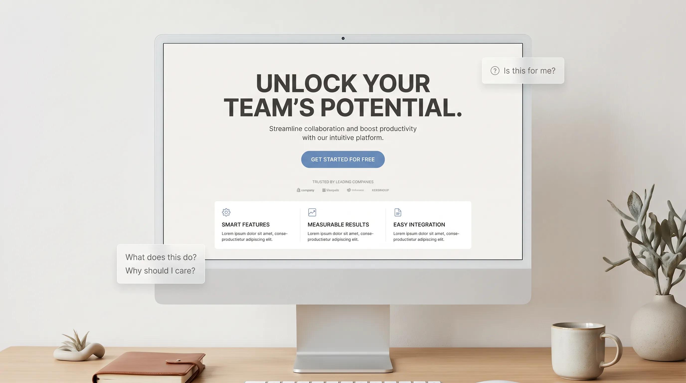
When a prospective customer opens your website, their brain makes a split-second decision: stay or leave.
If they hit a wall of dense text, broken images, or vague corporate slogans, they won't stick around to figure out your business. They will close the tab and move straight to your nearest competitor.
Building an effective homepage isn't about fitting every minor detail onto a single screen. It's about engineering an intuitive visual path that captures attention, addresses real customer needs, and guides readers smoothly toward taking action.

What Makes a Good Homepage? Start With One Simple Goal
A front page doesn't need to close every sale on the spot. Its true objective is much simpler: guide visitors directly to their exact next step with zero hesitation.
HOMEPAGE ATTENTION ARCHITECTURE
│
▼
[ CATCH ATTENTION ]
Immediate Clear Offer
Hero Headline Banner
[ VALUE PROOF ]
Verified Testimonials
Customer Ratings
[ DIRECT THE CLICK ]
High-Contrast Action
Low-Friction Button
To build a good homepage design, strip away non-essential clutter and focus on these three core goals:
- Immediate Orientation: Confirm what you do within three seconds.
- Social Proof: Show that real people trust your service.
- Direct Action: Highlight one primary button to click next.
Focusing your homepage layout around one core direction makes taking the next step clear and straightforward for every visitor.

Your Homepage Should Answer One Question Immediately: "Am I in the Right Place?"
Put yourself in your customer's shoes.
When someone searches for a local service online, they are looking for a fast, reliable solution. If your main top hero banner reads "Synergistic Operational Growth for Tomorrow," you force their brain to work hard just to guess what you sell.
[ VAGUE HEADLINE (WEAK) ]
"Delivering Unmatched Excellence Across the Tristate Region."
──► Confusing, abstract claim
[ DIRECT HEADLINE (STRONG) ]
"Residential Plumbing & Drain Cleaning In Denver. Fixed in 2 Hours."
──► Specific service + clear location
Apply the Jobs-to-Be-Done (JTBD) approach:
- People don't buy abstract brand stories.
- They buy tangible results that solve their immediate problems.
State your primary service, target market, and service area right at the top of your business homepage.
Write a Headline People Understand Without Thinking
Keep your language straightforward and simple.
Your homepage headline must communicate your core value instantly. Use the natural vocabulary your clients use every day—a technique known as Voice of Customer (VoC) messaging.
THE 5-SECOND HERO ARCHITECTURE
[PRIMARY HEADLINE]
Fast Commercial HVAC Repair for Local Factory Owners
[SUPPORTING SUBHEADLINE]
We repair system breakdowns, perform seasonal tune-ups, and keep your facility running with zero operational downtime.
[ CALL-TO-ACTION BUTTON ]
[ Book an On-Site Technician ]
A proven structure for an effective website headline:
Clear Service + Target Audience + Primary Benefit
Weak: "Pioneering Quality Engineering Solutions."
Strong: "Emergency Roof Repair for Austin Homeowners—Arriving in 60 Minutes or Less."
Clear, direct statements perform better than clever or artistic slogans every single time.

Tell Visitors Why They Should Choose You
Once a visitor understands what you sell, they immediately compare your offering to others: "Why should I hire this company instead of the one down the street?"
Answer this clearly with a distinct value proposition. Instead of generic claims like "We care about quality," highlight concrete outcomes using the PAS (Problem-Agitate-Solve) framework:
VALUE TRANSLATION MATRIX
│
▼
[ COMMON HEADACHE ]
"Contractors who don't show up on schedule"
[ AGITATED REALITY ]
Unanswered calls and surprise bills.
[ CONCRETE PROMISE ]
"Guaranteed 24-hour response time with flat-rate estimates."
Presenting clear, observable benefits gives buyers confidence that your business is the right choice.

Show What You Sell Without Making People Search for It
Avoid hiding your core offerings inside complex nested menus. Showcase your primary services directly on the main page canvas using clean, structured content grids.
Using the Gestalt Principle of Common Region, place each distinct offering inside its own visual block:
3-COLUMN SERVICES GRID
[ SERVICE 1 ]
Emergency Repairs
24/7 rapid fixes for urgent issues.
[ SERVICE 2 ]
Preventative Audits
Regular maintenance to stop breakdowns.
[ SERVICE 3 ]
Full Upgrades
Complete system installations.
Organizing your homepage content into structured blocks makes it easy for readers to scan your services without hunting across sub-pages.

Use Images That Help People Understand Your Business
Generic stock photos of corporate handshakes look artificial and erode trust.
[ GENERIC STOCK MEDIA (WEAK) ]
[ Photo of Stock Model ]
──► Feels fake, raises doubt
[ REAL AUTHENTIC MEDIA (STRONG) ]
[ Photo of Local Team ]
──► Builds trust, shows real work
Use high-resolution website images that feature your real operations:
- Trade & Field Services: Feature your actual technicians, branded vehicles, and completed projects.
- Product Brands: Show clear, close-up shots of your product being used in real situations.
- Software Platforms: Display actual interface previews highlighting key workflows.
Authentic visuals validate your claims and reassure visitors about your quality.

Give Visitors a Reason to Trust You
Consider what evidence a hesitant prospect needs to see before making contact.
Placing authentic social proof directly into your page layout resolves doubts early. Using Cognitive Dissonance & Resolution, turn natural customer hesitation into trust.
SOCIAL PROOF LAYERS
│
▼
[ VERIFIED REVIEWS ]
5-Star Google Ratings
[ PROJECT GALLERY ]
Before-and-After Photos
[ CERTIFICATIONS ]
State Licenses & Insurance
Display real customer quotes, verified review badges, and star ratings near your main service highlights to confirm your reputation.

Make the Next Step Impossible to Miss
Every main section should lead toward a single, prominent action trigger.
According to B.J. Fogg’s Behavior Model (B = MAP), driving action requires aligning Motivation, Ability, and a clear Prompt.
[ HIGH-FRICTION BUTTON COPY ]
[ SUBMIT ]
──► Vague, feels like effort
[ LOW-FRICTION ACTION COPY ]
[ GET MY FREE QUOTE ]
──► Clear outcome + zero risk
Make your call to action (CTA) clear and value-focused:
- Instead of "Learn More": Use "View Pricing & Plans"
- Instead of "Contact Us": Use "Schedule Your Free Call"
- Instead of "Submit": Use "Request My Instant Estimate"
Distinct website buttons eliminate ambiguity about what occurs after clicking.

Keep Your Homepage Focused Instead of Stuffing Everything Into It
Attempting to display every single company detail on your main page leads to visual overload. Apply Hick’s Law: The time needed to make a decision grows with the number and complexity of choices.
BALANCED HOMEPAGE STRUCTURE
│
▼
[ MAIN HERO BANNER ]
Primary Service Offer
Direct Action Button
[ TOP SERVICES GRID ]
3 Core Deliverables
Links to Sub-Pages
[ REVIEWS & FOOTER ]
Client Reviews & Rating
Contact Details & Hours
Keep background history, technical whitepapers, and press items on dedicated sub-pages. Maintain a clean effective homepage layout focused on your core services, proof points, and contact options.

Make Your Homepage Work on Phones, Not Just Desktops
A significant portion of overall web traffic comes from mobile devices. If your page text displays poorly or links are hard to tap on smartphones, visitors will leave immediately.
MOBILE HOMEPAGE CHECKLIST
│
▼
[ TAP-FRIENDLY BUTTONS ]
Min 48×48px Touch Targets
[ FAST IMAGE LOADING ]
Compressed WebP Files
[ STICKY CALL BAR ]
One-Tap Mobile Dialing
Building a responsive mobile homepage requires:
- Vertical Layout Stacking: Content blocks stack naturally without requiring horizontal scrolling.
- Large Touch Targets: Buttons and input fields are easy to tap with a thumb.
- Fixed Contact Bar: A click-to-call button remains accessible at the bottom of the screen as users scroll.
A clean mobile setup ensures seamless browsing for every visitor.

Test Your Homepage With These Questions Before You Publish
Run your main page draft through this quick homepage usability checklist:
| Evaluation Criteria | Verification Question | Check |
|---|---|---|
| 5-Second Clarity Test | Can a new visitor read your top banner and explain your service in 5 seconds? | [ ] |
| Visible Action Trigger | Is your main action button clearly visible on the screen without scrolling? | [ ] |
| Visible Proof | Are customer reviews or star ratings featured near your top section? | [ ] |
| Scannable Sections | Is your page text divided into short paragraphs, clear headings, and bullet points? | [ ] |
| Mobile Performance | Do all buttons, navigation items, and forms work smoothly on mobile screens? | [ ] |
If your layout meets these five requirements, your page is ready to perform.

Create a Better Homepage Without Starting From a Blank Screen
Designing a professional homepage doesn't require weeks of manual coding or hiring expensive design agencies.
With BoltWeb, you can launch a conversion-focused homepage in minutes using a simple AI website builder.
BOLTWEB HOMEPAGE ENGINE
│
▼
[ AUTOMATED LAYOUTS ]
Pre-Structured Frames
Drag-and-Drop Editing
[ CONVERSION SECTIONS ]
Hero & Review Blocks
High-Converting Forms
[ NATIVE RESPONSIVENESS ]
Auto-Scaling Views
Fast Page Loading
Why growing brands use BoltWeb's business website builder:
- Automated Site Assembly: Describe your service and audience to generate a structured homepage layout instantly.
- Pre-Formatted Conversion Blocks: Add pre-built hero banners, customer review cards, service blocks, and lead forms.
- Native Mobile Adaptation: Content layout scales across desktop, tablet, and mobile viewports automatically.
- Integrated Hosting & SEO: Clean header structures, meta tag tools, and enterprise cloud hosting come included.
Turn your business homepage into a consistent customer acquisition tool.
Build a clean, responsive homepage with BoltWeb today.

Frequently Asked Questions About What Makes a Good Homepage
What is the main goal of a business homepage?
A homepage shouldn't try to close every sale or explain your entire history at once. Its primary goal is to act as a clear directional engine—orienting visitors within seconds, establishing immediate trust, and guiding them to take a single next action (such as requesting a quote, calling your team, or booking a consultation).
What is "above the fold" and why does it matter?
"Above the fold" refers to everything visible on your screen before a user starts scrolling. It matters because over 80% of visitors judge your business based on this first viewport alone. If your top screen fails to state what you sell, who you serve, and what action to take, visitors will bounce back to search engine results.
How long should my homepage headline be?
Your main headline should be a single, direct sentence that can be read and understood in under five seconds. Avoid vague corporate slogans like "Innovating for Tomorrow." Instead, use plain-language formulas that combine your core service, target market, and primary benefit (e.g., "Emergency Commercial Plumbing in Dallas—On-Site in 60 Minutes").
How many main menu links should I put in my navigation header?
Keep your header menu restricted to 5 or 6 core links (Home, Services, Pricing, Reviews, Contact). Applying Hick’s Law, reducing choices prevents visual clutter and decision fatigue. Avoid multi-level dropdowns, as they hide critical pages and create severe navigation friction on mobile devices.
Should I use stock photos or custom imagery on my homepage?
Always choose authentic, real-world imagery over generic stock photography. Stock photos of corporate models create artificial barriers and erode trust. Real photos of your team, branded vehicles, actual products, or live software screenshots validate your claims and reassure hesitant clients immediately.
What is a value proposition and where should it go?
A value proposition is a plain-language explanation of the specific, concrete outcome a client receives by working with you. It belongs directly under your main hero headline and near your core service listings, clearly translating technical features into user benefits.
Where should I place social proof and customer reviews?
Place compact trust indicators—such as star ratings or verified review badges—directly in your top hero section near your call-to-action button. Display full client testimonials and before-and-after project photos further down the page alongside your primary service details to eliminate buying doubts.
What makes an effective call-to-action (CTA) button?
An effective CTA button uses specific, action-oriented phrasing that describes the exact outcome of the click. Replace vague button copy like "Submit" or "Learn More" with high-converting prompts such as "Get My Free Price Estimate" or "Schedule an On-Site Inspection."
How do I organize my services so visitors don't get overwhelmed?
Use a structured, multi-column grid layout where each core service lives inside its own visual card. Limit your homepage display to your top 3 to 4 primary offerings, providing a short 2-sentence summary for each and linking out to dedicated sub-pages for technical specifications.
How do I ensure my homepage works well on mobile phones?
Design for single-column vertical stacking, ensure body text scales to at least 16px to prevent auto-zooming, make buttons at least 48×48 pixels for easy finger tapping, and keep a tap-to-call contact bar fixed to the bottom of the mobile viewport.
How fast should my homepage load to prevent high bounce rates?
Your homepage should load completely within 2 to 3 seconds. Page delays beyond 3 seconds double your mobile bounce rate. You can speed up your page loading times by compressing heavy images into WebP formats, eliminating unnecessary code scripts, and using high-performance cloud hosting networks.
What is the fastest way to build a professional homepage without coding?
The fastest approach is using a dedicated AI website builder like BoltWeb. BoltWeb automatically generates structured, mobile-ready homepage layouts tailored to your industry, pre-formatted with high-converting hero sections, service grids, social proof blocks, and lightning-fast cloud infrastructure out of the box.