Imagine stepping into a high-end storefront where the displays look like cheap, plastic replicas. Even if the underlying product is world-class, your brain registers an immediate disconnect.
That same visceral hesitation happens when a visitor lands on your website.
Visuals are the fastest form of communication on the web. Long before a visitor reads your headline or scans your pricing tier, their brain processes your imagery. If your site relies on stiff, overly polished stock photos of models shaking hands in pristine conference rooms, you send an unintentional message: this business is detached, unoriginal, and potentially untrustworthy.
Choosing images for website layouts isn't about decorating blank space—it’s about providing visual proof. Here is how to select, refine, and position website images that build instant credibility and guide visitors toward conversion.

How to Choose Images for Your Website Without Making It Look Generic
Most business owners fall into the trap of using images as mere space-fillers. They look at a section of text, decide it feels too plain, and drop in a generic stock photo of a laptop next to a cup of coffee.
That approach dilutes your message.
When mastering how to choose images for your website, every visual must serve a specific narrative purpose. An image shouldn't just sit next to your text; it should amplify it. If an image can be swapped onto a competitor’s site without anyone noticing, it doesn't belong on yours.
Focusing on meaningful website image selection shifts your site from looking like a templated placeholder to a tailored, high-converting digital platform.
Start With the Job the Image Needs to Do
Before browsing stock libraries or scheduling a photo shoot, ask yourself one question: What job does this image need to accomplish?
Your website visual content should fulfill at least one of five functional roles:
- Explanatory: Shows how a complex software feature or physical mechanism operates.
- Demonstrative: Displays a product in active use or showcases a real before-and-after transformation.
- Aspirational: Evokes the feeling or lifestyle your customer achieves after using your service.
- Trust-Building: Proves your physical location, real team, or verified client success.
- Action-Supporting: Directs visual focus straight toward a primary CTA button or signup form.
| Image Function | Primary Visual Target | Desired Result |
|---|---|---|
| Explanatory | Annotated product diagram | Reduces confusion |
| Demonstrative | Product in active use | Validates real utility |
| Trust-Building | Real team / client work | Eliminates buyer doubt |
Defining a clear website image strategy prevents decorative clutter and ensures every photo advances a business objective.
Choose Images That Make Your Business Easier to Understand
If a first-time visitor covers up your text, can they guess what your company provides just by looking at your business website images?
If your consultancy uses abstract geometric patterns or stock photos of skyscrapers, the answer is no. This forces visitors to work harder to understand your offer, increasing cognitive load and accelerating bounce rates.
Ground your website visuals in the concrete reality of your work:
- If you run a SaaS company, showcase crisp, high-resolution interface callouts.
- If you operate a residential construction firm, feature detailed close-ups of completed architectural projects.
- If you run a logistics service, display your actual fleet and warehousing facilities.
Direct, unambiguous visual communication anchors context and eliminates guesswork. Ensure these visuals perfectly match your core website messaging.
Show the Experience Your Customer Is Actually Buying
People rarely purchase just a physical item or a raw service; they purchase the outcome and the experience that comes with it.
Instead of displaying isolated objects, focus your website photography on the human element and the emotional result. Show the relief of a client reviewing a completed tax strategy, the excitement of a team using an intuitive workflow tool, or the comfort of a customer enjoying a newly renovated space.
Authentic business website photography helps prospects project themselves into the scenario, creating emotional connection and desire.
Use Real Images When Proof Matters More Than Polish
A slightly imperfect, authentic photograph of your actual team or physical workspace will outperform an overly polished stock photo every single time.
Modern consumers have developed a sharp filter for "AI slop" and staged stock photography. Ultra-glossy photos of generic models trigger skepticism because they feel artificial.
When Authentic Photography Is Essential
- Team & About Pages: Use real photos for website team sections to prove there are accountable professionals behind the screen.
- Case Studies & Reviews: Pair client testimonials with authentic headshots or real project results rather than generic avatars.
- Local Business Highlights: Feature your actual storefront, reception area, or local team in action to establish immediate community roots.
Leveraging authentic website images turns visual assets into trust-building proof points.

Match the Image to the Moment When Visitors Need It
An image that excels in a blog post header might completely fail on a high-converting sales page. Website image placement depends entirely on where the visitor sits within the conversion funnel.
Pairing the right image with the right stage of the reader's journey creates seamless narrative continuity across your entire website layout.
Give Every Important Image Enough Room to Be Understood
A great image crammed into a tight, cluttered column with zero margin loses all visual authority.
Proper website image layout requires intentional visual breathing room:
- Generous Padding: Surround hero graphics and product shots with ample whitespace to draw the eye directly to the focal point.
- Controlled Proportions: Avoid stretching or forcing photos into awkward container shapes that crop out vital details.
- Strategic Alignment: Place imagery adjacent to relevant copy blocks so the eye naturally glides between text and visual support.
Giving visuals room to breathe establishes clear hierarchy and prevents visual fatigue.
Keep Your Images Consistent Without Making Every Photo Look the Same
Mixing high-contrast dark photography with muted pastel flat-lays creates visual friction. It makes your site feel like a collage rather than a cohesive brand.
Establishing a unified website visual identity doesn't mean every photo must look identical—it means they should belong to the same visual family.
| Visual Property | Inconsistent Approach | Cohesive Brand Approach |
|---|---|---|
| Color Palette | Neon stock mixed with earthy tones | Uniform color grading matching brand accents |
| Lighting Style | Harsh studio flash alongside dim indoor shots | Consistent natural lighting across all pages |
| Subject Focus | Random mix of abstract art and macro shots | Clear focus on human interaction & real workflows |
Maintaining a consistent website image style reinforces professionalism and elevates perceived brand value.
Don't Let a Beautiful Image Slow the Website Down
Unoptimized, multi-megabyte image files are the primary cause of slow page loads. A beautiful site that takes five seconds to load will lose visitors before those images even render.
Properly optimize images for website performance using modern web standards:
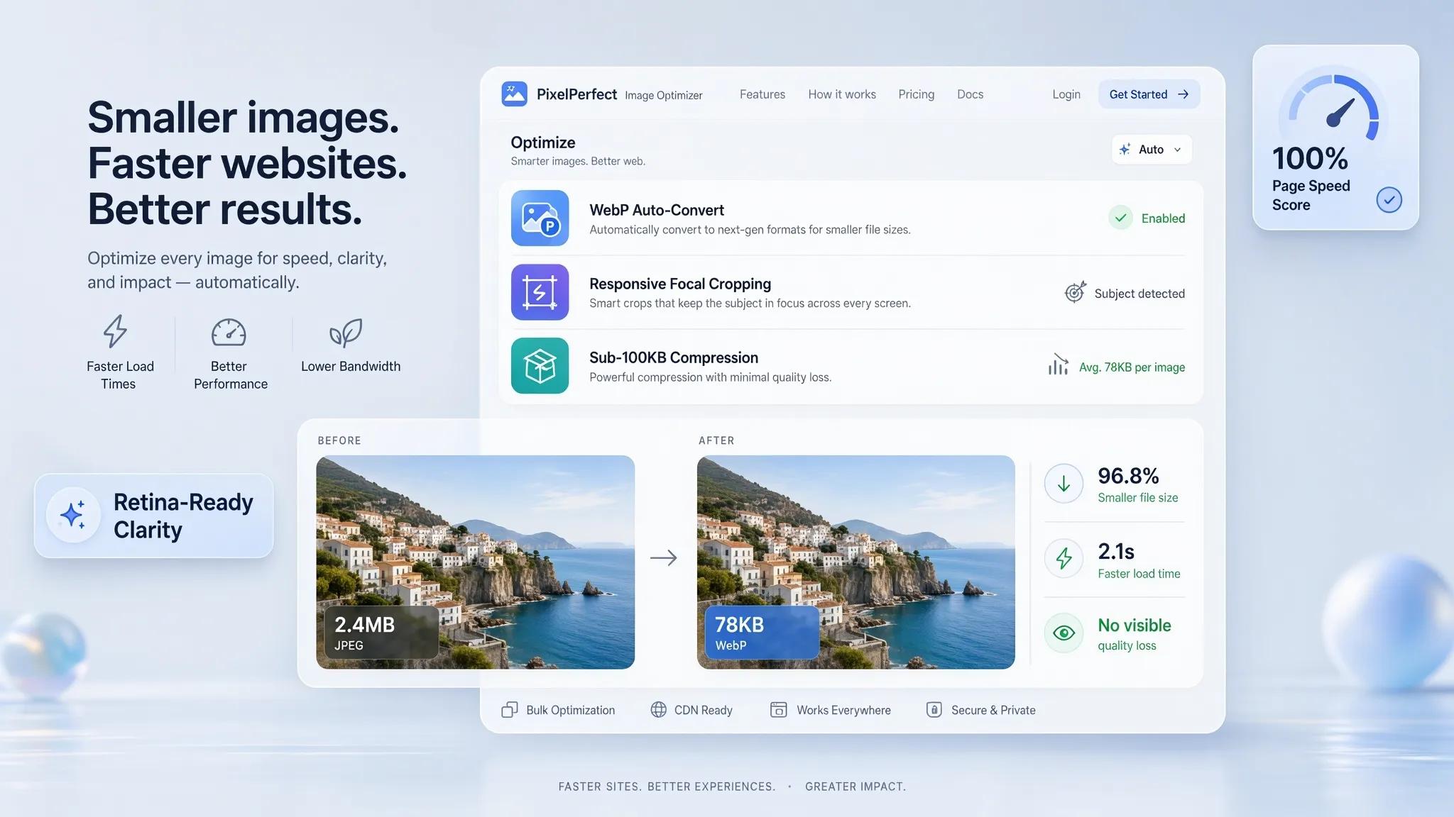
- Next-Gen Formats: Convert heavy JPEGs and PNGs into WebP or AVIF formats for superior compression with zero quality loss.
- Dimension Scaling: Resize raw camera uploads down to the maximum display width required by your container layout (e.g., 1920px for hero images).
- Lazy Loading: Enable native lazy loading so images below the fold only load as the visitor scrolls down the page.
Keeping tight control over image size for website assets preserves lightning-fast site speed and protects search engine rankings.

Make Sure Your Images Still Work When the Screen Gets Smaller
A horizontal landscape image that looks stunning on a widescreen desktop monitor can shrink down into an unreadable strip on a mobile device.
Building a truly mobile-friendly website requires testing responsive image behavior:
- Focal Point Cropping: Ensure key subjects remain centered when images switch to portrait orientation on mobile screens.
- Legibility Checks: Verify that text overlays embedded inside or over graphics remain crisp and readable on smaller viewports.
- Vertical Stacking: Allow side-by-side desktop image layouts to stack cleanly vertically on smartphones.
Implementing responsive images guarantees an engaging visual experience across every screen size. Learn how to make your website easy to use across all devices.
Check What Your Images Say When Nobody Can See Them
Images don't just speak to sighted visitors—they also communicate critical context to search engine crawlers and screen readers used by visually impaired visitors.
Optimizing your site's visual accessibility requires simple, descriptive micro-copy:
- Write Descriptive Alt Text: Replace blank alt tags with clear explanations (e.g., write
alt="Founder demonstrating software dashboard on laptop"instead ofalt="image1"). - Descriptive File Names: Rename camera defaults like
DCIM_0084.jpgto keyword-relevant, descriptive filenames likecustom-software-dashboard-preview.jpg. - Separate Text from Imagery: Avoid baking important headlines directly into image files where search bots and screen readers cannot read them.
Proper image alt text and image SEO practices make your site accessible to everyone while improving organic search visibility.
Build a Website Where Every Image Has a Purpose
Sourcing authentic photography, manually editing crops, compressing file sizes, setting up responsive breakpoints, and configuring alt text often turns into an overwhelming technical headache. Many business owners end up relying on generic stock libraries or AI-generated visual clutter simply because traditional website builders make visual management far too tedious.
You shouldn't need a degree in graphic design or complex editing software to publish stunning, high-converting visuals.
This is where BoltWeb transforms the workflow. As an all-in-one AI website builder, BoltWeb features a specialized built-in image pipeline designed to eliminate generic, low-quality stock visuals entirely.
Whether you need a full business website builder, an intuitive small business website builder, or a powerful website builder with a built-in website image editor, BoltWeb handles design, hosting, responsiveness, and visual optimization under one roof.
Stop settling for generic placeholders. Use BoltWeb to build a fast, clean, high-converting website where every image serves a clear purpose and turns visitors into loyal customers.
Frequently Asked Questions: How to Choose Images for Your Website
How do I know if an image on my website looks too generic?
If an image could be seamlessly swapped onto a competitor’s site or any random business website without feeling out of place, it is generic. Generic images usually feature staged corporate settings, overly polished models shaking hands, or abstract office coffee cups that communicate zero specific details about your actual offer. High-performing website visuals provide distinct proof of your real products, workplace, team, or specific customer outcomes.
Should I use professional stock photos or take my own real business pictures?
Real, authentic photos almost always outperform polished stock photography in building trust and driving conversions. A slightly imperfect, genuine photograph of your actual team, location, or completed work proves your business exists and is accountable. Use stock photos sparingly—primarily for background textures or general conceptual context—and choose un-staged shots that reflect authentic human interaction.
3. "What file format should I use for images on my website?"
For the best balance of visual quality and fast page load speeds, convert your website images to modern formats like WebP or AVIF. These next-generation formats provide superior compression compared to traditional JPEGs and PNGs without sacrificing clarity. Use PNGs only when transparent backgrounds are required, such as for brand logos or UI icons.
What image dimensions should I upload to keep my website loading fast?
Never upload raw, uncompressed camera files directly to your website. For full-width hero sections, scale your image to a maximum width of 1920 pixels. For standard content columns and blog post illustrations, keep image widths between 800 and 1200 pixels. Keeping your maximum image file size under 200 KB ensures swift page loads across both desktop and mobile networks.
How do I make sure my images look great on mobile phones without cutting off key details?
Mobile viewports require responsive focal cropping. Horizontal landscape images often shrink into tiny, unreadable strips on portrait mobile screens. Ensure your web layout uses responsive image containers that re-crop or adjust focal points to keep the primary subject centered on smaller displays, or stack image elements vertically above or below text blocks.
How many images should I include on a single web page?
Use images only where they actively explain a feature, demonstrate a product, build trust, or provide visual relief to break up dense body text. Adding images purely to fill blank space creates unnecessary visual clutter and slows down page loading speeds. If an image doesn't advance your message or help the reader understand your offer faster, remove it.
How do I write alt text for my website images for accessibility and SEO?
Alt text should provide a clear, concise description of what is visually happening inside the image for visually impaired visitors using screen readers and search engine crawlers. Be specific and descriptive rather than keyword-stuffing. For example, use alt="Founder demonstrating software analytics dashboard on laptop" instead of alt="software dashboard analytics software website".
How can I make images from different sources look cohesive across my site?
To keep diverse images looking like they belong to the same visual brand, maintain consistent lighting styles, color tones, and aspect ratios. You can harmonize disparate photos by applying a consistent color grading filter, using unified padding and margin standards, or ensuring all imagery reflects a consistent mood—such as bright natural light or high-contrast modern tones.
What is lazy loading, and why should I enable it for my website images?
Lazy loading is a web browser optimization technique that delays loading images located below the fold until the visitor scrolls down to see them. This drastically speeds up the initial page load time because the browser only downloads the imagery immediately visible on the user's screen, improving both user experience and search engine performance.
Is it okay to use AI-generated images on a business website?
AI-generated images can be useful for conceptual illustrations, custom blog banners, or abstract patterns, but they should be used cautiously. Modern visitors quickly spot repetitive AI artifacts—such as overly smooth skin, surreal lighting, or unnatural hands—which can trigger skepticism. Avoid using AI imagery to represent real team members, physical products, or client results where authenticity matters most.
Where should I place images on my landing pages to drive higher conversions?
Place your highest-impact visual in the top hero section adjacent to your primary headline and main call-to-action button. Throughout the rest of the page, pair specific imagery directly next to the corresponding feature descriptions or client testimonials. Placing images directly alongside relevant copy reinforces message retention and keeps visitors engaged as they scroll down. Review our landing page CTA best practices to align imagery with action.
How can I manage and optimize all my website images without spending hours in editing software?
Instead of manually cropping, converting, compressing, and setting up responsive breakpoints for every photo, you can use modern visual site builders with built-in media pipelines. Platforms like BoltWeb feature integrated image tools that automatically optimize file formats, generate responsive crops, handle image compression, and suggest accessible alt text, allowing you to build clean, fast, and visual-rich websites effortlessly.