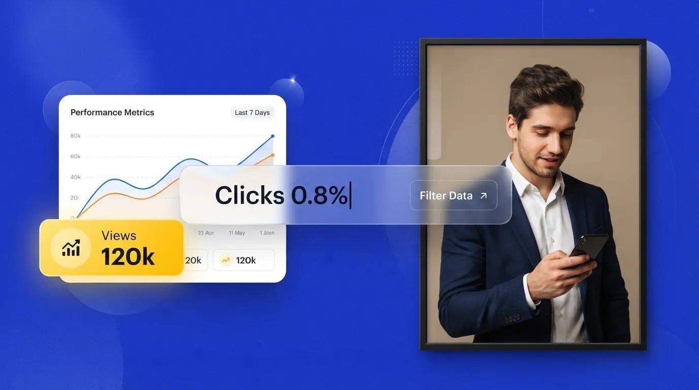


You move your thumb right over an "Add to Cart" button on your phone screen, and half a second before your finger lands, a banner drops in above it—pushing the button down so you tap a random link instead.
Here is the plain truth:
Unexpected movement breaks trust on the spot. When paragraphs shift mid-sentence, headings resize after text shows up, or a late banner shoves buttons out from under someone's thumb, visitors lose their place and get frustrated fast. In this guide, you will discover how layout shifts happen, how to spot the exact element moving on screen, and how to keep pages visually steady from the first frame.
In the past, tracking down sudden page jumps meant digging through stylesheets and guessing why a block moved half a second after load. Modern builders make starting with a clean structure much easier. When you build with BoltWeb, you get a visual workspace designed for straightforward page setup while still letting you verify layout stability on your live pages. Inside BoltWeb, AI Foundry helps you organize sections and content cleanly so you spend less time untangling layout fixes and more time growing your business.
Let's walk through how to measure, trace, and prevent layout shifts across your site.
1. What Is Cumulative Layout Shift (CLS), and Why Does It Matter for SEO?
When content moves unexpectedly on screen, visitors can lose their spot while reading or tap the wrong control by accident.
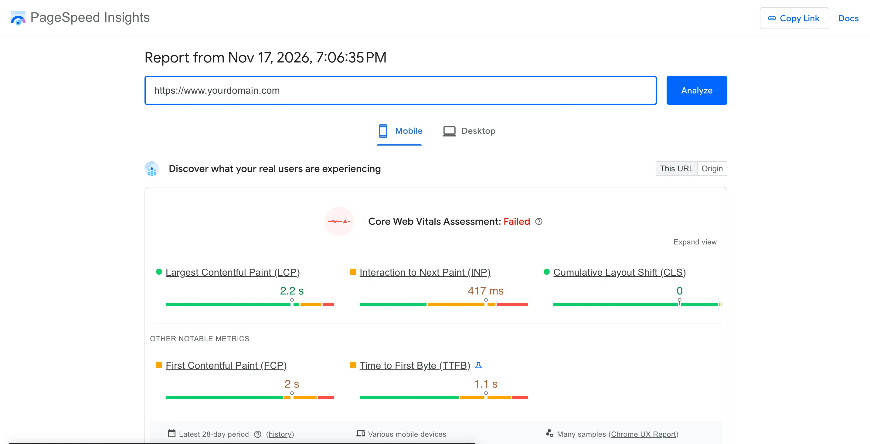
Cumulative Layout Shift (CLS) measures visual stability by looking at unexpected movement of visible elements—shaped by the impact fraction (how much of the viewport the shifting elements affect) and the distance fraction (how far unstable elements move relative to the viewport). Google evaluates CLS across Core Web Vitals using three practical brackets—good at 0.1 or less, needs improvement between 0.1 and 0.25, and poor above 0.25—though a healthy score does not promise ranking jumps on its own (see Google Search Central: Understanding Core Web Vitals and Google Search and our guide to fix Core Web Vitals). Paying attention to Cumulative Layout Shift strengthens CLS SEO and keeps Core Web Vitals CLS from working against real visitors.
2. How to Check Your CLS Score with PageSpeed Insights and Google Search Console
Start with real data rather than guessing which page is jumping around.
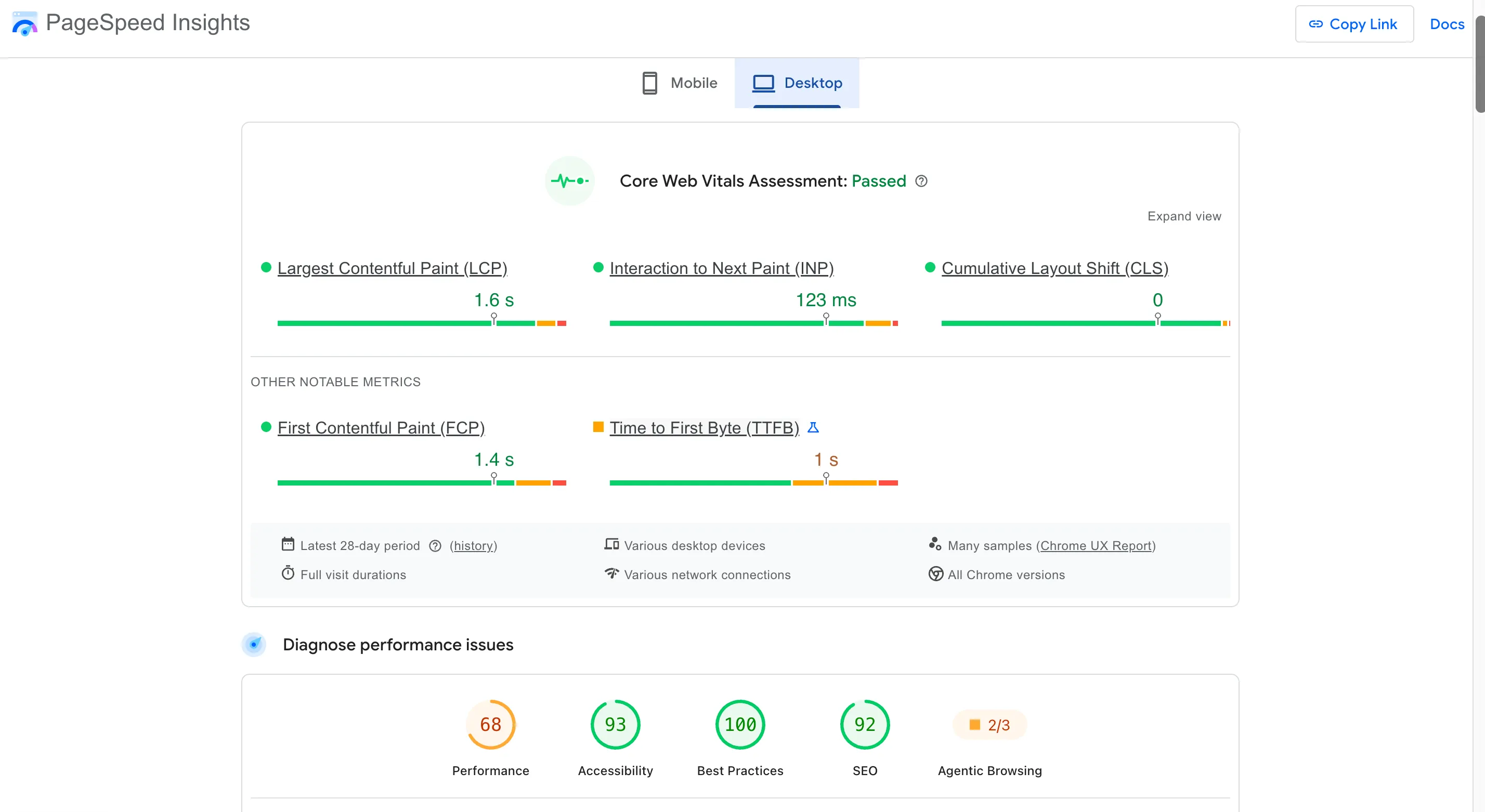
Test individual URLs on mobile and desktop in PageSpeed Insights to compare real-user field data with single-run lab diagnostics, and review affected URL groups in the Google Search Console Core Web Vitals report. A single lab check will not catch every shift because real visitors use different screens, scroll differently, and trigger late states that one load misses. Knowing how to check CLS score across PageSpeed Insights CLS and the Search Console CLS report gives you a clear starting baseline.
3. Find the Elements Causing Unexpected Layout Shifts
Knowing a page shifts is only half the story—you need to see which block, image, or widget is doing the shifting.
Open Chrome DevTools, record a performance trace while loading, scrolling, or interacting with the page, and inspect the layout-shift entries and affected nodes to see what moved during initial load versus after user interaction. That detail helps you identify layout shifts accurately, makes CLS debugging straightforward, and pinpoints layout shift elements behind unexpected layout shifts.
4. Add Image Width and Height to Prevent Cumulative Layout Shift
When an image loads without reserved dimensions, the browser does not know how much vertical room to hold for it—so surrounding text and buttons get pushed down once the file arrives.
<img
  src="/images/business-team.webp"
  width="1200"
  height="800"
  alt="Business team working together"
>
Setting width and height lets the browser calculate the aspect ratio and reserve space before the image finishes downloading (and pairs naturally with our guide to optimize website images for SEO). Use explicit dimensions, CSS aspect ratios, and proper sizing across responsive images, videos, and media containers so image dimensions CLS stays low and prevent image layout shifts works reliably through clean image width and height and image aspect ratio setup.
5. Reserve Space for Ads, Videos, Embeds, and Dynamic Content
Images are far from the only culprit. Ads, video players, maps, social embeds, banners, and dynamically inserted blocks often pop in after the initial layout pass and shove nearby content downward.
.video-container {
  width: 100%;
  aspect-ratio: 16 / 9;
  overflow: hidden;
}

.video-container iframe {
  width: 100%;
  height: 100%;
  border: 0;
}
Reserving an aspect-ratio container keeps a video embed from pushing surrounding text down when it loads.
.promo-placeholder {
  min-height: 120px;
  width: 100%;
}
Keep placeholders sized to match expected content rather than leaving giant empty gaps.
Planning ahead to reserve space for ads, prevent iframe layout shifts, reduce dynamic content CLS, and manage embed CLS stops late-loading widgets from disrupting readers.
Launch Steadily With BoltWeb
Build Clean Pages That Stay Composed While Your Business Grows
Do not let messy layout edits or scattered page updates slow down your momentum as you publish offers and guides. Create and refine pages on BoltWeb with AI Foundry to organize sections cleanly, connect related guides smoothly, and keep your site ready to scale.
Get Started On Your Journey →6. Fix Web Font Loading to Stop Text and Layout Shifts
Even a small shift in line height or character width when a custom font swaps in can wrap text onto another line and push lower blocks down the page.
@font-face {
  font-family: "Business Sans";
  src: url("/fonts/business-sans.woff2")
    format("woff2");
  font-display: swap;
}

body {
  font-family: "Business Sans", Arial, sans-serif;
}
Using font-display: swap shows fallback text right away instead of leaving a blank space, though it does not eliminate CLS on its own—matching fallback font metrics and dimensions to your web font also matters (see web.dev: Web Performance Guides for broader loading guidance). Smart font loading CLS choices, careful font-display CLS handling, steps to prevent font layout shift, and solid web font optimization keep typography steady as fonts settle.
7. Stop Banners, Popups, and Notifications from Pushing Content Around
A top announcement bar, cookie notice, promo banner, newsletter box, chat prompt, or status alert that snaps into the document flow after reading starts can yank the whole page downward.
Reserve space ahead of time, place banners or modals as non-disruptive overlays where appropriate, or trigger prompts in response to user actions rather than sudden layout shifts. Keeping banner CLS low, avoiding popup layout shift surprises, curbing notification CLS, and finding ways to prevent content shifting protects visitors right where they are reading.
8. Use Stable CSS Layouts and Animations to Reduce CLS
How you size containers and animate motion shapes whether neighboring elements stay put or get knocked around.
.card {
  transition: transform 200ms ease;
}

.card:hover {
  transform: translateY(-4px);
}
Transforms generally avoid triggering layout changes that move nearby elements, whereas animating layout-affecting properties like top, left, or box dimensions can shift surrounding content. Pair sensible min-height, aspect ratios, and flex or grid rules with disciplined motion—and connect key pages cleanly through a focused internal linking strategy for small business. Applying CSS CLS optimization helps prevent CSS layout shifts, supports layout stability, and keeps CLS animations smooth.
| Problem | Likely Cause | Recommended Fix |
|---|---|---|
| Text jumps when images load | Missing image dimensions | Add width and height or aspect ratio |
| Page moves when an advertisement appears | No reserved ad space | Allocate an appropriate container |
| Video pushes article content down | Iframe dimensions not reserved | Use an aspect-ratio container |
| Headings change size after loading | Web font and fallback font differ | Match font metrics and review font-display |
| Announcement bar pushes content down | Banner inserted into document flow | Reserve space or use a suitable overlay |
| Cards change height unexpectedly | Inconsistent content and component dimensions | Establish predictable component layouts |
| Mobile page shifts more than desktop | Responsive sizing or wrapping differences | Test mobile layouts and reserve dimensions |
| Elements move during animation | Layout-affecting CSS properties | Prefer transform and opacity animations |
9. Fix CLS Problems on Mobile and Responsive Website Layouts
Narrower screens wrap lines sooner, change image crops, resize menus, and leave less room for banners or sticky bars—so a layout that looks steady on desktop can jump noticeably on a phone.
Check pages at multiple viewport widths and across portrait and landscape orientations rather than relying on one screen size (see how to test mobile website performance across real conditions). Targeted mobile CLS fixes reduce responsive layout shifts, strengthen mobile Core Web Vitals, and make responsive CLS optimization practical on real devices.
10. Build Visually Stable Website Pages with Better Layout Planning
Stability gets much easier when you plan container proportions, placeholders, and reusable blocks before publishing rather than patching shifts after visitors complain.
When you create and edit pages with BoltWeb in its visual website editor, you can set up clean sections fast, check image dimensions as you go, preview responsive views, and review dynamic components before sharing a page—while still checking finished pages against real testing tools. Thoughtful planning supports a stable website layout, improves website layout optimization, and makes the BoltWeb website builder a practical place to shape pages cleanly.
11. Measure CLS Improvements and Verify Layout Stability
Do not assume a code tweak solved visual stability from a single test—verify both immediate behavior and real-world trends.
Retest affected URLs in PageSpeed Insights and inspect updated traces in Chrome DevTools—including post-load shifts—while watching Search Console URL groups over the 75th-percentile field-data window (and keeping related guides linked with a clean internal linking strategy for small business). Tracking how to measure CLS improvements lets you test CLS score, monitor Core Web Vitals, and read CLS field data with confidence.
| Tool | Best Use |
|---|---|
| Google PageSpeed Insights | Check CLS scores and performance diagnostics |
| Chrome DevTools | Identify shifted elements and inspect layout-shift records |
| Google Search Console | Find groups of URLs with poor CLS field performance |
| Google Lighthouse | Run lab audits and identify potential layout issues |
| Chrome UX Report | Examine aggregated real-user experience data |
12. Follow a Cumulative Layout Shift Checklist Before Publishing
Turn visual stability into a quick pre-publish check on every new or updated page—verifying image dimensions, reserved spaces, embeds, fonts, banners, animations, responsive widths, and post-publish monitoring.
Building a consistent CLS checklist makes it easier to prevent layout shifts, follow CLS best practices, and fix Cumulative Layout Shift before visitors ever hit a moving button.

Keep Every Tap Where Visitors Expect It Before You Hit Publish
Picture a visitor tapping straight onto your offer on a phone screen without a sudden banner shoving their finger off target or text jumping mid-read.
Open your next page in BoltWeb, check how it holds together across screen sizes and live interactions, and create a business website where visitors stay right where they intend to click.
Get Started On Your Journey →FAQs: Fix Cumulative Layout Shift (CLS)
Why does my website keep jumping around while it loads, and does Google actually measure that annoyance when real people visit my pages?
Nothing breaks a visitor's focus faster than reading a line or reaching a tap target only to watch the screen lurch sideways or downward mid-motion. When paragraphs shift or a button slips out from under a thumb, people lose their spot—and bad visual stability can turn an interested buyer into a bounce.
Cumulative Layout Shift (CLS) measures unexpected movement on screen using impact fraction and distance fraction, with scores at 0.1 or less considered good, 0.1 to 0.25 needing improvement, and anything above 0.25 rated poor—though hitting a good score does not guarantee ranking jumps on its own (see Google Search Central: Understanding Core Web Vitals and Google Search and our guide to fix Core Web Vitals). Paying attention to Cumulative Layout Shift strengthens CLS SEO and keeps Core Web Vitals CLS from working against visitors, while BoltWeb and AI Foundry inside BoltWeb help you organize clean page sections quickly while you verify layout stability on live pages.
How do I find out whether my website actually has a CLS problem before guessing at fixes?
Start with real measurements across individual URLs rather than relying on a hunch or a single quick glance.
Run mobile and desktop checks in PageSpeed Insights to compare field data against lab diagnostics, and review affected URL groups in the Google Search Console Core Web Vitals report—knowing that one test run will not catch every shift across different screens and user actions. Learning how to check CLS score across PageSpeed Insights CLS and the Search Console CLS report gives you a practical starting baseline.
My CLS score is poor, but how do I pinpoint the exact element moving on the page?
Spotting a high shift score only tells you something moved—not which image, text block, banner, or widget caused the jump.
Open Chrome DevTools, capture a performance trace while loading, scrolling, or interacting with the page, and check layout-shift entries and affected nodes to see what moved initially versus later in the session. That process helps you identify layout shifts accurately, makes CLS debugging clearer, and pinpoints layout shift elements behind unexpected layout shifts.
Why does my article or product page jump when images finish loading?
When an image lacks reserved dimensions, the browser cannot set aside the right vertical space ahead of time—so nearby text and buttons get pushed down once the image arrives.
Adding explicit width and height attributes, CSS aspect ratios, and clean sizing across responsive images, videos, and containers lets the browser reserve space early (and pairs naturally with our guide to optimize website images for SEO). Solid image dimensions CLS habits help you prevent image layout shifts using clean image width and height and image aspect ratio setup.
My page looks calm at first, but ads, videos, and embeds keep pushing everything down—how do I stop that?
Images are only part of the story. Advertisements, video players, maps, social embeds, banners, and dynamically injected blocks often pop into the page after initial rendering and shove nearby elements downward.
Reserving matching containers, using aspect-ratio wrappers for embeds, and keeping dynamic placeholders sized close to expected content stops sudden jumps without leaving awkward giant gaps. Planning ahead to reserve space for ads, prevent iframe layout shifts, lower dynamic content CLS, and manage embed CLS keeps surrounding content steady.
Why does my heading change size or move after the page starts loading?
A custom web font with different character widths or line metrics than its fallback can wrap lines differently once it loads, shifting headings and blocks below it.
Using font-display: swap lets fallback text show right away instead of leaving an empty gap, while matching fallback font metrics to your web font helps reduce layout shifts when the custom typeface arrives (see web.dev: Web Performance Guides for broader performance guidance). Thoughtful font loading CLS choices, careful font-display CLS handling, steps to prevent font layout shift, and solid web font optimization keep typography predictable.
My announcement banner or popup shows up late and pushes the rest of the page down—what is a better approach?
A top promo bar, cookie notice, newsletter box, chat prompt, or alert that inserts itself into normal document flow mid-read can yank everything below it out of place.
Reserving space in advance, placing overlays thoughtfully where appropriate, or revealing prompts in response to user actions prevents jarring jumps right where people are reading or tapping. Keeping banner CLS low, avoiding popup layout shift surprises, curbing notification CLS, and finding ways to prevent content shifting protects reader attention.
Why does my layout shift when elements expand, resize, or animate on screen?
Layout shifts happen whenever styles or animations force the browser to recalculate box positions and sizes around neighboring elements instead of moving things smoothly.
Favoring transforms like translate or opacity over layout-affecting properties like top, left, or changing container dimensions—alongside predictable container sizing—keeps nearby elements anchored (and works well alongside a focused internal linking strategy for small business). Applying CSS CLS optimization helps prevent CSS layout shifts, supports layout stability, and keeps CLS animations smooth.
My desktop CLS looks fine, but why does mobile still show noticeable layout shifts?
Narrower viewports wrap copy earlier, crop images differently, resize navigation, and leave less room for banners or sticky elements—exposing layout shifts on phones that stay hidden on wider monitors.
Testing across multiple viewport widths and both portrait and landscape orientations catches responsive friction early (see how to test mobile website performance under real conditions). Focused mobile CLS work reduces responsive layout shifts, strengthens mobile Core Web Vitals, and makes responsive CLS optimization practical on real handsets.
How can I stop introducing layout problems every time I create or update a page?
Planning section heights, placeholders, and reusable blocks upfront beats chasing layout bugs after visitors complain.
When you build and edit pages with BoltWeb in its visual website editor, you can set up structured sections quickly, check image dimensions as you go, preview responsive views, and review dynamic elements before publishing—while still verifying finished pages on live testing tools. Thoughtful planning supports a stable website layout, improves website layout optimization, and makes the BoltWeb website builder a clean place to shape pages.
I adjusted my layout styles, but how do I know real visitors are seeing less movement
A single test run does not prove every visitor sees a steadier page across real devices, scroll patterns, and sessions.
Retesting URLs in PageSpeed Insights, checking updated traces in Chrome DevTools including post-load shifts, and tracking Search Console URL groups over the 75th-percentile field window shows whether real sessions improve over time (and keeps related guides connected through an internal linking strategy for small business). Tracking how to measure CLS improvements lets you test CLS score, monitor Core Web Vitals, and read CLS field data clearly.
How do I make sure I don't keep running into the same CLS issues on future updates?
Turn visual stability into a quick pre-publish habit across every new or edited page—checking image dimensions, reserved spaces, embeds, fonts, banners, animations, responsive widths, and post-publish reports.
Keeping a consistent CLS checklist makes it easier to prevent layout shifts, follow CLS best practices, and fix Cumulative Layout Shift before visitors ever hit a moving button.
Picture a visitor tapping straight onto your offer on a zoomed mobile screen without a sudden banner shoving their thumb off target or text jumping mid-sentence.