


You tap your own business link from your phone while waiting for coffee, watch the header sit empty for four long seconds, and finally try to open the menu—only for the screen to stutter while a prospective customer would have already hit the back button.
Here is the plain truth:
Desktop testing flatters slow websites. A computer plugged into reliable broadband with plenty of memory can brute-force heavy images and bloated scripts that bring a handheld phone to its knees. Today we are walking through how you can test mobile website performance across real screens, slower networks, and actual tap journeys—so you will discover where mobile visitors hit friction and how to fix what slows them down.
In the past, checking how pages held up on phones meant cobbling together emulators, guessing why a layout broke on narrow screens, and rewriting stylesheets by hand. Using BoltWeb when you build a website lets you create mobile-responsive pages so you can check and publish with confidence. Inside BoltWeb, AI Foundry structures clean, responsive sections fast so you spend less time wrestling layout code and more time turning mobile traffic into real inquiries.
Let's dive into the exact checks that show how your pages really perform in a visitor's hand.
1. Why Does Your Website Feel Slower on a Phone Than on a Computer?
Think about what a phone is juggling compared to a laptop. Phones run on smaller processors, tighter memory limits, mobile browsers with stricter resource caps, and cellular connections that fluctuate from block to block.
On top of that, a page can look completely fine when shrunk to phone width while still taking far too long to load its hero section or respond to a finger tap. Knowing how to test mobile website performance separates visual appearance from true mobile website speed, making mobile performance testing essential before you assume visitors get the same experience you see at your desk.
2. Run a Mobile Website Speed Test with Google PageSpeed Insights
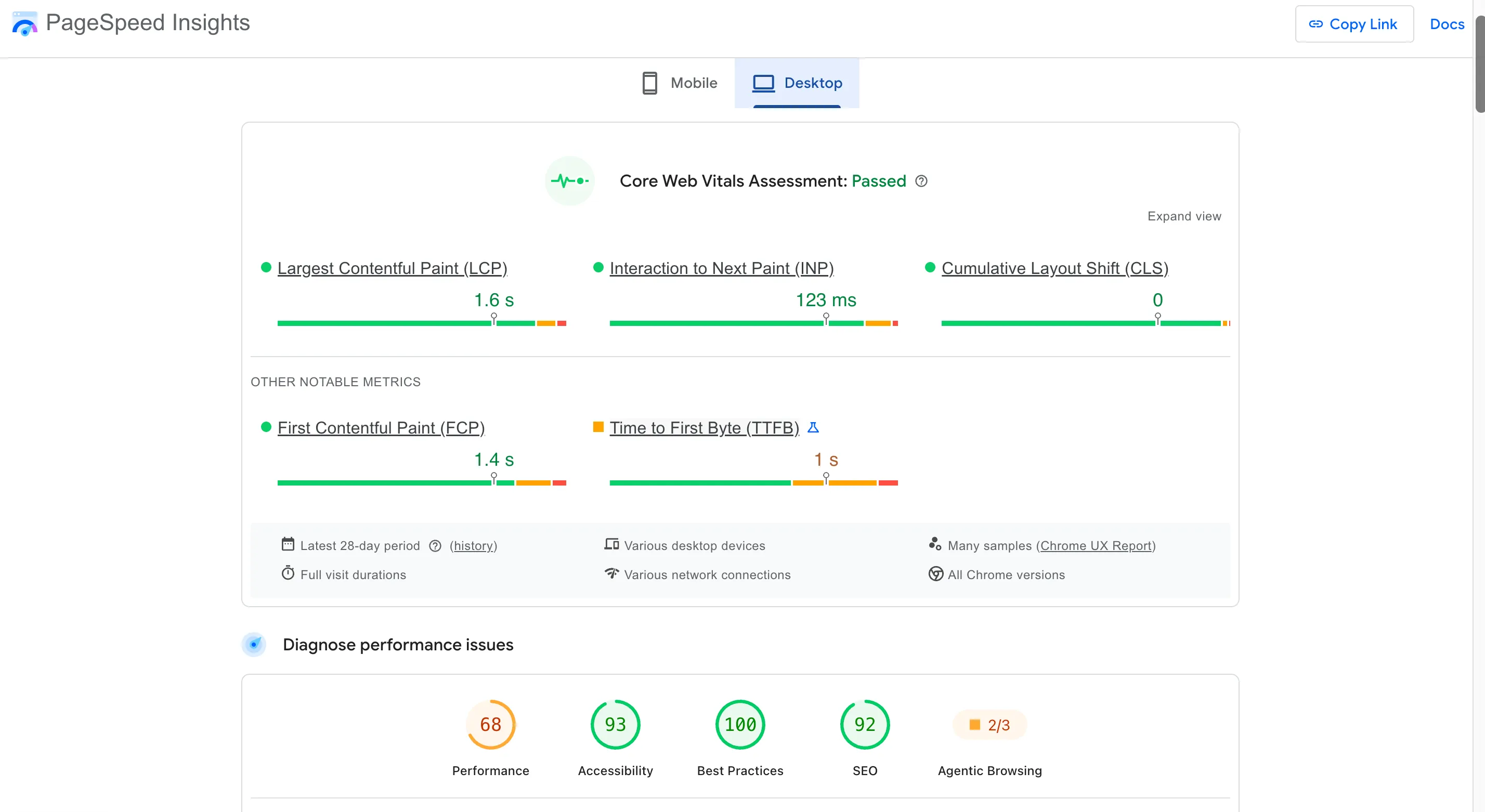
Start with a quick, zero-setup baseline right in your browser using Google PageSpeed Insights. Paste the full URL of an important page—not just your homepage, since service pages, booking flows, and popular articles often carry very different scripts and media—and make sure the mobile tab is selected.
Look first at the performance score at the top, check whether real-user field data appears for that URL, and read through the Lighthouse diagnostics underneath to see what held up loading or interactivity. Running a mobile website speed test through Google PageSpeed Insights mobile is the fastest way to test website speed on mobile and spot immediate bottlenecks.
3. Test Your Website on Real Phones, Not Just Desktop Simulations
Shrinking a desktop browser window or toggling device emulation is handy for quick layout checks, yet your computer's processor, memory, and mouse cursor still power the session underneath.
Pick up actual Android and iOS phones across different screen sizes, browsers, and operating systems to see how pages behave in real hands. Actual devices expose memory strain, touch latency, and browser quirks that desktop previews smooth over. When you test website on real devices, you uncover genuine mobile browser testing differences and protect mobile website compatibility where buyers actually browse.
4. Check Mobile Loading Speed on Different Network Connections
People rarely visit your business from a quiet desk with fiber internet—they tap links on commuter trains, inside busy stores, or on weak cellular bars where latency climbs and download speeds drop.
Test your pages on standard Wi-Fi, everyday 4G, slower cellular connections, and throttled network profiles inside Chrome DevTools to watch how requests behave when bandwidth tightens. Practicing mobile network speed testing reveals hidden drag in mobile website loading speed whenever network throttling simulates real-world signal drops.
5. Measure Mobile Core Web Vitals and Understand the Results
Skip the urge to chase a single vanity number and look straight at the three Core Web Vitals on mobile: Largest Contentful Paint for how quickly main content appears, Interaction to Next Paint for how fast taps and clicks update the screen, and Cumulative Layout Shift for unexpected movement during loading.
Field metrics reflect real visitors evaluated at the 75th percentile of page loads over time, whereas lab diagnostics reflect one controlled test run—and you can track page-group patterns in the Google Search Console Core Web Vitals report alongside our guide to fix Core Web Vitals. Reading mobile Core Web Vitals through mobile LCP, mobile INP, and mobile CLS turns raw numbers into clear experience signals.
Build Mobile-Responsive Pages With BoltWeb
Launch Clean Storefronts Ready to Check and Publish With Confidence
Do not let clunky layouts or slow mobile templates hold back visitors who are ready to reach out from their phones. Shape and launch mobile-responsive pages on BoltWeb with AI Foundry, connect your guides cleanly, and scale your site without wrestling raw code.
Get Started On Your Journey →6. Find Images and Page Elements That Take Too Long to Load on Mobile
Open the Network panel in Chrome DevTools on a mobile profile and follow the loading waterfall from top to bottom. Oversized hero photos, unoptimized product images, custom web fonts, background videos, and external widgets frequently stall the top of the screen while lower sections wait.
Inspect file transfer sizes, check when each request begins, and verify that mobile screens receive properly sized responsive images instead of giant desktop files (see how to optimize website images for SEO and improve Largest Contentful Paint). Auditing mobile image loading sharpens mobile page speed optimization, clarifies website resource loading, and boosts mobile loading performance.
7. Check Whether JavaScript Is Making Your Mobile Website Unresponsive
Even after text and images finish downloading, heavy JavaScript bundles, long main-thread tasks, complex animations, and stacked third-party scripts can overwhelm a phone's processor.
Turn on CPU throttling in Chrome DevTools and record a performance trace while scrolling, opening a navigation drawer, or typing into a search box to see where script execution blocks input (and pair this with our guide to improve Interaction to Next Paint). Checking mobile JavaScript performance protects mobile website responsiveness through targeted JavaScript performance testing.
8. Test Mobile Navigation, Forms, Buttons, and Touch Interactions
Put away the mouse trackpad and work through your mobile hamburger menu, dropdowns, sticky header, search field, sliders, expandable sections, and inquiry form using only your thumb.
Make sure tap targets have enough breathing room to prevent accidental taps, buttons show immediate visual feedback when pressed, on-screen keyboards match field types, and form labels stay visible rather than vanishing inside placeholder text (see how to check website accessibility for touch and form clarity). Thorough mobile usability testing pairs mobile touch interaction with mobile navigation testing and mobile form testing around real conversion actions.
9. Find Mobile Layout Problems That Affect Reading and Navigation
Narrow viewports expose spacing and sizing mistakes right away—causing horizontal scrolling, clipped headings, overlapping buttons, overflowing images, misconfigured viewport tags, or sticky bars that squeeze reading space.
Check pages across several viewport widths and rotate phones between portrait and landscape orientations to verify that text stays readable without pinching or sideways scrolling (and see how to fix Cumulative Layout Shift when mobile elements jump). Careful mobile responsive testing catches mobile layout testing flaws early and eliminates mobile website display issues.
10. Test Mobile Website Performance Across Your Most Important Pages
Your homepage rarely reflects every layout template, form script, or media block across your domain. Service pages, landing pages, pricing tables, blog articles, and contact forms each carry distinct assets and conversion paths.
Select a representative sample covering every core template and buyer journey so you catch shared template bottlenecks as well as page-specific slowdowns—while keeping related pages connected through a clean internal linking strategy for small business and strong SEO meta descriptions. Focused mobile website testing lets you test individual website pages efficiently as part of a practical mobile page performance audit.
11. Turn Mobile Performance Test Results into a Clear Fix List
A wall of audit warnings gets manageable the moment you log each finding, separate one-off page quirks from template-wide problems, rank fixes by how badly they block real users, and compare before-and-after metrics once changes ship.
| Test Area | Finding | Priority |
|---|---|---|
| Initial page loading | Large hero image takes too long to appear | High |
| Navigation | Menu takes time to open | High |
| Images | Some images are wider than their display area | Medium |
| Forms | Submit button gives no immediate feedback | High |
| Layout | Horizontal scrolling on smaller screens | High |
| Fonts | Heading changes size after font loads | Medium |
| Below-the-fold content | Several images load unnecessarily early | Medium |
Organizing findings into a clear mobile performance audit turns scattered mobile website performance issues into steady mobile speed optimization wins.
12. Make Mobile Performance Testing Part of Your Website Publishing Routine
Treat mobile checks as part of publishing itself rather than an emergency cleanup after leads drop off—reviewing narrow-screen previews, testing on an actual phone, validating menus and forms, and checking post-launch metrics in Google Lighthouse and web.dev Performance Guides.
Using BoltWeb when you build a website lets you create mobile-responsive pages so you can check and publish with confidence, while still verifying real-device speed and touch behavior on every finished page. Following a repeatable mobile website performance checklist makes it second nature to test website before publishing with a dependable BoltWeb website builder workflow.

Give Every Phone Visitor a Smooth Path From First Tap to Inquiry
Think about a buyer pulling up your page on a crowded train with weak signal bars, reading every line without sideways scrolling, tapping your menu with one thumb, and sending a request without a second of lag.
Open your next page inside BoltWeb, run it through real phones and mobile speed checks before you share the link, and create a business website built to win mobile visitors every single day.
Get Started On Your Journey →FAQs: Test Mobile Website Performance
My website opens in a blink on my laptop, so why does it feel so slow and clunky on my phone when real buyers are trying to use it?
A fast desktop connection, generous memory, and a wide display can mask heavy assets that a smartphone exposes the moment someone taps a link on the move. Phones work with tighter memory, smaller processors, shifting mobile signals, and touch controls—so a layout that looks snappy on your computer can still stall in a buyer's hand.
Learning how to test mobile website performance protects your mobile website speed and makes mobile performance testing a grounded check on real visitor experience rather than a desktop illusion. If you want a smoother starting point for getting pages up without wrestling raw setup, BoltWeb and AI Foundry inside BoltWeb help you organize clean layouts quickly, while you still verify how live pages behave on real phones.
Where can I test my website on mobile without installing complicated software right away?
Head straight to PageSpeed Insights in your browser, paste a specific URL—such as a service page, booking page, or top article rather than only the homepage—and switch to the mobile tab first.
Scanning the mobile score, available field metrics, and diagnostic items underneath gives you a practical first look at what is slowing down that page. Running a quick mobile website speed test with Google PageSpeed Insights mobile is an easy way to test website speed on mobile without heavy tools.
The mobile preview on my computer looks fine, so why do some visitors still experience problems on phones?
Resizing a browser window on your computer still relies on your computer's hardware and often misses real touch behavior, tight memory limits, and browser-specific quirks.
Trying your pages on real Android and iOS phones across different screen sizes, browsers, and operating systems shows what visitors actually run into. When you test website on real devices, you catch mobile browser testing differences and protect mobile website compatibility where people really browse.
Does my website only work well when someone has a fast internet connection?
People checking a business on their phones are often walking, commuting, or sitting on spotty mobile data rather than sitting next to fast broadband.
Testing across Wi-Fi, standard 4G, slower connections, and throttled network profiles reveals where requests lag or bunch up when signals dip. Practicing mobile network speed testing exposes weak spots in mobile website loading speed when network throttling mimics less-than-ideal connections.
My mobile performance score is poor. Which numbers should I actually care about?
Zero in on the three Core Web Vitals for mobile—Largest Contentful Paint for how fast the main content appears, Interaction to Next Paint for how quickly taps and clicks update the screen, and Cumulative Layout Shift for unexpected movement while loading.
Field data captures real visitors at the 75th percentile over time, whereas lab data reflects a single controlled run—and checking the Google Search Console Core Web Vitals report alongside our Core Web Vitals guide shows where real mobile users hit friction. Reading mobile Core Web Vitals through mobile LCP, mobile INP, and mobile CLS keeps your focus on what visitors feel.
Why does the top of my page stay blank on a phone while the rest of the website starts loading?
Watch the loading waterfall in your browser's network panel on a mobile profile to see which hero banner, product image, web font, video, or third-party script is holding up the top of the screen.
Checking transfer sizes, request start times, and responsive image sizing helps keep phones from downloading giant desktop files before primary content shows up (see how to optimize website images for SEO and improve Largest Contentful Paint). Inspecting mobile image loading sharpens mobile page speed optimization, clarifies website resource loading, and strengthens mobile loading performance.
My website opens on a phone, but scrolling, clicking, and opening menus feel sluggish—could JavaScript be to blame?
Even after HTML and images arrive, heavy scripts, long main-thread tasks, chat widgets, or extra animations can tie up a phone's processor right when a visitor tries to interact.
Turning on CPU throttling in browser developer tools and recording a performance trace while scrolling, opening menus, or typing into inputs surfaces slow script work quickly. Checking mobile JavaScript performance helps you protect mobile website responsiveness through focused JavaScript performance testing.
Can visitors actually use my website comfortably with their fingers on a touchscreen?
Tap through your mobile menu, search bar, accordions, sliders, and inquiry form using your thumb to see how controls behave in everyday use.
Make sure tap targets have enough space so fingers do not hit the wrong button, menus open and close smoothly, and form labels stay clear rather than disappearing inside placeholder text with helpful error cues when a mistake happens. Strong mobile usability testing pairs mobile touch interaction with mobile navigation testing and mobile form testing around real visitor tasks.
Why do some sections look perfect on desktop but break with horizontal scrolling or clipped text on smaller screens?
Narrower viewports expose layout cracks fast, turning tidy desktop sections into side-to-side horizontal scrolling, clipped headings, overlapping buttons, overflowing images, or sticky bars that crowd the screen.
Checking pages across different viewport widths and both portrait and landscape orientations reveals where responsive rules need tightening. Thorough mobile responsive testing uncovers mobile layout testing issues early and prevents mobile website display issues from pushing readers away.
Do I really need to test every single page on my website, or can I check a few important ones?
Your homepage rarely represents every template or script on your site, because service pages, pricing pages, lead forms, and popular articles can load different elements and guide different conversion steps.
Testing a focused group of key pages across your main templates and visitor journeys lets you spot shared template issues and high-value bottlenecks without wasting time (while keeping related guides connected through an internal linking strategy for small business). Smart mobile website testing lets you test individual website pages as part of a practical mobile page performance audit.
I have a performance report full of warnings—how do I turn those findings into a clear fix list?
Sort your findings by how many visitors they affect, how severely they block key actions, and whether a fix solves a whole template or just one page, then note your baseline numbers and retest after making changes.
Tackling top blockers first—like slow initial loading, sluggish menus, unresponsive form buttons, or horizontal scrolling—turns a long list of warnings into visible progress. A structured mobile performance audit helps you resolve mobile website performance issues through focused mobile speed optimization.
How do I avoid publishing another page that looks fine on desktop but performs badly on phones?
Build mobile checks straight into your publishing routine—previewing narrow screens, testing on a phone, checking menus and forms, and reviewing results after publishing rather than waiting for visitor complaints.
Whenever you put pages together with a builder workflow, you can still check finished pages on real phones and testing tools before sharing them widely so performance stays solid as your site grows. A simple mobile website performance checklist makes it easier to test website before publishing with a dependable BoltWeb website builder workflow.
Picture a buyer opening your service page on a busy train ride with shifting signal strength, tapping straight to your details on a responsive screen, and reaching out before a slow mobile load ever gets in the way.