
You finish designing a sleek service page, preview it on your widescreen monitor, and admire how clean the layout looks—then a quiet thought stops you mid-scroll:
Here is the plain truth:
A visually polished website is not automatically an accessible one. When a visitor cannot use a mouse, relies on assistive technology to hear your page aloud, or needs clearer visual contrast and instructions to read your forms, hidden friction turns interested buyers into abandoned sessions.
Learning how to check website accessibility closes that gap between looking good on screen and working reliably for every visitor. In this guide, you will discover how to spot real barriers, test interactions practically, and build an accessible website that supports real human tasks.
In the past, checking compliance meant digging through dense technical specs and guessing which template block was causing trouble. Modern site building makes getting started far smoother.
When you build with BoltWeb, your pages are created with clean structure ready to run and scale, and you can still check web accessibility on any testing tool once your pages are live. Inside your BoltWeb workspace, AI Foundry helps you organize layouts and content fast so you spend less time wrestling with setup and more time serving customers.
Here is how to test, prioritize, and maintain accessibility across every page you publish.
1. Can Everyone Use Your Website Without a Mouse or a Perfect View of the Screen?
Picture four everyday visitors trying to request a quote on your site. One person cannot operate a mouse due to a hand injury and relies on keyboard keys. Another uses a screen reader because of blindness. A third reads with low vision on a zoomed-in display, and a fourth gets stuck when form instructions are vague.
Even if your colors and layout look sharp at default zoom, invisible barriers can block any of those visitors from completing a basic task. When you check website accessibility, look beyond surface appearance to see how real people navigate, read, and interact. Building an accessible website improves web accessibility for everyone while making your pages clearer for all readers.
2. Start with a Website Accessibility Checker to Find Obvious Problems
Start with a quick diagnostic scan on a public page to surface obvious issues before you inspect every element by hand.
Automated tools catch missing image attributes, low-contrast text pairs, and structural gaps quickly—yet a single scan of your homepage cannot represent an entire website or verify human judgment. Treat scan findings as a starting map rather than the final word (see the W3C: Web Accessibility Evaluation Tools List and W3C: Evaluating Web Accessibility for broader evaluation guidance). Running a website accessibility checker through accessibility testing tools gives you an immediate baseline for automated accessibility testing across your key templates.
3. Check Your Website Against WCAG 2.2 Accessibility Guidelines
"What accessibility standard should I use, and what does WCAG actually mean?"
When you want a shared benchmark for evaluation, WCAG organizes accessibility around four practical questions about how people experience a page:
- Perceivable: Can visitors sense the information and interface components through sight, sound, or alternative text?
- Operable: Can people operate navigation, controls, and interactive elements using a keyboard or other input methods?
- Understandable: Are the content, instructions, and interface behavior clear and predictable?
- Robust: Can assistive technologies reliably interpret the underlying code as browsers and tools evolve?
Conformance spans Levels A, AA, and AAA, with WCAG 2.2 Level AA commonly used as a practical target for many accessibility efforts—though following a standard does not serve as a universal legal guarantee on its own. Grounding your review in WCAG 2.2 and WCAG accessibility guidelines helps you apply clear website accessibility standards without guessing.
4. Test Whether You Can Navigate Every Important Page Using Only a Keyboard
Set your mouse aside and try moving through a key page using only Tab, Shift + Tab, Enter, Space, and arrow keys.
Watch closely as you tab from element to element. Can you see a clear focus outline showing where you are on the page? Can you open menus, submit buttons, and close dialogs without getting trapped inside a widget? A helpful skip link at the top also lets keyboard users jump straight to main content instead of tabbing through repeated navigation every time. Trying this keyboard accessibility check makes keyboard navigation testing a practical website accessibility test you can run in minutes.
5. Check Whether Screen Readers Can Explain Your Website's Content
A button that looks obvious visually can sound completely vague when announced out loud without a clear accessible name or proper role.
Screen readers rely on descriptive page titles, logical heading levels, structural landmarks, and clean button or link labels to explain what is on the screen and what happens next. Testing a page with a screen reader often reveals gaps between visual layout and announced structure—especially when headings skip levels or custom elements lack proper semantics. Practicing screen reader testing strengthens screen reader accessibility, rewards clean semantic HTML, and supports an accessible website structure.
Build Conversion-Ready Pages with BoltWeb
Turn Clear, Accessible Pages Into Consistent Customer Inquiries
Do not let clunky layouts or confusing page paths slow down visitors who are ready to buy or reach out. Launch and refine your pages on BoltWeb with AI Foundry to structure clean sections, connect related guides smoothly, and keep your site ready to grow.
Get Started On Your Journey →6. Find Color Contrast Problems That Make Website Text Difficult to Read
Light gray text on a soft white background or thin captions over busy photos can look stylish at a glance while straining eyes in bright sunlight or on lower-quality displays.
WCAG sets clear contrast benchmarks—including at least 4.5:1 for normal text, 3:1 for large text, and 3:1 for meaningful non-text interface elements and graphics where applicable. Checking foreground and background pairs with a contrast tool catches subtle readability issues before visitors struggle to read your offers (and pairs naturally with strong website SEO audit checklist for small business habits). Using a color contrast checker against WCAG color contrast rules helps you pick reliable website accessibility colors.
7. Check Images, Icons, and Graphics for Missing Text Alternatives
Start by asking what job an image or icon does on the page rather than describing every visual detail on sight alone.
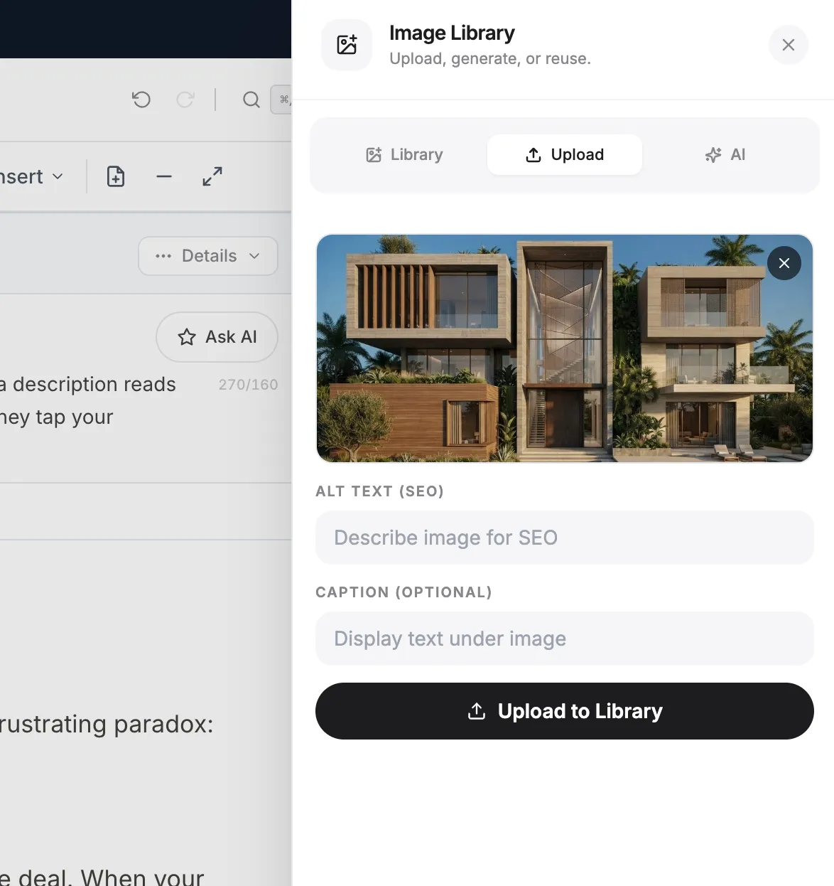
Meaningful photos, informative icons, and image links need concise alternative text that conveys their purpose or information, while complex charts benefit from clear nearby text explanations. By contrast, purely decorative graphics that add no information should use an empty alt="" attribute so screen readers skip noise (see how to optimize website images for SEO without sacrificing clarity). Reviewing image alt text and image accessibility alongside accessible icons ensures helpful text alternatives reach every visitor.
8. Test Website Forms, Buttons, and Menus for Accessibility Barriers
Walk through a complete real-world task—such as filling out a contact or quote form—from start to finish rather than inspecting single fields in isolation.
Every input needs a visible label tied to the field rather than relying solely on placeholder text that disappears when typing. Required fields, dropdown menus, accordions, and dialogs should behave predictably, and error messages should explain clearly what went wrong and how to fix it. Testing accessible forms and accessible buttons alongside accessible navigation makes form accessibility testing practical and goal-focused.
9. Review Headings, Links, Page Titles, and Content Structure
Clear organization helps both assistive technology users and busy readers scan a page and grasp how sections relate to one another.
Check that each page has a descriptive title, a sensible heading hierarchy, a declared page language, and link text that makes sense out of context instead of repeating vague phrases like "click here." Good structure and plain instructions go hand in hand with clear internal linking strategy for small business planning and clean SEO meta descriptions. Refining accessible headings and descriptive link text improves website content accessibility and HTML document structure.
10. Test Mobile Accessibility, Zoom, and Small-Screen Interactions
Zoom your browser to 200%, rotate your phone between portrait and landscape, and test small-screen layouts to see if text clips, overlaps, or forces awkward horizontal scrolling.
Check that buttons and tap targets have enough room so thumbs do not hit the wrong control, and watch out for sticky bars that crowd the screen when zoomed in. Under WCAG 2.2, generous target sizing and responsive reflow help keep key actions reachable on smaller viewports. Regular mobile accessibility testing and responsive accessibility checks—paired with website zoom testing and touch target accessibility—catch layout friction early.
11. Turn Accessibility Test Results into a Prioritized Fix List
A long list of errors and warnings can feel overwhelming until you sort issues by who is affected, how severe the barrier is, how often it occurs, and how much it blocks key tasks.
Separate confirmed barriers on high-value flows—like navigation, forms, and primary content—from automated warnings that need human verification, then log each item with its location, owner, and status so you can retest cleanly after fixing (and resolve any duplicate pages or canonical URL errors that split attention across similar URLs). A clear accessibility audit turns raw findings into a focused plan to fix website accessibility issues from an accessibility testing report.
| Tool | What Readers Can Use It For |
|---|---|
| WAVE | Visual feedback about accessibility errors, alerts, and page structure. |
| axe DevTools | Detect common accessibility issues in browser-based pages and interfaces. |
| Google Lighthouse | Run automated accessibility audits in Chrome DevTools. |
| WebAIM Contrast Checker | Check text and background color contrast ratios. |
| NVDA | Test how website content and controls are announced by a screen reader. |
| VoiceOver | Test website navigation and announcements on Apple devices. |
12. Keep Every New Website Page Accessible Before You Publish
Treat accessibility as a routine check before publishing every new page or edit rather than a rare rescue mission after complaints pile up.
Check headings, image alt text, color contrast, keyboard navigation, form labels, mobile zoom, and automated scan results before hitting publish. When you create and manage pages with BoltWeb, you get a clean website built to run smoothly and scale—and you can still verify accessibility on any tool on your finished pages so nothing slips through. Building a steady website accessibility checklist supports accessible website design and makes website accessibility testing part of everyday growth.
Make Every Visitor Journey Seamless Before Your Next Launch
Picture a first-time visitor opening your service page on a phone with zoomed text, tabbing cleanly to your inquiry button, reading every label without strain, and sending a message without a single hiccup.
Start your next page build on BoltWeb, review your live screens across real devices and testing tools, and create a business website where every visitor can move forward with confidence.
Get Started On Your Journey →FAQs: Check Website Accessibility
My website looks completely normal to me, so how do I know whether someone without a mouse, someone using a screen reader, or someone with low vision can actually use it without hitting a wall?
Looks can be deceiving. A layout that feels clean and sharp to you might still stop a visitor cold if they navigate by keyboard, listen through a screen reader, or zoom in because of low vision—turning curious shoppers away before they ever reach your contact button or checkout.
Taking time to check website accessibility moves you past guesswork into real-world usability so you can shape a genuinely accessible website and strengthen everyday web accessibility. Where a solution fits—such as putting a clean page structure in place quickly—BoltWeb and AI Foundry inside BoltWeb help you draft organized sections fast, though you still want to verify your live pages with accessibility checks after publishing.
Is there a tool that can scan my website and show me what's wrong right away?
A quick automated scan on a public page is a practical first step because it flags obvious gaps—like missing image text, weak color contrast, or structural hiccups—before you examine elements one by one.
Just keep in mind what a single scan cannot tell you: checking one homepage does not cover every template on your site, and automated tools cannot judge whether wording or flow actually makes sense to a human. Pairing a website accessibility checker and accessibility testing tools with smart automated accessibility testing gives you a helpful starting map without pretending it finishes the job.
What accessibility standard should I use, and what does WCAG actually mean?
Think of WCAG as a practical yardstick built around four simple questions: can people perceive what is on screen, can they operate the controls, can they understand the content and instructions, and can assistive technologies read the underlying markup reliably?
Its conformance tiers run across Levels A, AA, and AAA, with WCAG 2.2 Level AA widely used as a sensible benchmark—though meeting a standard is never a universal legal guarantee on its own. Leaning on WCAG 2.2 and WCAG accessibility guidelines gives you clear website accessibility standards to evaluate real visitor friction.
What if someone can't use a mouse? Can they still reach my website's main features?
Put the mouse aside for two minutes and step through a key page using Tab, Shift + Tab, Enter, Space, and arrow keys to see if every link, button, menu, form, and modal works without a pointer.
Look for a visible focus outline so you never lose your place, make sure nothing traps your keyboard inside a widget, and check that skip links help visitors bypass repetitive menus. Running a keyboard accessibility check turns keyboard navigation testing into a fast, honest website accessibility test you can try yourself.
Can someone using a screen reader understand what each part of my page does?
An icon button or custom card can look obvious on screen yet sound vague or confusing out loud when a screen reader announces it without a clear name, logical heading level, landmark, or semantic tag.
Listening to how assistive tech reads your page titles, headings, links, buttons, images, and form fields exposes gaps between visual design and spoken clarity. Hands-on screen reader testing improves screen reader accessibility, rewards clean semantic HTML, and reinforces an accessible website structure.
My text looks readable on my screen. Why would it fail a contrast check?
Soft gray copy on a pale background or delicate labels over photos can look fine on a calibrated monitor in a dim room, yet become hard to read in bright daylight or on lower-contrast screens.
WCAG defines measurable contrast ratios—including 4.5:1 for standard text, 3:1 for large text, and relevant non-text contrast for meaningful UI elements and graphics. Checking pairs with a color contrast checker against WCAG color contrast targets helps you pick dependable website accessibility colors instead of relying on eye strain.
How do I know whether visitors who cannot see an image still receive its information?
Ask what role an image, icon, image link, or chart plays on the page—whether it carries essential information or simply decorates the layout.
Meaningful visuals need helpful text explanations or concise alternative text that captures what the visual communicates, while purely decorative elements belong with an empty alt="" so screen readers do not read out extra noise. Careful image alt text and image accessibility alongside accessible icons give visitors clear text alternatives without clutter.
Can people understand what a form needs and recover when they make a mistake?
Try completing a real inquiry or signup form from top to bottom rather than checking one input box in isolation, paying attention to how fields behave when something is missed or mistyped.
Placeholder text disappears as soon as someone types, so it cannot replace a real form label—and visitors need clear required cues, predictable menus, buttons, accordions, and dialogs, plus plain error messages that show how to fix an issue. Focused accessible forms and accessible buttons paired with accessible navigation make form accessibility testing practical around real tasks.
Could someone understand my page without relying on its visual layout?
Clear page titles, sensible heading levels, link text that makes sense on its own, plain instructions, and a declared page language help people follow how sections connect even without visual layout cues.
Checking structure and wording alongside your content and internal linking strategy for small business pages keeps paths logical for every reader. Sharpening accessible headings and descriptive link text strengthens website content accessibility and HTML document structure.
Does my website remain usable when someone zooms in or uses a phone differently?
Zooming a browser, enlarging text, rotating a phone between portrait and landscape, or viewing on a narrow screen can squeeze layouts, clip words, crowd sticky bars, or force awkward horizontal scrolling.
Check that buttons and touch targets leave enough room so fingers do not tap the wrong control by mistake and that content reflows cleanly as screen size changes. Routine mobile accessibility testing and responsive accessibility checks—alongside website zoom testing and touch target accessibility—catch small-screen snags before visitors do.
My audit found dozens of issues. Which ones should I fix first?
An audit report full of errors and warnings feels much less daunting once you rank items by who is affected, how severe the barrier is, how often it happens, and how much it blocks core tasks.
Separate confirmed roadblocks on key journeys from automated warnings that need a human look, log each item clearly, and retest after fixes so high-impact barriers get solved first. A practical accessibility audit turns raw findings into a clear plan to fix website accessibility issues from an accessibility testing report.
How do I stop accessibility problems from returning every time I add a new page?
Making accessibility part of your normal publish routine keeps small slips from piling up—so you catch issues right away instead of treating them as an emergency later.
Quickly checking headings, image alt text, contrast, keyboard flow, form labels, mobile zoom, and scan results before publishing protects new pages as your site grows, and when a builder workflow helps you get pages out smoothly, you can still check finished pages with your preferred testing tools. A steady website accessibility checklist supports accessible website design and makes website accessibility testing a natural habit.
When a visitor opens your site on a zoomed phone screen, tabs straight to your form, and submits a request without hitting a single roadblock, your pages stop losing quiet opportunities and start welcoming every customer in.