Launching a new physical item, SaaS tool, or digital product requires a dedicated conversion funnel. Learning how to build a landing page for a product comes down to structuring your page flow to highlight tangible value, demonstrate real-world usage, resolve buyer friction, and lead visitors toward a single checkout or signup event.
Below are 12 unique Voice of Customer (VoC) questions focusing specifically on product landing page architecture, visual demonstration, offer presentation, and conversion optimization—answered concisely with precise keyword mapping.

What makes a product landing page different from a standard company homepage?"
Here is the key distinction: a standard homepage acts as a broad directory for your entire brand, whereas effective product landing page design focuses entirely on a single item.
When learning how to build a landing page for a product, you must remove global site navigation links, header drop-down menus, and secondary blog posts. Keeping the layout 100% focused on a single product offer prevents decision fatigue and guides traffic directly to the purchase button.
How do I explain what my product actually does in just a few seconds?"
Here is what works: your primary product landing page headline must state your product's core job within seconds. Avoid abstract slogans that force visitors to guess what you are selling.
Combine a clear statement of your product type with the specific result it delivers. Presenting a sharp product value proposition right at the top of the page hooks early traffic so visitors stay engaged to explore key details.
Why should customers buy my item instead of fixing the problem manually?
Think about buyer motivation: shoppers do not buy raw specs; they buy time saved and hassle avoided. Translate technical product features into real-world outcomes.
Feature
"Battery capacity rated at 10,000 mAh."
Benefit
"Keep your phone fully charged for three straight days of travel without searching for an outlet."
Framing your content around clear product landing page benefits shows prospective buyers exactly how your offer improves their daily routine.
How can I show my product off visually if visitors can't physically hold it?
Uncertainty creates immediate buying hesitation. High-converting pages rely on rich product demo visuals to make the item feel real:
- High-resolution, multi-angle product photos
- Short looping GIF demonstrations showing main features in action
- Interactive 3D renders or annotated UI screenshots
Providing comprehensive product landing page visual proof eliminates physical uncertainty so visitors buy with confidence.

Where should I place the order button so people don't miss it?
Look at how clear visual hierarchy impacts sales: your primary product landing page CTA must stand out immediately against your site palette.
Place your primary buy button above the fold near your product title, and repeat it directly below benefit breakdowns and social proof sections. Using explicit action copy like "Claim Your Kit" or "Get Instant Access" increases your overall product page conversion rate.

How do I show potential buyers that real people love this product?
When visitors evaluate a new product, internal skepticism kicks in. Displaying authentic product landing page testimonials, star ratings, and unboxing videos creates instant trust.
Position real product reviews right next to order forms and checkout buttons. Showing verified buyer feedback provides the social proof required to turn on-the-fence visitors into paying customers.
How do I convince shoppers that my product is better than cheaper alternatives?
Your target audience is actively comparing your item against alternative options. If you do not highlight your unique value proposition, customers will judge your product strictly on price.
Use a clean comparison table to contrast your build quality, feature set, or warranty terms against generic alternatives. Showing clear superiority makes choosing your product the obvious decision.
What details do I need to include so buyers aren't surprised after ordering?
Avoid post-purchase refund requests by setting crystal-clear expectations in your product landing page content. Detail all technical parameters clearly:
| Specification Category | Information to Include |
|---|---|
| Physical Dimensions | Exact height, weight, materials, and color options |
| Package Contents | Complete list of accessories included in the box |
| Compatibility | Supported operating systems, hardware versions, or fittings |
Displaying explicit product specifications answers technical questions before they stall out a sale.
What if visitors are worried about shipping costs, returns, or warranties?
It comes down to eliminating risk: buyers want to know what happens if the product fails or does not fit. An accordion-style product landing page FAQ section directly resolves these concerns.
Clarify return windows, outline shipping delivery timelines, and detail money-back guarantees. Reassuring buyers directly on the page removes hesitation right at the point of purchase.
How can I get hesitant shoppers to place their order today instead of waiting?
Procrastination causes lost sales. Strategic conversion optimization uses authentic incentives to prompt immediate purchases.
Highlighting limited production batch runs, offering a free bonus accessory for early orders, or running a time-sensitive launch discount encourages prompt action. Adding legitimate product page urgency stops visitors from leaving to "think about it" and never returning.
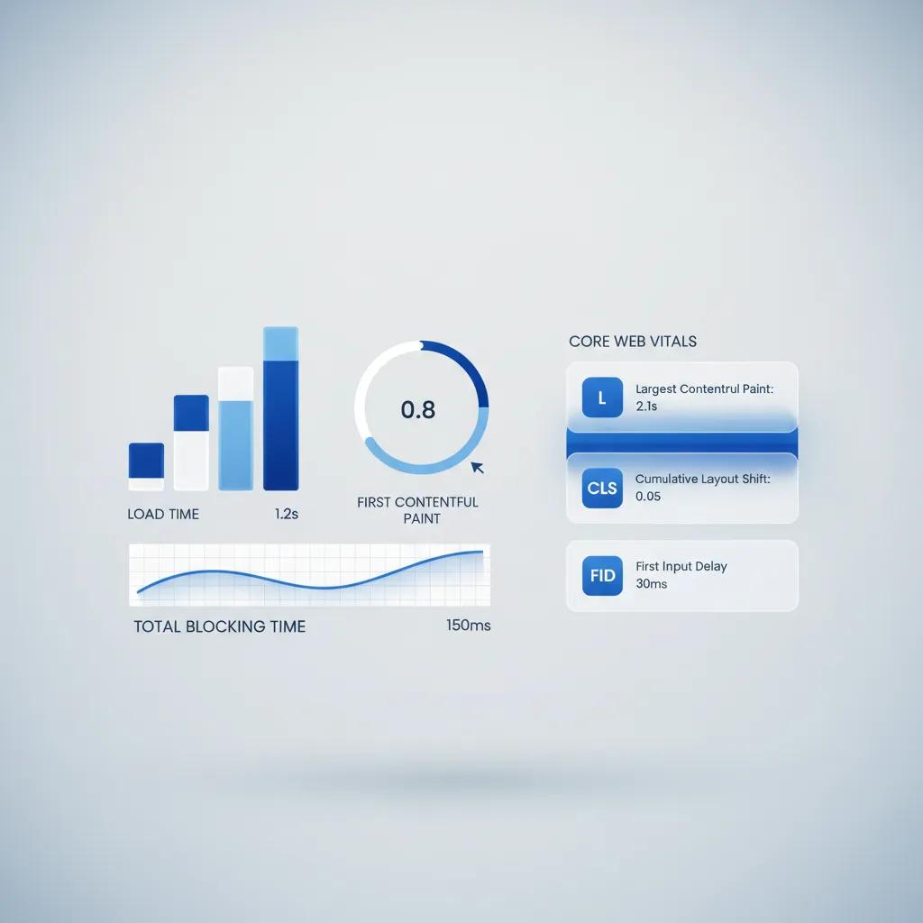
How do I make sure my product page loads fast and looks great on smartphones?
More than 60% of online shopping happens on mobile devices. If your mobile product page loads slowly or forces users to pinch-zoom to read specs, sales will drop sharply.
Prioritize mobile performance: optimize high-resolution product images, ensure tap-friendly buy buttons, and verify fast product page speed across cellular networks to protect your mobile checkout rates.

How can I build a complete product landing page without hiring developers?
Learning how to build a landing page for a product—and manually writing code, optimizing images, and designing responsive layouts—can take weeks. For founders, creators, and online stores wanting to launch quickly, modern platforms streamline the technical work entirely.
Build High-Converting Product Landing Pages Effortlessly with BoltWeb
BoltWeb takes the hassle out of building product pages by automatically creating fast, beautifully structured, high-converting layouts tailored to your item in seconds.
1. Describe Your Product Details
No technical design or coding experience needed. Open the BoltWeb Foundry interface and select the product landing page option. Type a simple prompt describing your item, key features, target audience, and primary goal.
2. Generate Your Complete Product Page
Layout, product copy, and visuals generated instantly. Click Generate. BoltWeb automatically constructs a complete product page featuring clear headlines, visual proof containers, benefit grids, and pre-formatted buy buttons.
3. Customize Content and Visual Assets
Intuitive visual editing interface. Use the drag-and-drop builder to adjust product copy, upload high-res images, or reorder sections with zero risk of breaking your responsive layout or slowing down load times.
4. Connect Domain and Start Selling
Global edge deployment on custom domains. Add your custom domain in the dashboard, update your DNS records with your registrar, and click Publish to deploy a fast, mobile-optimized product page ready to capture sales.

Faq about How to Build a Landing Page for a Product
What makes a product landing page different from a standard company homepage?
Here is the key distinction: a standard homepage acts as a broad directory for your entire brand, whereas effective product landing page design focuses entirely on a single item.
When learning how to build a landing page for a product, you must remove global site navigation links, header drop-down menus, and secondary blog posts. Keeping the layout 100% focused on a single product offer prevents decision fatigue and guides traffic directly to the purchase button.
How do I explain what my product actually does in just a few seconds?
Here is what works: your primary product landing page headline must state your product's core job within seconds. Avoid abstract slogans that force visitors to guess what you are selling.
Combine a clear statement of your product type with the specific result it delivers. Presenting a sharp product value proposition right at the top of the page hooks early traffic so visitors stay engaged to explore key details.
Why should customers buy my item instead of fixing the problem manually?
Think about buyer motivation: shoppers do not buy raw specs; they buy time saved and hassle avoided. Translate technical product features into real-world outcomes.
Feature
"Battery capacity rated at 10,000 mAh."
Benefit
"Keep your phone fully charged for three straight days of travel without searching for an outlet."
Framing your content around clear product landing page benefits shows prospective buyers exactly how your offer improves their daily routine.
How can I show my product off visually if visitors can't physically hold it?
Uncertainty creates immediate buying hesitation. High-converting pages rely on rich product demo visuals to make the item feel real:
- High-resolution, multi-angle product photos
- Short looping GIF demonstrations showing main features in action
- Interactive 3D renders or annotated UI screenshots
Providing comprehensive product landing page visual proof eliminates physical uncertainty so visitors buy with confidence.
Where should I place the order button so people don't miss it?
Look at how clear visual hierarchy impacts sales: your primary product landing page CTA must stand out immediately against your site palette.
Place your primary buy button above the fold near your product title, and repeat it directly below benefit breakdowns and social proof sections. Using explicit action copy like "Claim Your Kit" or "Get Instant Access" increases your overall product page conversion rate.
How do I show potential buyers that real people love this product?
When visitors evaluate a new product, internal skepticism kicks in. Displaying authentic product landing page testimonials, star ratings, and unboxing videos creates instant trust.
Position real product reviews right next to order forms and checkout buttons. Showing verified buyer feedback provides the social proof required to turn on-the-fence visitors into paying customers.
How do I convince shoppers that my product is better than cheaper alternatives?
Your target audience is actively comparing your item against alternative options. If you do not highlight your unique value proposition, customers will judge your product strictly on price.
Use a clean comparison table to contrast your build quality, feature set, or warranty terms against generic alternatives. Showing clear superiority makes choosing your product the obvious decision.
What details do I need to include so buyers aren't surprised after ordering?
Avoid post-purchase refund requests by setting crystal-clear expectations in your product landing page content. Detail all technical parameters clearly:
| Specification Category | Information to Include |
|---|---|
| Physical Dimensions | Exact height, weight, materials, and color options |
| Package Contents | Complete list of accessories included in the box |
| Compatibility | Supported operating systems, hardware versions, or fittings |
Displaying explicit product specifications answers technical questions before they stall out a sale.
What if visitors are worried about shipping costs, returns, or warranties?
It comes down to eliminating risk: buyers want to know what happens if the product fails or does not fit. An accordion-style product landing page FAQ section directly resolves these concerns.
Clarify return windows, outline shipping delivery timelines, and detail money-back guarantees. Reassuring buyers directly on the page removes hesitation right at the point of purchase.
How can I get hesitant shoppers to place their order today instead of waiting?
Procrastination causes lost sales. Strategic conversion optimization uses authentic incentives to prompt immediate purchases.
Highlighting limited production batch runs, offering a free bonus accessory for early orders, or running a time-sensitive launch discount encourages prompt action. Adding legitimate product page urgency stops visitors from leaving to "think about it" and never returning.
How do I make sure my product page loads fast and looks great on smartphones?
More than 60% of online shopping happens on mobile devices. If your mobile product page loads slowly or forces users to pinch-zoom to read specs, sales will drop sharply.
Prioritize mobile performance: optimize high-resolution product images, ensure tap-friendly buy buttons, and verify fast product page speed across cellular networks to protect your mobile checkout rates.