Creating a landing page that consistently turns casual visitors into paying customers or qualified leads is one of the most critical challenges in digital marketing. Whether you are launching a new product, running paid ad campaigns, or building an email list, your landing page is the final destination where decisions are made. Yet, far too many businesses struggle with low conversion rates simply because they do not know what structural elements belong on the page.
Here is the truth: a landing page fails when it tries to explain everything to everyone. Building a page that competes and wins in today’s market comes down to strategic alignment—arranging the right visual proof, persuasive copy, and clear conversion paths in a sequence that feels effortless to the reader.
Knowing how to build a landing page for a product gives you the foundation for product-specific positioning, but understanding the universal structural components ensures every offer you publish yields maximum return on investment.

Start With One Clear Goal
The biggest mistake web designers and business owners make is cluttering a single page with competing objectives. When a landing page asks visitors to read a blog post, follow social media channels, schedule a demo, and purchase a subscription all at once, it triggers immediate decision paralysis.
To maximize conversions, every element on your page must point toward a single, primary action:
- Direct Sale: Driving an immediate checkout or payment.
- Lead Capture: Collecting contact details through a simple intake form.
- Account Signup: Prompting users to register for a free trial or platform account.
Think of your page as a guided funnel. Eliminating unnecessary navigation links and secondary distractions keeps the visitor focused entirely on the core offer.
If your primary objective requires capturing customer inquiries directly on the page, the layout of your intake section becomes critical. Understanding how to add a lead form to a website ensures your input fields collect vital customer data without introducing unnecessary drop-off points.

Write a Headline That Makes the Offer Immediately Clear
Your headline is the single most important piece of copy on the entire page. You have less than five seconds to capture a visitor's attention before they click away. Clever, abstract, or overly complex taglines fail because they force the reader to decode what you are actually offering.
A high-converting landing page headline communicates value immediately by answering three subconscious questions:
- What is this offer?
- What specific problem does it solve for me?
- What outcome can I expect?
| Headline Type | Vague / Weak Headline | Clear / High-Converting Headline |
|---|---|---|
| Direct Value | "Empowering Your Digital Transformation" | "Automate Your Client Onboarding in Under 10 Minutes" |
| Targeted Solution | "The Best Platform for Small Teams" | "All-in-One Scheduling Built Specifically for Personal Trainers" |
| Outcome Focused | "Revolutionize Your Daily Workflow" | "Cut Weekly Admin Work in Half With Automated Invoicing" |
Notice the immediate difference. When your headline hooks the reader, their eyes naturally move down the page to evaluate the underlying value.
Structuring this hero section correctly ensures the headline and primary conversion elements are immediately visible without scrolling. Reviewing what should go above the fold on a website provides the exact layout rules needed to capture initial attention on desktop and mobile viewports.

Explain the Main Benefit, Not Just What You Sell
A common trap in web design is focusing entirely on features while forgetting the human benefit behind them. Features describe what your product or service is; benefits explain what your offer does to improve the customer's life or business.
Feature: "Includes 256-bit SSL encryption and automated daily backups."
Benefit: "Rest easy knowing your critical customer data is completely secure and fully recoverable 24/7."
Connect every technical specification or service parameter directly to a real-world result. Show the reader how your offer saves them money, recovers lost time, removes daily friction, or eliminates stress.
Here is why this matters: once visitors understand the tangible benefits of your offer, they naturally evaluate how easy your site is to navigate. If the layout feels confusing, even the best copy will fail. Learning how to make a website easy to use helps you format your benefit sections so readers scan and digest key details instantly.

Show Visitors Exactly What You're Offering
Uncertainty is the quiet killer of online sales. If visitors cannot visualize what they are receiving when they click your call-to-action, they will hesitate and leave.
You need to make your offer tangible through precise visual and textual clarity:
If you are selling physical goods, present crisp, high-resolution imagery from multiple angles. If you are offering software, digital downloads, or consulting services, display interactive UI mockups, clear dashboard previews, or itemized service breakdowns.
Showing your offer clearly naturally leads visitors to inspect the surrounding visual layout. If your header or hero layout feels cluttered, it distracts from the core deliverable. Checking what makes a good homepage yields structural insights on visual hierarchy that apply directly to high-impact landing page design.

Add a Clear Call to Action (CTA)
A high-converting page never leaves the reader guessing what step to take next. Your call-to-action button should serve as the obvious visual focal point of the section.
Avoid passive, uninspired button labels like "Submit," "Click Here," or "Learn More." Instead, write action-oriented copy that reinforces the valuable outcome the user receives upon clicking:
- "Claim Your Free Audit"
- "Start Your 14-Day Free Trial"
- "Download the Growth Guide Now"
Make sure your primary CTA button utilizes a high-contrast color that stands out sharply against your background palette. Position your call to action strategically throughout the page flow—above the fold, after your main benefit breakdown, below social proof sections, and at the very bottom of the page. Reviewing landing page CTA best practices ensures your buttons drive maximum click-through rates.
Use Images or Visuals That Help Sell the Offer
Generic stock photos of smiling office workers in suits do not build conversions; they degrade trust. Every visual asset on your page must serve an educational or persuasive purpose.
High-impact visual elements include:
- Annotated UI Previews: Pointing out key features directly on software screenshots.
- Before-and-After Comparisons: Demonstrating clear transformation metrics.
- Diagrams & Flowcharts: Explaining complex service workflows visually.
Using intentional visuals accelerates customer comprehension, allowing visitors to grasp your value proposition in seconds rather than reading long blocks of text.
Add Social Proof Where Visitors Start to Doubt
Even when readers love your headline and benefit list, an internal voice asks: Does this actually work? Can I trust this company?
This is where authentic social proof converts skeptics into buyers. Place real customer reviews, star ratings, video testimonials, verified case study statistics, and client brand logos directly alongside key decision points on your page.
| Social Proof Type | Ideal Placement | Psychological Impact |
|---|---|---|
| Client Logos | Directly below the main hero section | Establishes immediate industry authority |
| Detailed Testimonials | Alongside feature and benefit breakdowns | Validates real-world results and satisfaction |
| Trust Badges & Certifications | Next to checkout buttons or lead forms | Eliminates security and transaction hesitation |
Placing social proof directly near your primary action points gives hesitant visitors the reassurance required to commit.

Explain Why People Should Choose You
Your prospects are actively comparing your offer against competitors, alternative workarounds, or doing nothing at all. If you do not explicitly define your unique advantage, visitors will default to comparing options based on price alone.
Clearly articulate your unique value proposition by highlighting key differentiators:
- Superior Speed: "Delivered in 48 hours vs. standard 2-week turnaround times."
- Transparent Pricing: "Flat monthly rates with zero hidden maintenance fees."
- Specialized Expertise: "Built exclusively for independent dental practices."
When visitors see a clear, undeniable distinction between your business and generic market alternatives, choosing your offer becomes the obvious decision.
Answer the Questions That Could Stop Someone From Converting
Before completing a purchase or submitting their email, visitors run through an internal checklist of potential risks and objections: What if this doesn't work for my business? How hard is setup? Is there a money-back guarantee?
Address these concerns head-on using an accordion-style FAQ section near the bottom of the page:
- Onboarding & Setup: Clarify how long implementation takes.
- Guarantees & Cancellations: Reassure users with explicit refund or cancellation terms.
- Support Access: Detail how customers get assistance if they encounter issues.
Resolving objections directly on the page removes the final hurdles stopping a prospect from taking action.
When visitors are confident in your offer, they evaluate the overall legitimacy of your site. If your brand authority feels weak, conversions stall out. Understanding how to build trust with your website helps you embed security indicators, clear privacy policies, and verified brand markers across your layout.

Create Urgency Without Making the Page Feel Pushy
Procrastination is a major reason potential buyers abandon landing pages. If there is no compelling reason to act right now, visitors often close the tab with the intention of returning later—and rarely do.
Ethical urgency encourages immediate decision-making:
- Time-Sensitive Bonus: Offering an additional resource for signups completed today.
- Limited Capacity: Highlighting available client slots or limited inventory counts.
- Upcoming Price Shifts: Noting an upcoming rate adjustment for early adopters.
Keep your urgency authentic. Fake countdown timers or manufactured scarcity degrade brand credibility and cost you long-term trust.

Make the Landing Page Fast, Mobile-Friendly, and Easy to Scan
Over half of all web traffic originates from mobile devices. If your page takes too long to load, contains tiny unreadable text, or features broken layout containers on mobile screens, your conversion rate will drop drastically.
Ensure your technical foundations are rock-solid:
- Responsive Layouts: Design elements that scale fluidly across smartphones, tablets, and desktops.
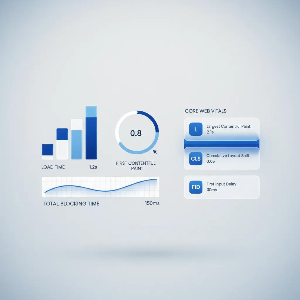
- Instant Load Times: Optimize images and scripts so your page paints in under two seconds.
- Scannable Hierarchy: Utilize bold subheadings, short paragraphs, and ample whitespace to prevent visual fatigue.
If your landing page feels slow during testing, technical performance issues must be fixed immediately. Running an audit using our guide on why is my website slow reveals technical bottlenecks, while applying the steps in how to make a website load faster guarantees your page renders instantly for every user.

Build a High-Converting Landing Page Without Starting From Scratch
Determining what to include on a landing page—and executing the code, design, mobile responsiveness, and copy manually—can consume weeks of technical effort. For web designers, agencies, and non-technical business owners, wrestling with complex page builders or fragile plugin stacks often delays crucial product launches.
You do not need to spend weeks coding or hiring expensive development teams to deploy a world-class landing page. Modern AI-powered platforms eliminate the technical guesswork entirely.
Build Optimized Landing Pages Instantly with BoltWeb
BoltWeb solves the landing page struggle by automatically building fast, beautifully structured, high-converting pages tailored to your specific offer out of the box.
1. Describe Your Business and Offer
No coding or manual design configuration required. Open the BoltWeb Foundry interface and select the landing page builder. Enter your product or service details, target audience, and key conversion goals using simple text prompts.
2. Generate Your Complete Landing Page
Complete structure, copy, and visuals generated instantly. Click Generate. BoltWeb automatically constructs a complete, high-converting landing page layout containing clear headlines, structured benefit sections, visual proof containers, and pre-formatted call-to-action blocks.
3. Refine Your Visual Layout
Fluid click-and-drag customization. Use the intuitive drag-and-drop editor to adjust copy, swap visual assets, or rearrange sections effortlessly. Customize your page design with zero risk of breaking layout responsiveness or adding code bloat.
4. Connect Your Domain and Go Live
Instant deployment on custom domains. Enter your custom domain in your dashboard, update your two DNS configuration records with your registrar, and hit Publish. Your lightning-fast, fully responsive landing page is instantly live and ready to convert traffic.

FAQ: What Should a Landing Page Include? 12 Core Questions Answered
Building a high-converting landing page often feels overwhelming. Creators, marketers, and business owners frequently struggle to understand why traffic lands on their site but leaves without buying or submitting a form.
Here is the secret: understanding what should a landing page include comes down to structuring your layout around real customer concerns, removing visual friction, and guiding visitors toward a single action.
Below are 12 of the most frequent questions regarding landing page structure, element placement, and conversion optimization
What do I actually need on my landing page to get people to act?
Here is the bottom line: driving conversions requires a focused sequence of core landing page elements working together. You need a benefit-driven headline to capture attention immediately, backed by clear visual proof like product photos or software interface previews. Positioning a single, prominent call to action keeps the visitor focused without decision paralysis.
Furthermore, you must translate feature lists into human outcomes and display authentic social proof like client reviews. Wrapping up the page flow with an objection-handling FAQ section eliminates hesitation points right before purchase.
I have only a few seconds—how do I make sure visitors know what I'm offering?
Think about it: your primary landing page headline carries the heavy burden of keeping a user from bouncing. Avoid clever or vague slogans that force readers to guess what you sell.
Instead, write concise landing page copy that directly states your product category, highlights the primary problem you solve, and reveals the exact result your customer achieves. Stating your core value proposition clearly above the fold hooks visitors immediately so they keep scrolling down the page.
Okay, but what do I actually get out of this product or service?
Here is a simple truth about buyer behavior: visitors do not buy technical features; they buy solutions to frustrating problems. Transform technical specifications into clear landing page benefits that show daily life improvements.
For instance, rather than highlighting "256-bit data encryption," explain that users will "rest easy knowing financial records are 100% secure from unauthorized access." Explicitly detailing the tangible outcome of your value proposition answers the customer's internal question: "What is in it for me?"
Can I actually see what I'm getting before I click or buy?
Uncertainty is the quiet killer of online sales. High-converting landing page content makes your offer tangible through intentional landing page design.
Display high-resolution physical product photos from multiple angles, crisp software UI previews, or itemized service breakdowns. When visitors clearly see the exact components of your landing page offer, their fear of making a bad purchase decision vanishes.
I'm interested—what am I supposed to do next on this page?
Look at the difference clarity makes: a successful page never leaves the reader guessing what step to take next. Your primary landing page CTA (call to action) must stand out visually using a high-contrast button color.
Avoid generic labels like "Submit" or "Click Here." Write action-oriented phrases like "Claim Your Free Audit" or "Start Your 14-Day Free Trial" to reinforce the value received. Strategic repetition of your primary call to action across major sections drastically boosts landing page conversion rates.
Why should I trust paragraphs of text without visual evidence?
The truth is, high-impact landing page images communicate value far faster than dense paragraphs of text. Leverage relevant landing page visuals like before-and-after transformation metrics, annotated workflow diagrams, or feature callouts on UI screenshots.
Skip generic stock photography of office workers entirely. Every visual element on your page must serve a clear educational or persuasive purpose.
Has anyone else like me actually used this and gotten results?
When visitors reach key decision points on your page, internal anxiety sets in. Adding authentic landing page testimonials, verified buyer ratings, case study statistics, and client brand logos builds immediate landing page trust.
Positioning real social proof directly beside checkout buttons or lead intake forms provides the extra reassurance hesitant buyers need to complete their action. Learn more about how to add testimonials to a website to maximize this effect.
Why should I pick your solution instead of another option?
Your prospective buyers are actively comparing your offer against competitors or doing nothing at all. If you fail to define your unique selling proposition (USP), visitors will judge you strictly on price.
Use simple side-by-side comparison tables to highlight clear advantages—such as faster turnaround times, flat-rate pricing, or specialized industry expertise—making your offer the obvious choice.
What if I have concerns about setup, pricing, or guarantees before I commit?
It comes down to risk reversal: before committing money or contact details, visitors run through an internal checklist of potential concerns. An accordion-style landing page FAQ section directly resolves common landing page objections.
Clarify onboarding timelines, highlight hassle-free money-back guarantees, and explain support access clearly. Resolving these doubts directly on the page eliminates the friction that causes visitors to abandon the tab.
Why should I take action right now instead of thinking about it later?
Procrastination causes endless lost sales. Effective landing page optimization incorporates ethical urgency to prompt immediate decision-making.
Highlighting limited client availability, offering time-sensitive bonus downloads, or noting an upcoming price shift encourages action today. Authentic urgency keeps interested visitors from closing the tab and forgetting to return.
Why is this page so annoying to navigate on my phone?
Over half of global web traffic comes from mobile devices. If your landing page design features tiny font sizes, misaligned content blocks, or unresponsive buttons on smartphones, your mobile landing page performance will suffer.
Prioritize mobile-first layouts with large, thumb-friendly CTA buttons, scannable typography, fast-loading images, and clean responsive containers on every screen size.
How do I build a complete, high-converting landing page without coding from scratch?
Determining what to include on a landing page—and manually assembling code, copy, and mobile responsiveness—traditionally takes weeks of tedious technical effort. For web designers, agencies, and non-technical business owners, wrestling with fragile plugins delays vital product launches.
You do not need to code from scratch or spend weeks designing. Modern AI platforms handle layout structure and performance automatically.
Build High-Converting Landing Pages Effortlessly with BoltWeb
BoltWeb removes the stress of what should a landing page include by automatically generating fast, beautifully structured, high-converting pages tailored to your exact offer in seconds.
1. Describe Your Product or Offer:
No technical design experience needed. Open the BoltWeb Foundry interface and select the landing page option. Type a simple prompt describing your product, target audience, and main conversion goal.
2. Generate Your Complete Landing Page:
Structure, copy, and layout generated in seconds. Click Generate. BoltWeb automatically builds a complete landing page featuring strategic headlines, benefit breakdowns, social proof containers, and high-converting CTA blocks.
3. Refine Layouts via the Visual Builder:
Intuitive click-and-drag customization. Use the visual editor to fine-tune copy, swap images, or reorder sections with zero risk of breaking your responsive layout or slowing down page load speed.
4. Connect Your Domain & Launch Live:
Instant global deployment with custom domains. Add your custom domain in the dashboard, update your DNS records with your registrar, and click Publish to deploy an ultra-fast, responsive landing page ready to drive sales.